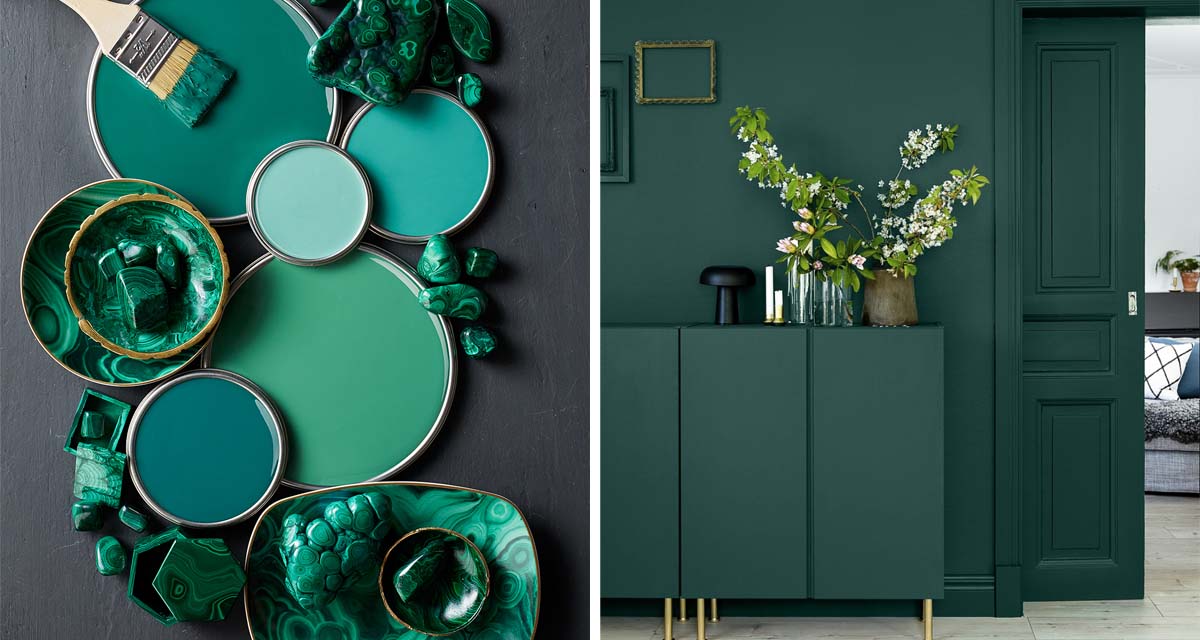
There are many different terms designers throw around when talking about colour and it’s value, that to many people can all start to sound a bit confusing and repetitive. You may think that words such as hue, tint, tone or shade are all just fancy ways of saying “colour”. But, in fact, they all have their own unique definition, importance for consideration and reason for application.
Today we thought we would unpack some of these terms for you, so that hopefully next time you’ll have a clearer understanding of what is being said and why – and more importantly, how it is going to affect your colour!
Hue
A hue is basically the colour that can be seen and the two terms are interchangeable. For example the colour green. Whether the colour is in its primary form or mixed with other colours, such as light green, dark green or lime green, the basic hue is green.


Value, Tint & Shade
Value refers to the lightness or darkness of a colour. A tint is a hue that has had white added to it, thereby, increasing its value and a shade is a hue that has had black added to it, thereby, decreasing its value. For example, a tint of blue could be a pastel blue whilst a shade of blue could be a navy blue.


Tone
A tone is created when both black and white are added to a hue, forming a greyed colour. These colours work particularly well when you are after a more muted look, or to balance out brighter hues.


As designers we place emphasis on the importance of colour as we know that it has a profound effect on the mood of a space, especially in your home where you have a personal and emotional connection to it.
Colour is therefore used to balance certain effects and evoke certain feelings, conveying a desired atmosphere. Colour can also alter people’s perceptions of light, space, weight and temperature. This is why you you’ll hear the suggestion of using a light, warm toned colour to make a space feel larger and warmer.
We always (always) talk about the power of paint. There is no easier or more budget friendly way to transform your home than by painting. And with the cold weather firmly in place, it’s never felt more important to have your home feeling cosy and welcoming.


