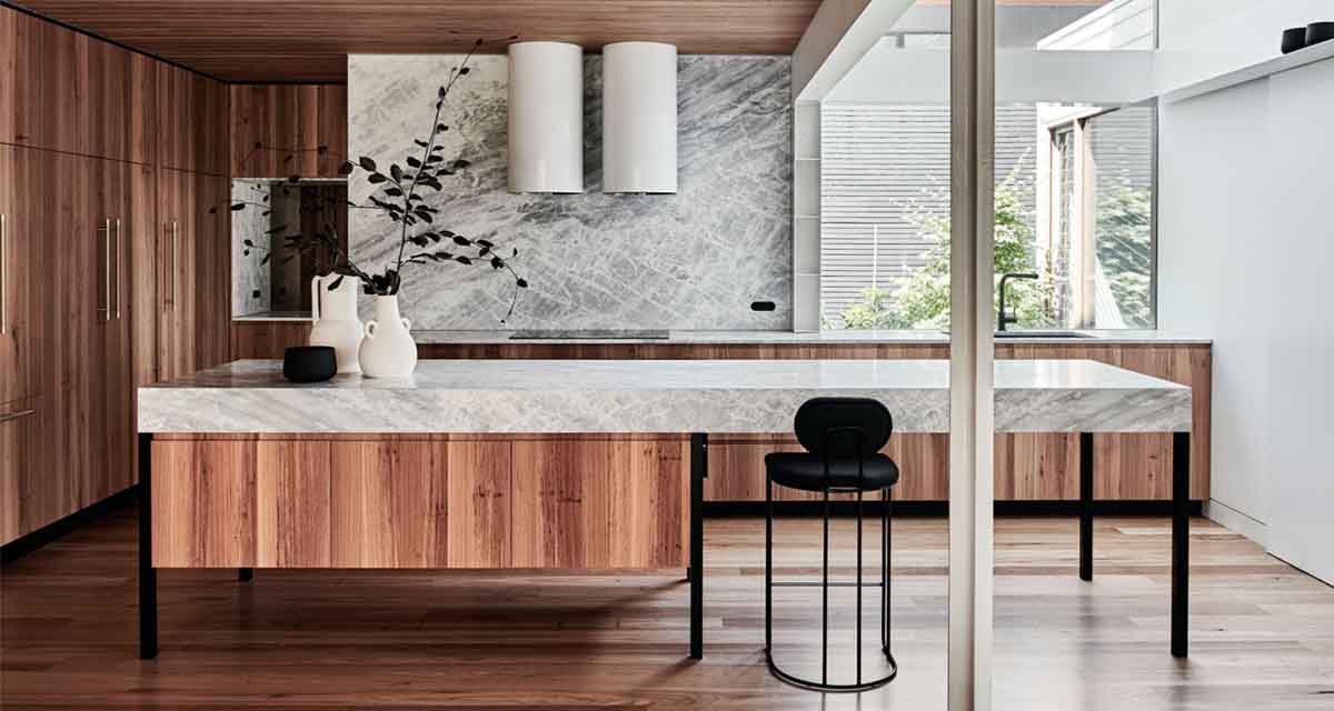
This home is a lesson in material simplicity.
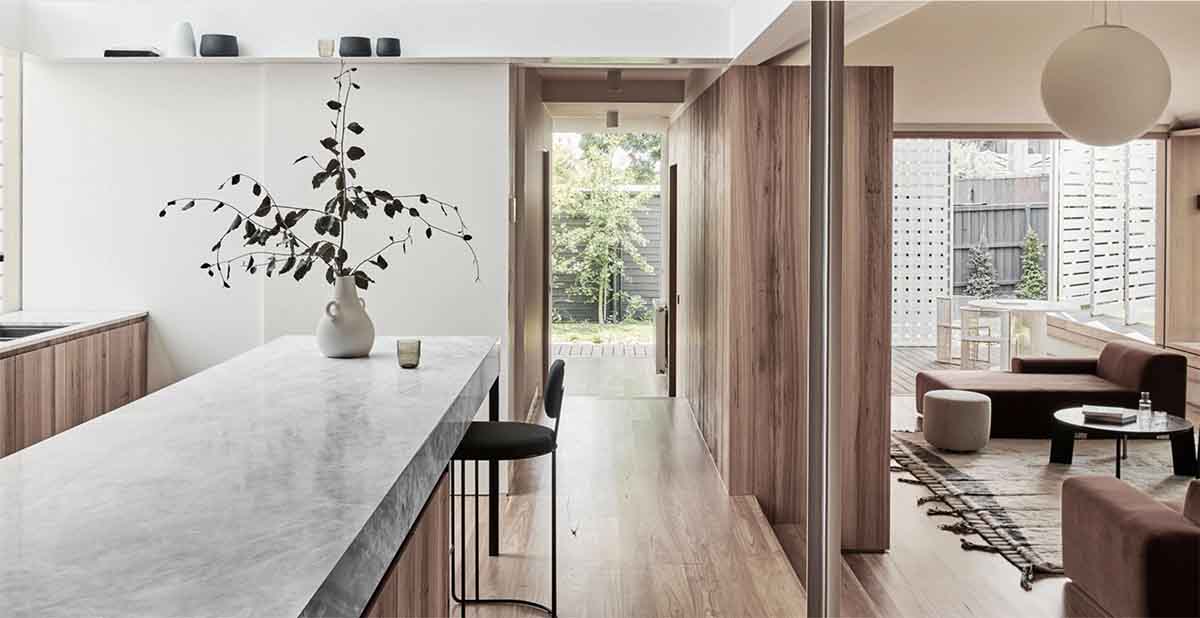
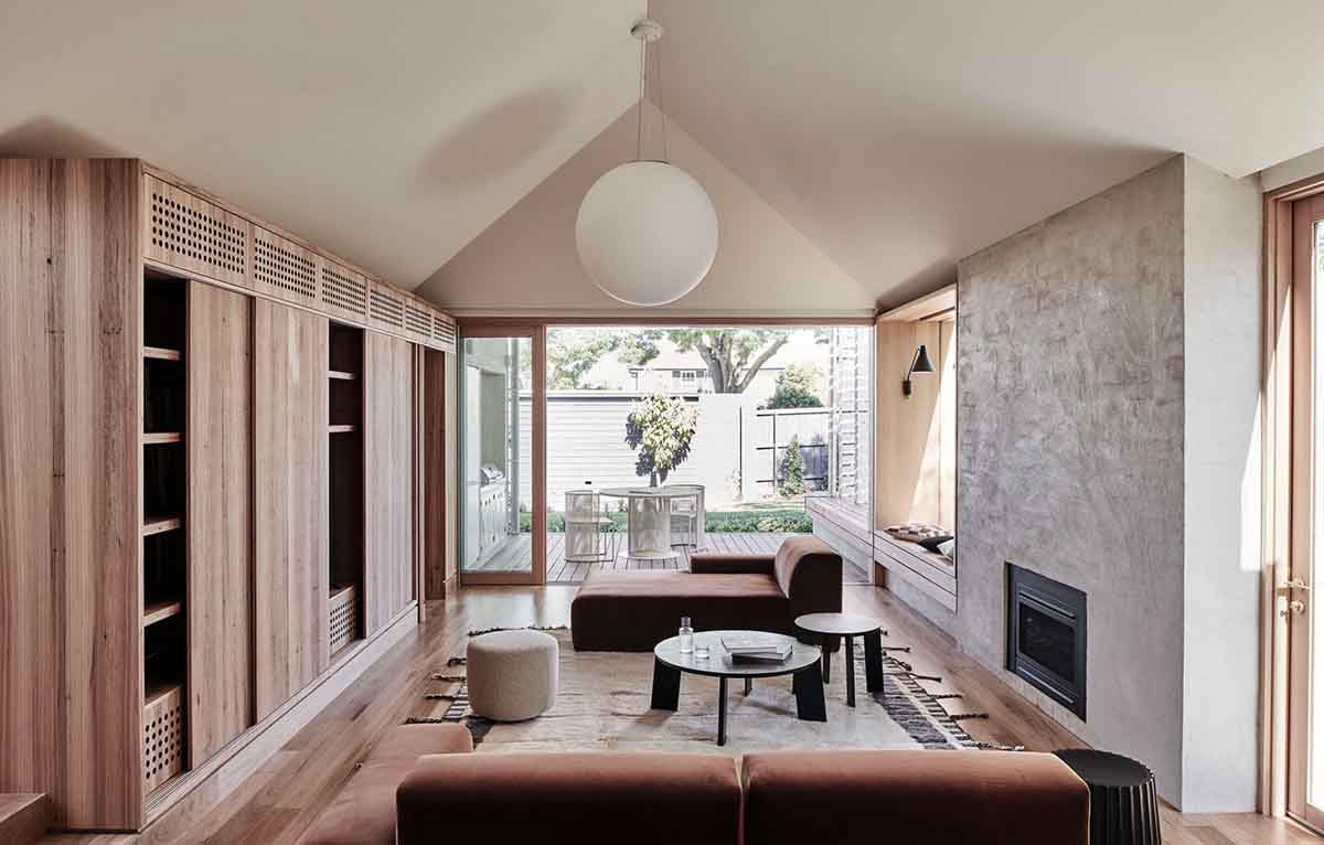
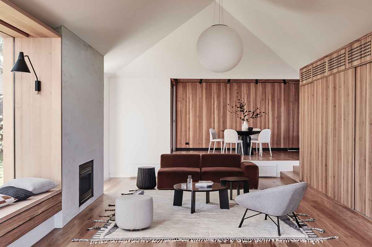
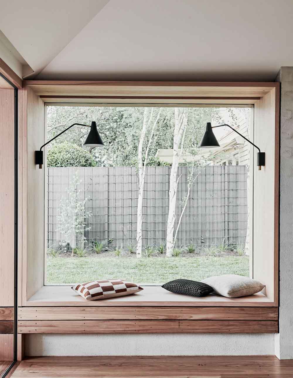
Each section of this house was designed around its existing structure, converting a once dark house into a light-filled home connected to its garden.
The overall vision was relatively simple: open up the floor plan by removing dead ends; create a sanctuary related to the outdoors; and facilitate a ‘lighter’ building sympathetic to its surroundings.
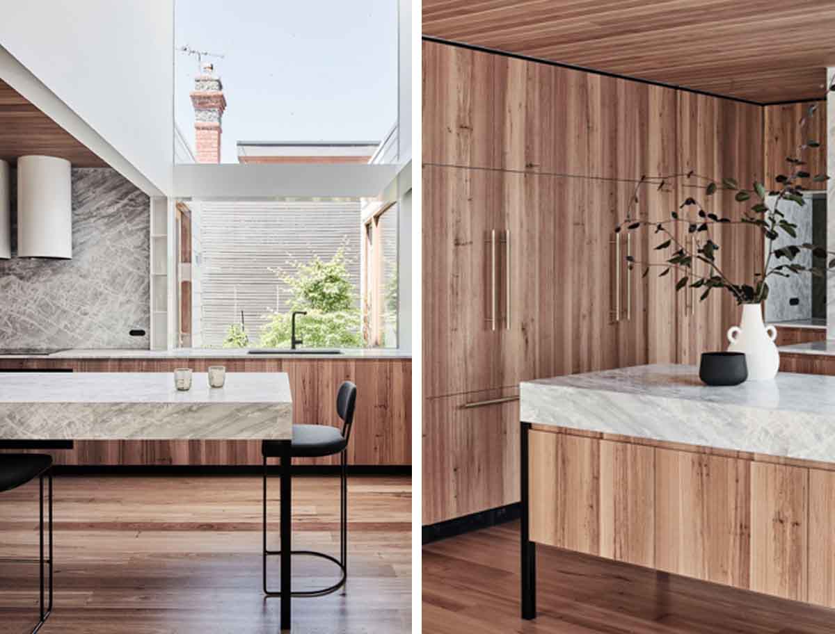
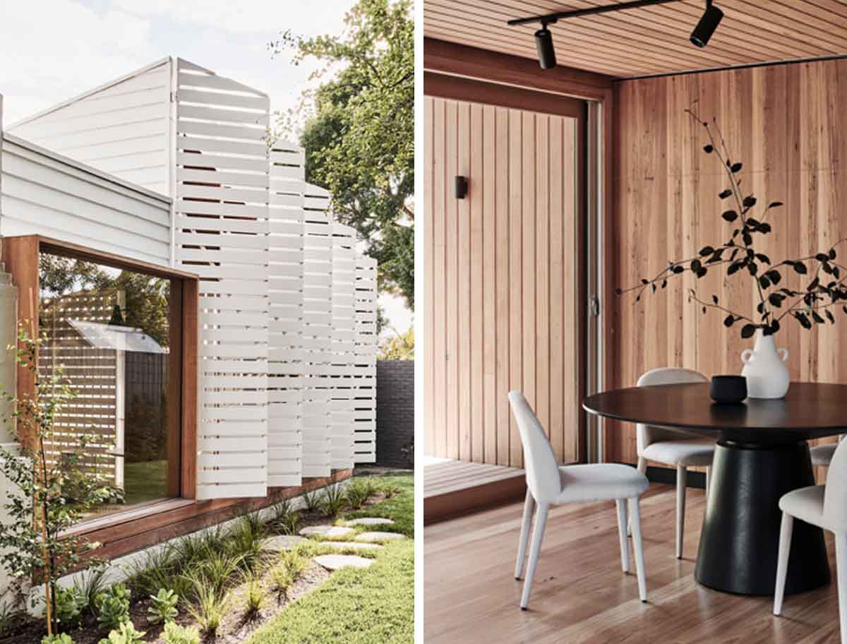
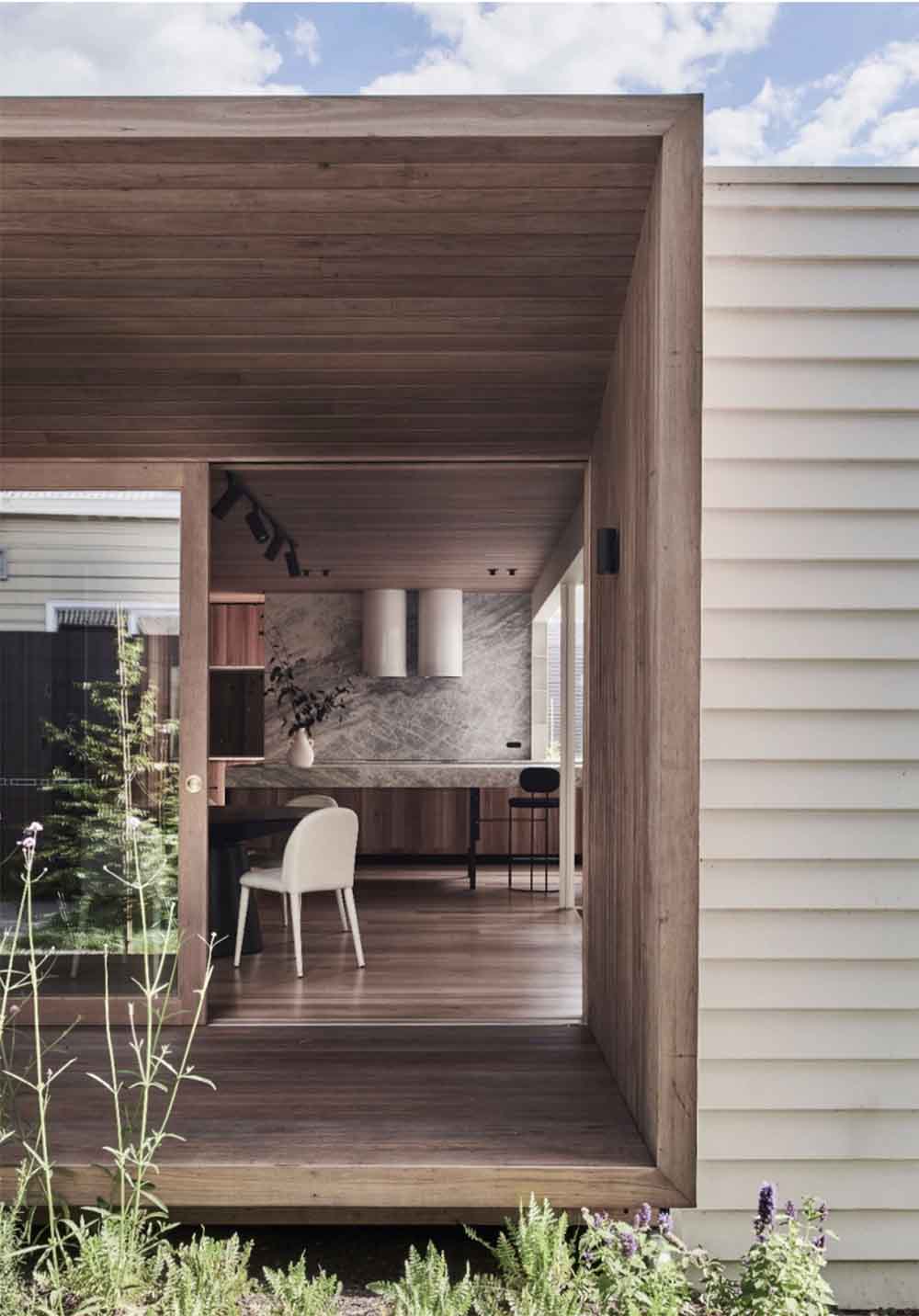
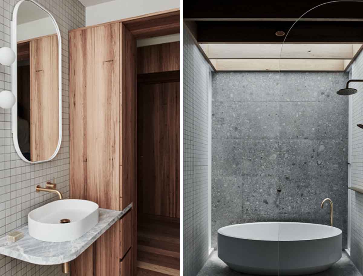
Original fireplaces, architraves, skirtings, and picture rails were all restored, and contemporary reinterpretations added. Australian sourced hardwood clads the punctured facade openings, as well as in the interiors that feature a low VOC hardwax oil coating.
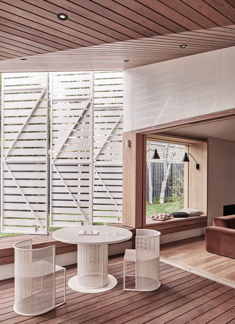
The only extension added is a new west-facing verandah and covered outdoor area surrounded by operable, slatted screens.
While challenging at times, working within the existing structure of this project drastically reduced construction waste, and ultimately resulted in a better home.
Images and article via The Design Files


