Today’s design question is, how do you design a black (dark) bathroom that appeals to both sexes? As part of the ongoing, never-ending, renovation process at House G, we are working towards (months down the road of course) our main bedroom and an en-suite bathroom.
However The Client has two rules for this space – definitely no pink, and no white if possible too (such.a.bummer!). So while I could opt for another saturated colour for the space, The Client is leaning towards a dark and moody setting.
I love the idea of a black bathroom, but always worry about it being too dark and feeling too cold. Many people worry about creating an all white space that feels too sterile, and I think the same can happen in black bathrooms.
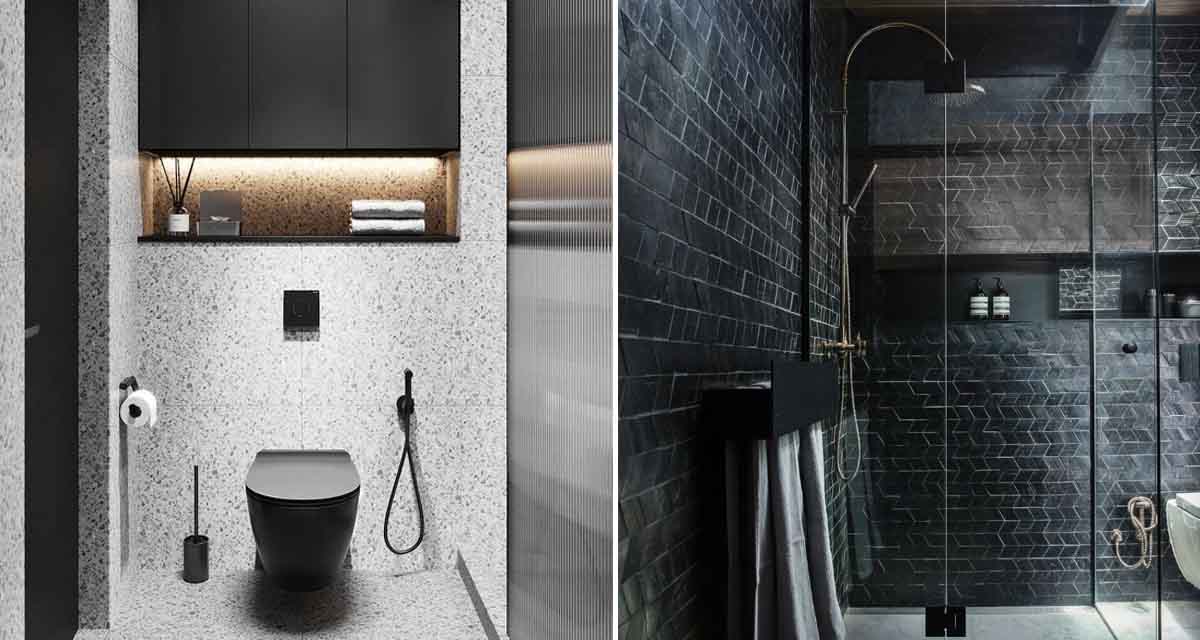
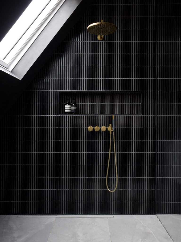
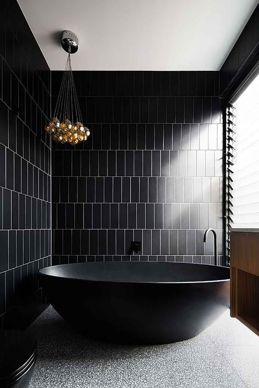
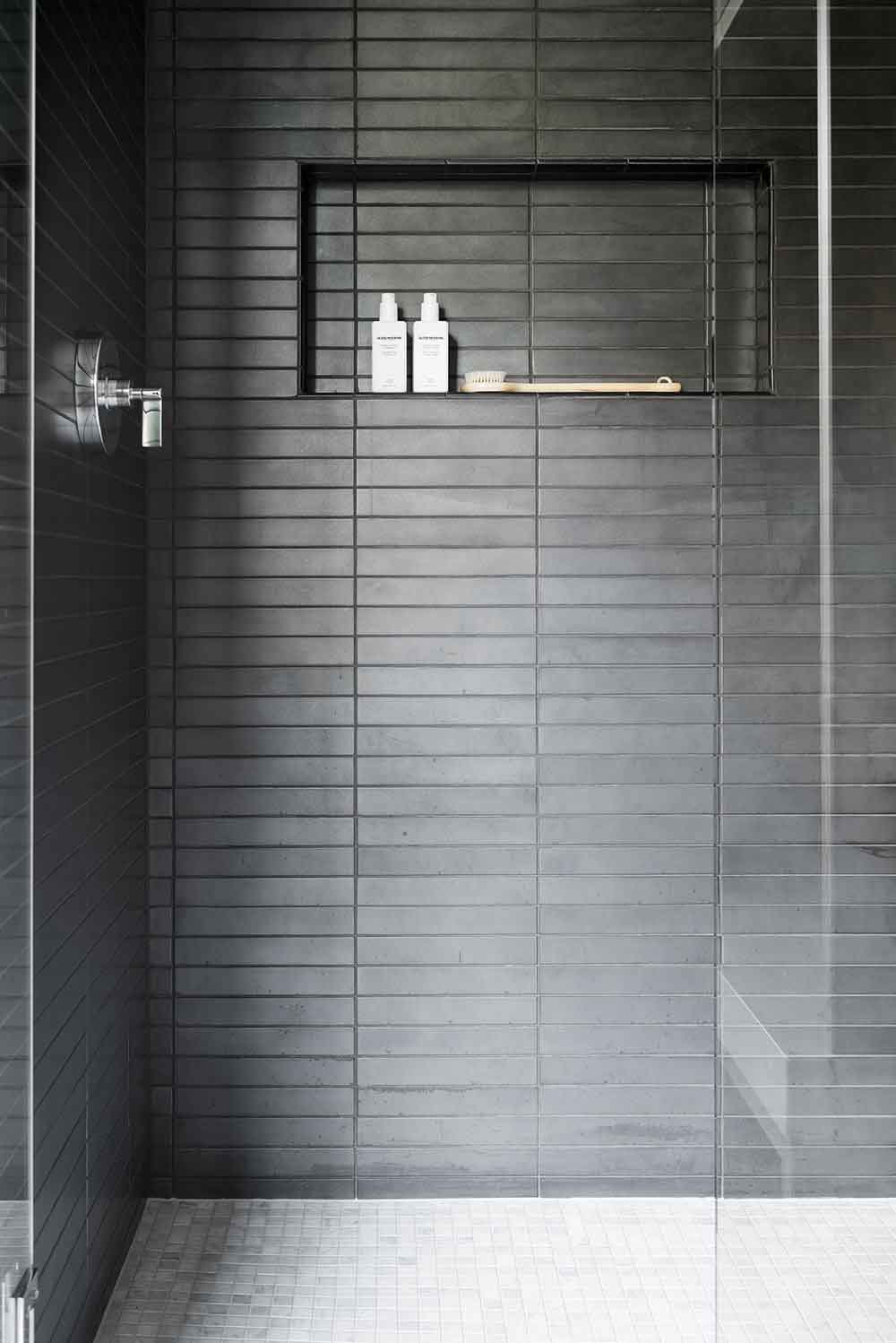
This first image is great, and it is because there is lots of texture in the shower box thanks to the smaller repeating tile and light coloured grouting. Notice on the second image how the larger, flat tile finish brings no dimension to the space – even with the interesting tile application – which for me feels a little colder and less welcoming.
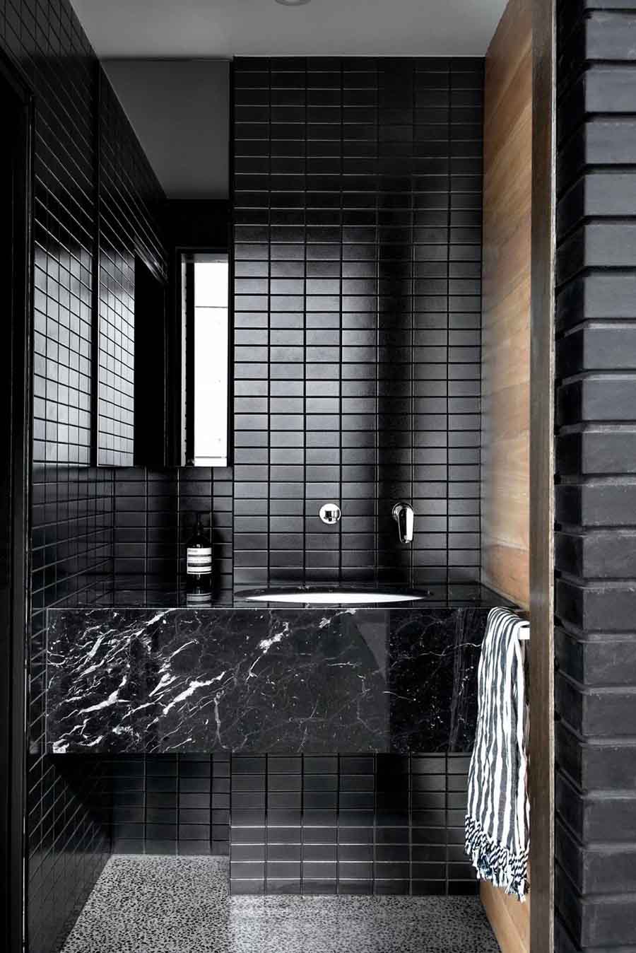
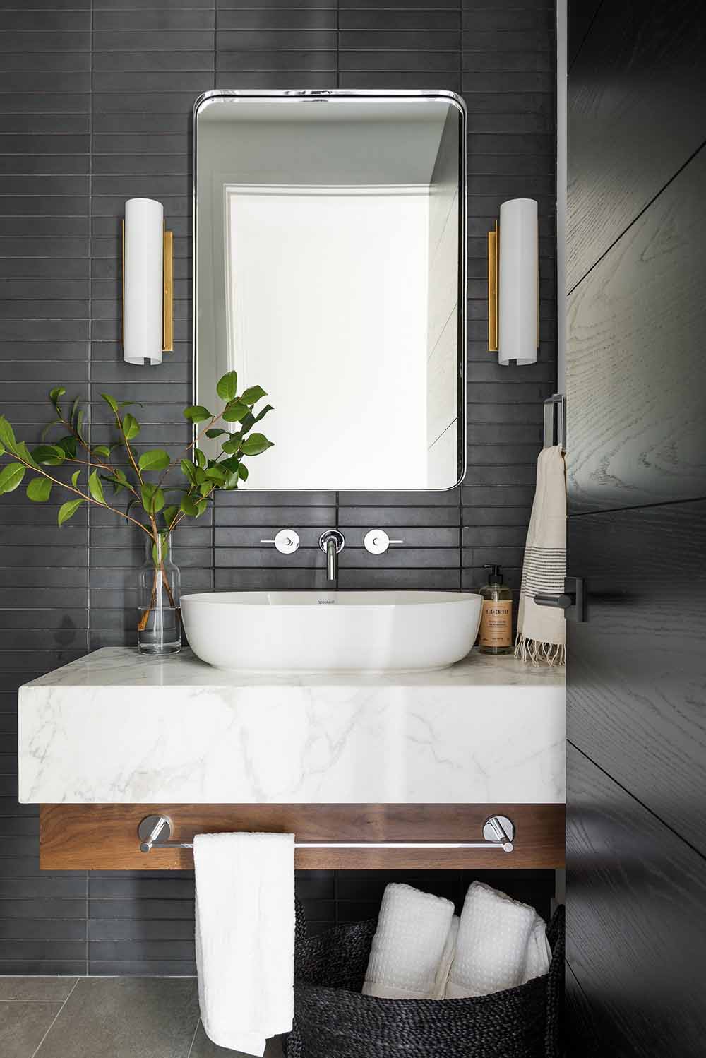
Here again we have the smaller black tile, which with the regular repeat gives itself more dimension in the setting. It comes across as far less flat and the overall style is more contemporary. They’ve also done a really good job of mixing materials, to layer the space and keep it interesting.
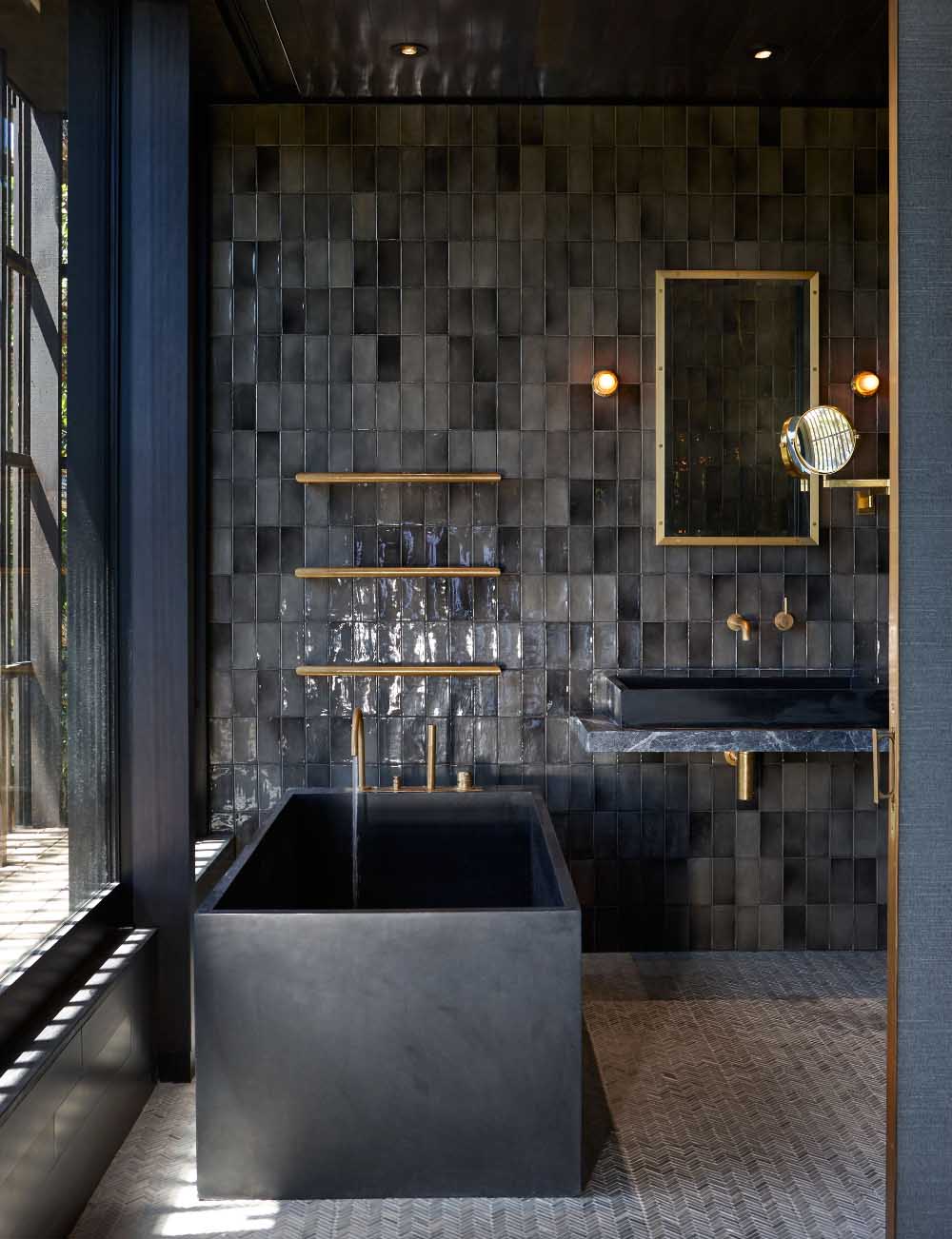
Now these dark space also sing, thanks to the tonal application of tiles on the wall (versus the flat finish we saw above), and the deep charcoal colour is still dark and moody, but not so black black. There is definitely something that appeals to me about a more textured look to the tile. One that plays with colour variations and depth.
The glossy finish in the first image brings a luxe finish to the space that feels more feminine. In the second two images the tiles have a matte finish, which definitely feels more contemporary and more unisex.
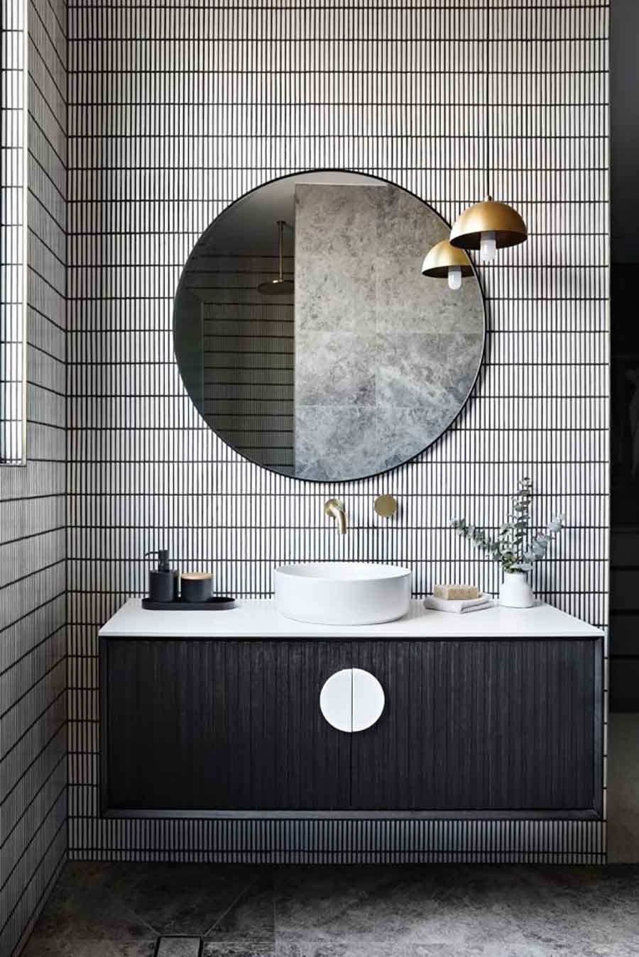
In contrast to the above darker settings, this bathroom really pops. I love how the white kit-kat tiles have been used with black grout. It’s more monochrome fresh than dark and moody that’s for sure. The combination of black and white for the vanity really lightens and brightens the space. A little bit of brass goes a long way to seal the deal.
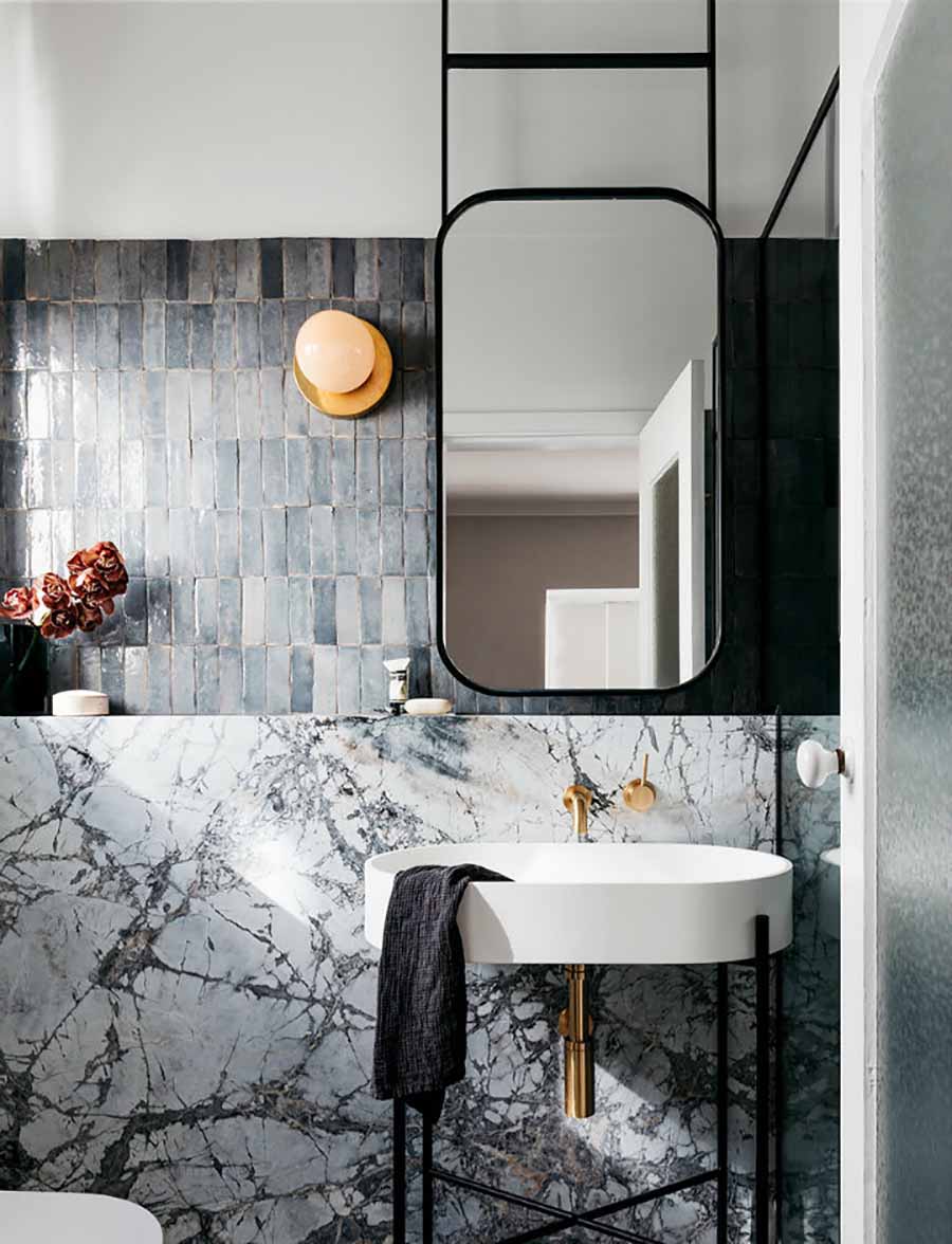
Now this is #bathroomsgoals. The textured subway tiles. The marble slab wall. The ceiling hung mirror. The brass light and taps. Probably a step too far in the feminine direction, but I could really get onboard with this concept.
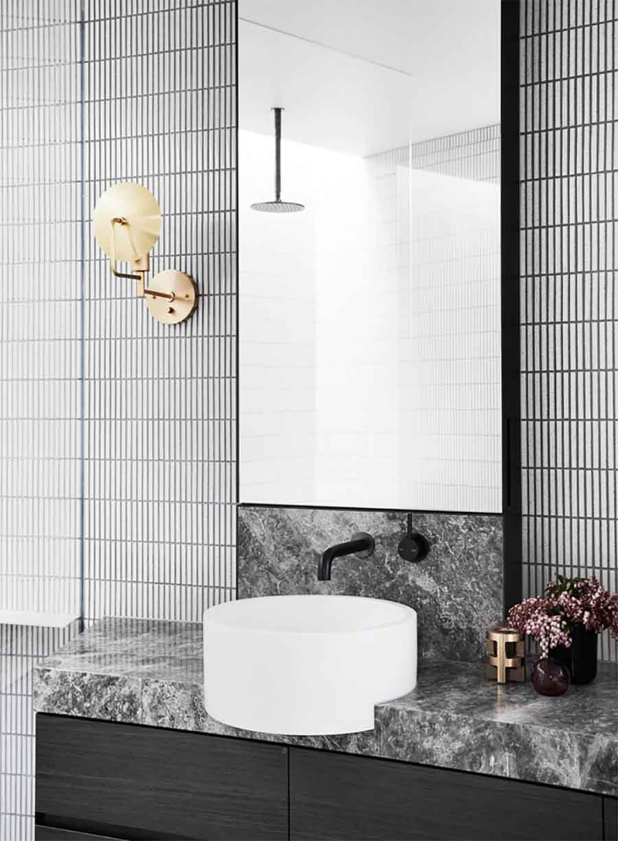
This bathroom is a sort of combination of the previous two, using the fun kit-kat wall tiles alongside the marble look vanity. These two elements partnered with black fixtures instead of brass options lean towards a contemporary unisex finish, rather than feminine. Small touches like the brass wall light soften the final effect.
Gosh. Any favourites?


 Images
 Images