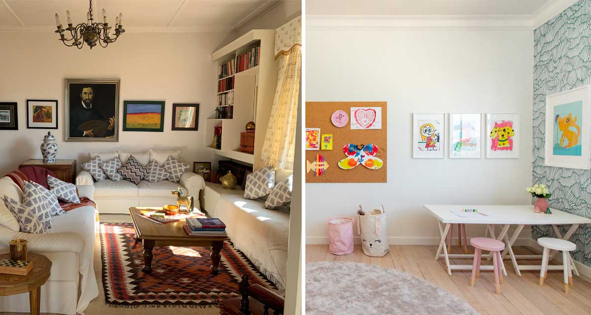
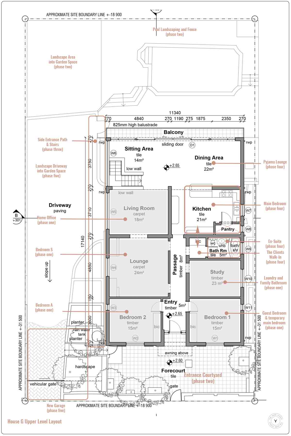
Welcome to Sofi’s bedroom, long before we got hold of it! Her room was formerly the main living area of the house. When we looked at the house as a whole, the long-term planning for the house was (is still) to move the key living spaces to the lower level, so that they are on the same level as the garden and pool, and so we can capture that indoor outdoor flow in the living spaces that I love so much.
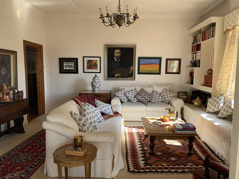
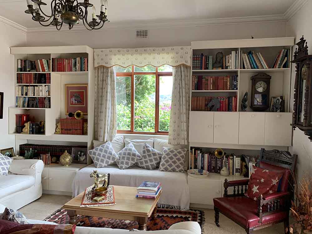
So while we planned for this long-term goal, we tried to re-use as much of the current spaces on the main level as they are, without the need to break down walls unnecessarily. As you can see from the plan below, to get our goal of 4 bedrooms and a home office, this would need to include turning the Lounge room into Sofi’s bedroom.
One thing I think we can all assume to be true with renovations – especially on older, heritage homes – is that they never go according to plan (or budget). For the most part this room was initially getting a purely cosmetic update. This included closing up two doorways, sanding the floors and a fresh coat of paint. NOT SO MUCH!
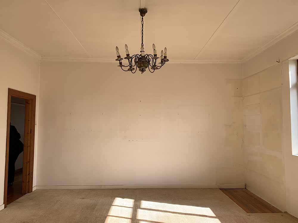
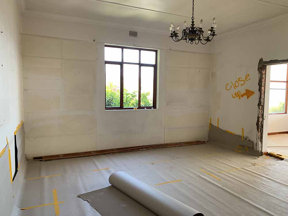
Day one on site and I arrived to this. Unfortunately the damage to the old ceilings was too extensive and it was best that they be removed (which means new cornice to be installed too). Removing ceilings also highlighting the badly worn ceiling trusses and holes in the roof….. and so began the renovation trend of damage and decay at House G!
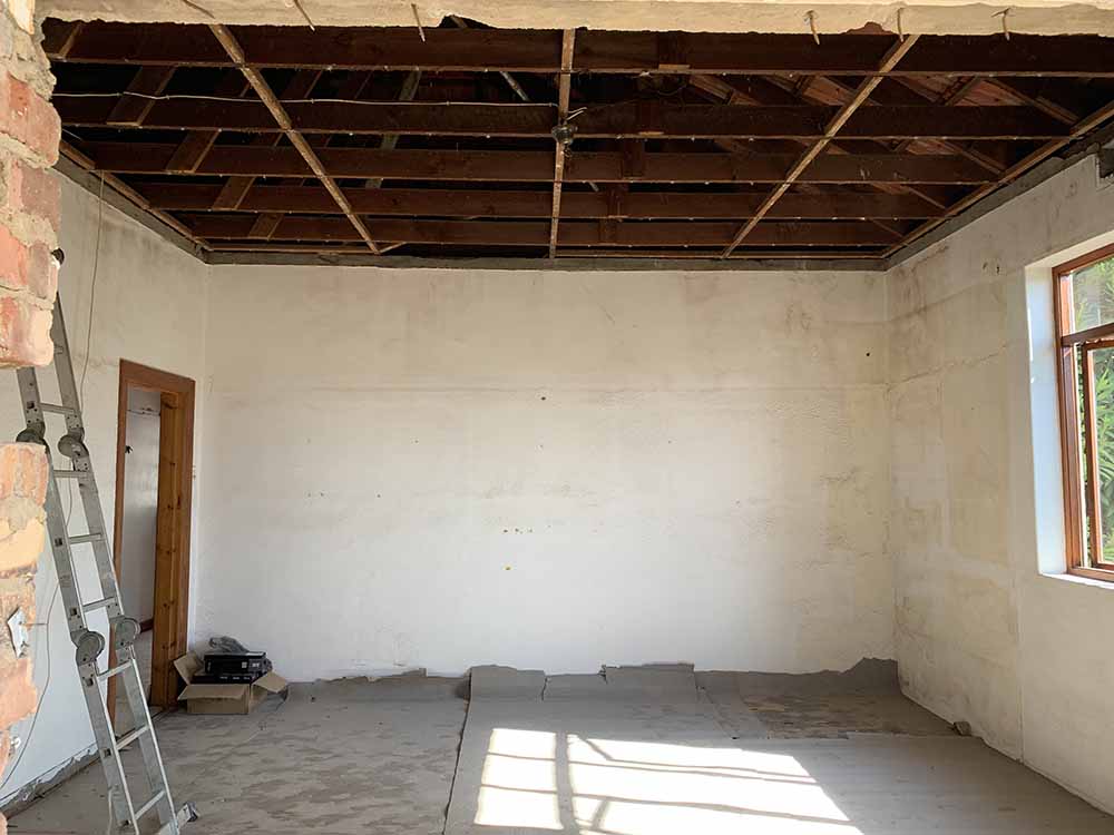
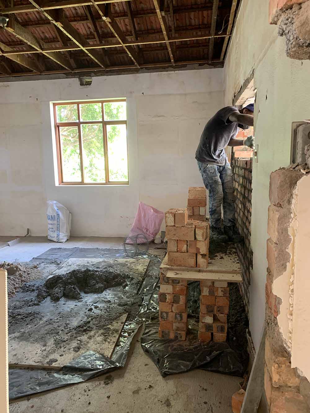
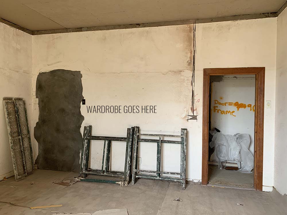
Fast forward one week and it quickly became apparent that the old windows were sealed closed. I’m not sure if the old wood windows were just old, or if it was because the window was never opened, but once we forced it open, we could never close it again. So say hello to the new bedroom window. And as things go, since we were replacing the window anyway, we took the opportunity to enlarge the small opening and make it more proportional to the size of the room.
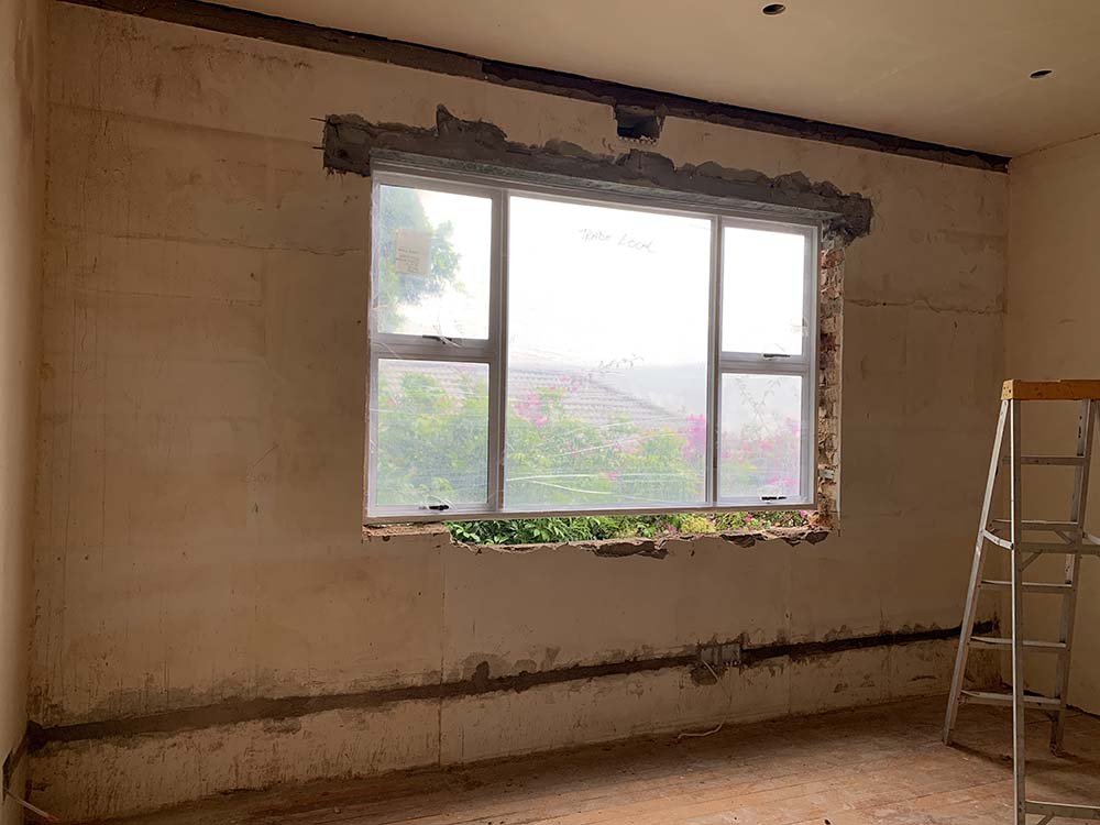
Six weeks later…. hello new window, freshly skimmed walls and ceiling and new cornice.
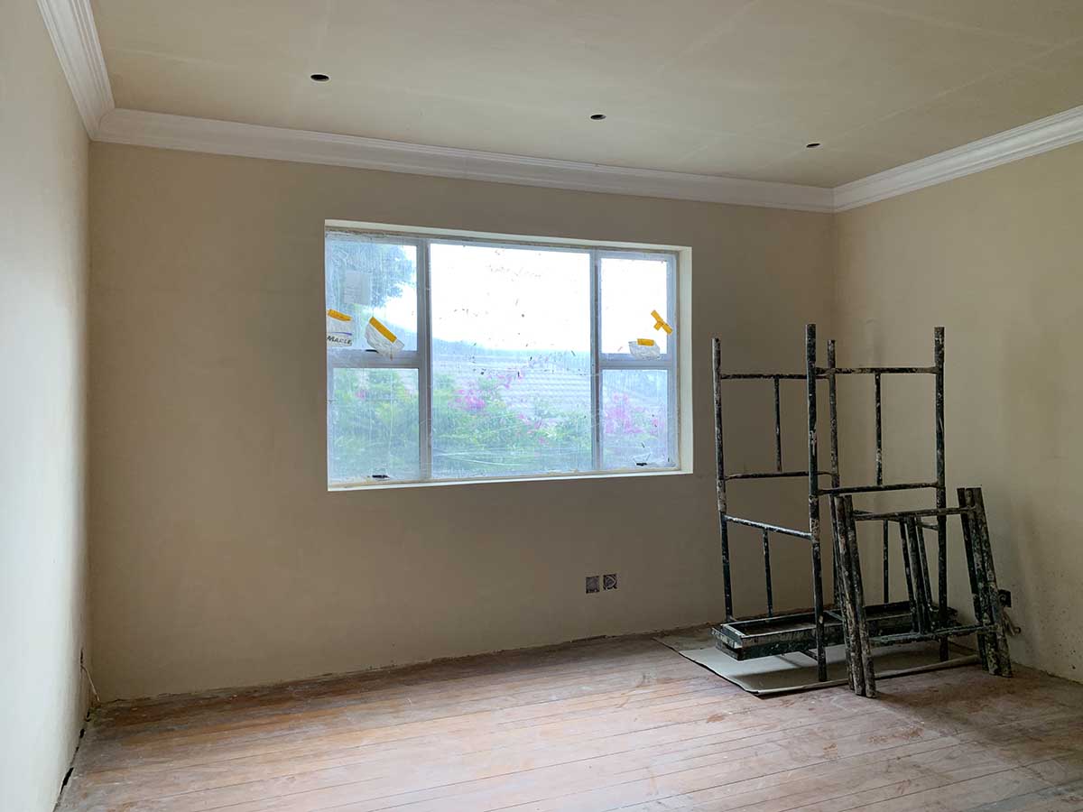
In the meantime I was forging ahead with the design concept started by Claire. Once she got the ball rolling, there was no holding me back. The wallpaper was in planning and sampling mode, just checking the scale of the design in the space.
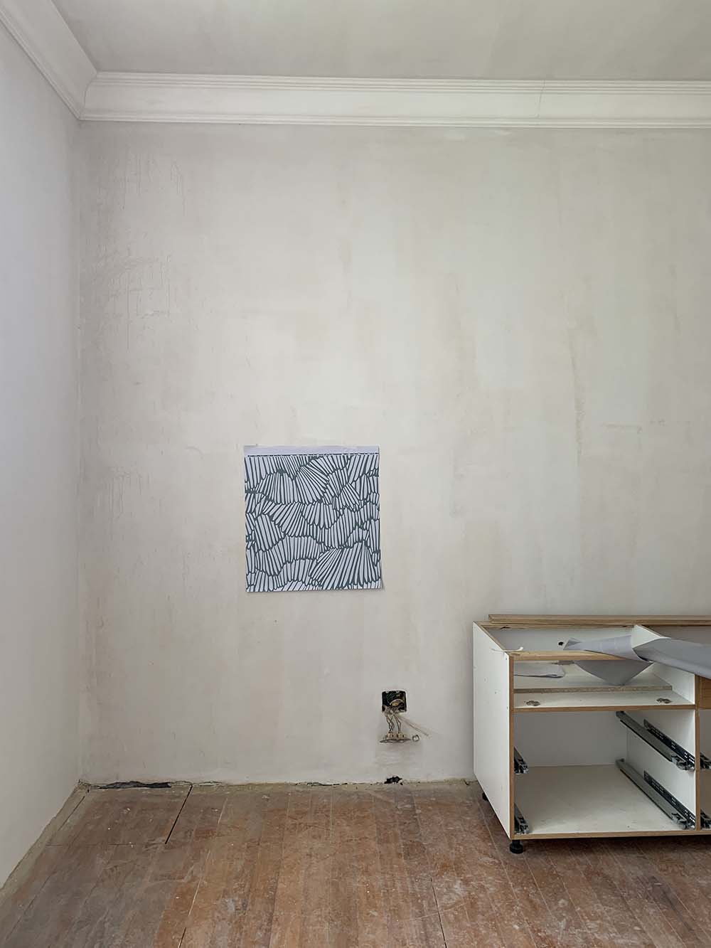
In the interim we had also moved away from the notion of bunk beds in the room and instead were bringing the large Queen bed from our current spare bedroom into Sofi’s bedroom. Since we were all trying to squeeze into a small bed for bedtimes stories, we decided to let the Queen of the house have a queen sized bed.
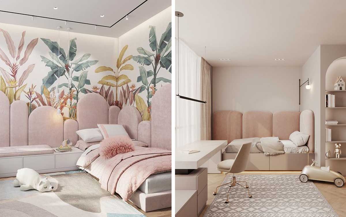
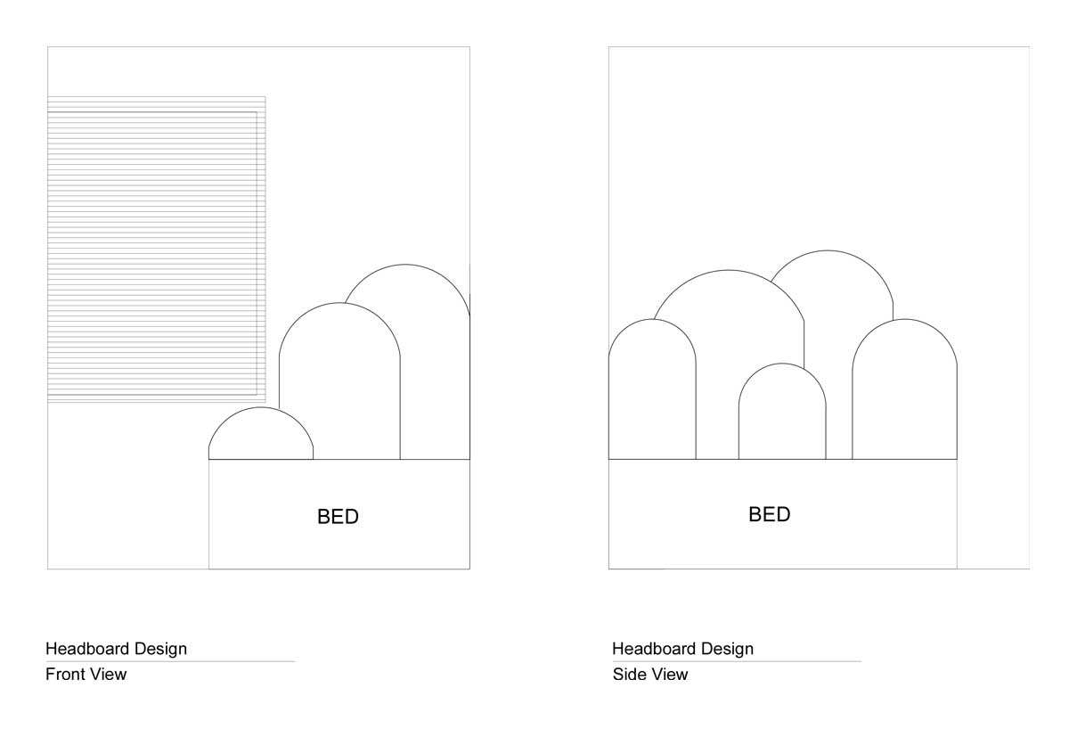
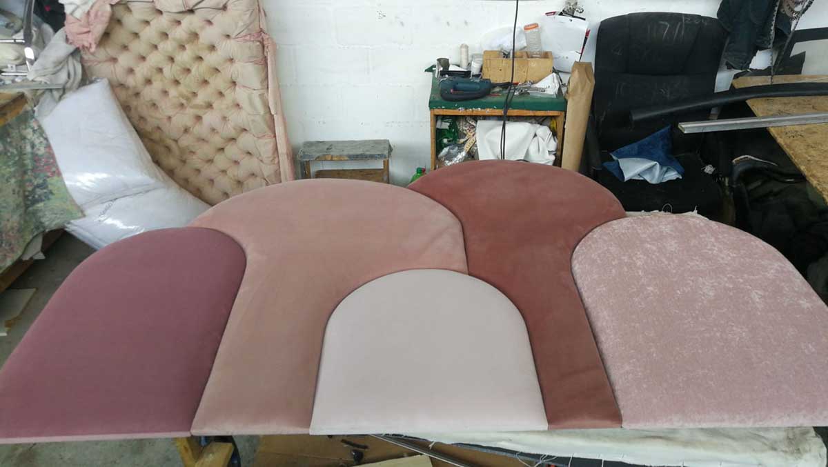
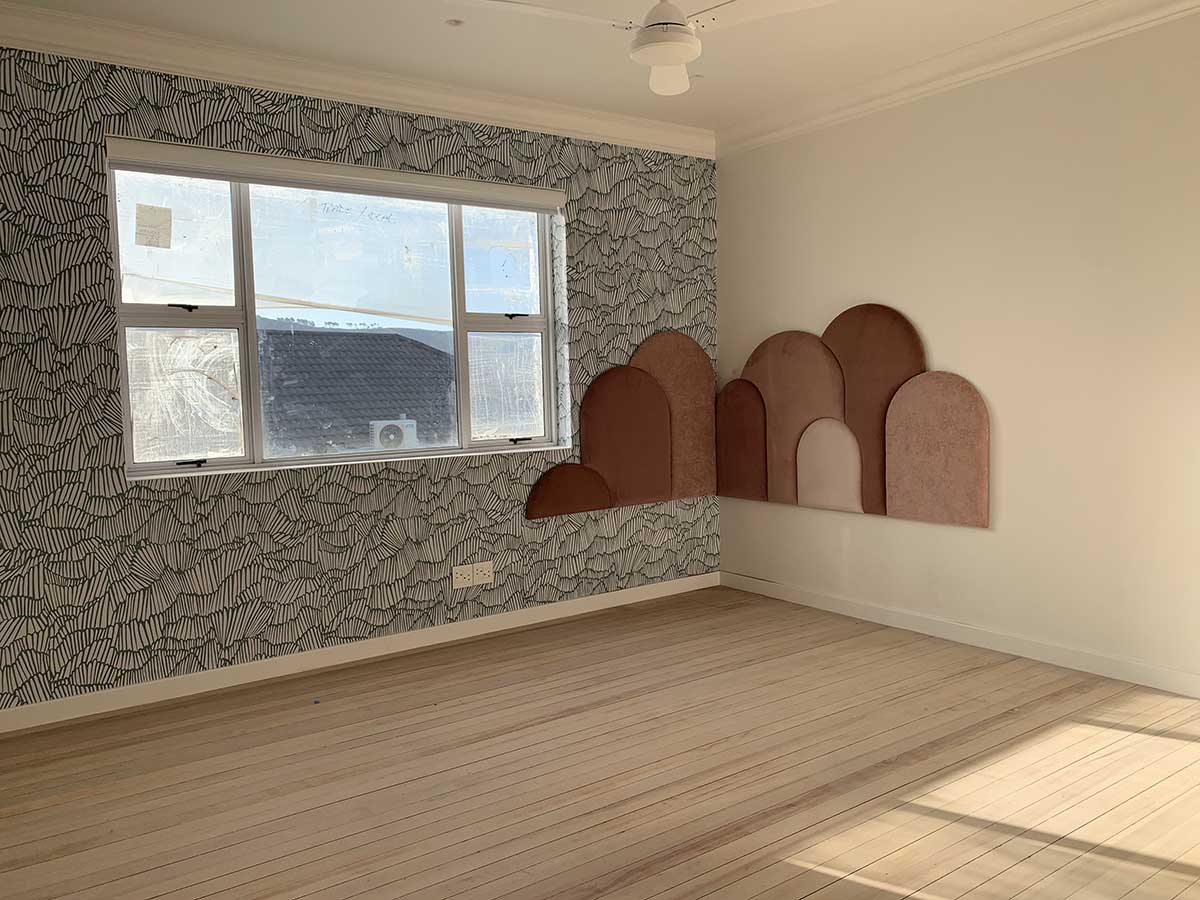
I new that on the big empty walls we would need a large feature headboard to make a statement in the room. Inspired by these images, we then custom designed a headboard to fit the corner of the bedroom, around the new larger window, where the bed would be placed.
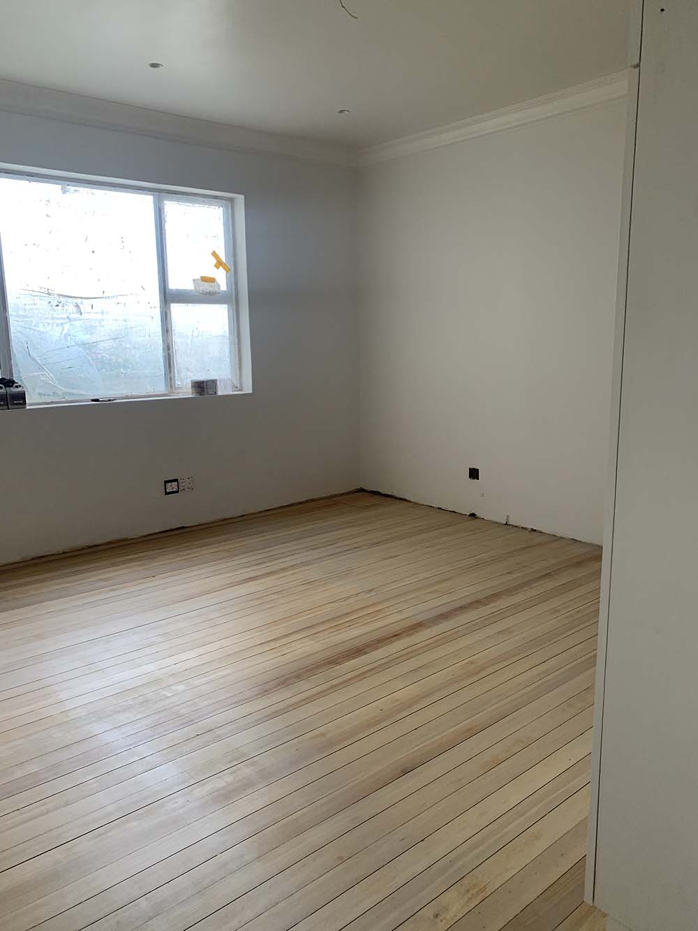
Just when you think things are under control, we had the saga of the floors. This picture shows you the final result of a lot of hard work (not by me, the contractors), EXPENSIVE mistakes and another thing that I know to be true of every project – that you learn something new every time!
The original pine floors were shiny and orange, and I just could not bear them. So we sanded them down. The lessons learnt from the process was what to do with your floors once they are sanded, how to achieve the colour you want, which materials are best and then how to seal them in the end. This story I will share another day.
At the time we were about 10 days away from annual builders holidays, the end of our rental lease and at the same time I was simulteansouly trying to push 6 client projects over the line before the Christmas shutdown too. Full dramatic confession. It is the only time I have cried on a project. Over these floors!
With the wardrobe in and the painting underway, things were starting to feel a little more optimistic.
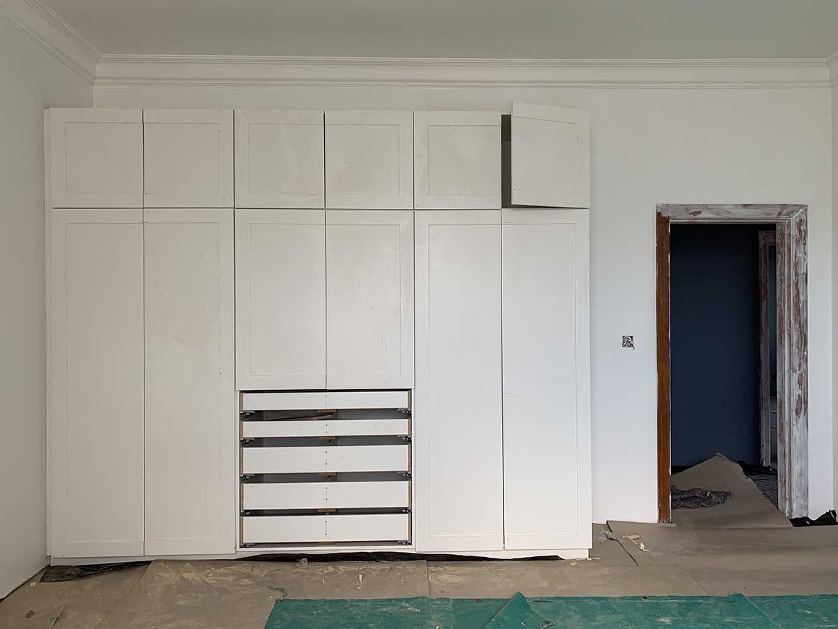
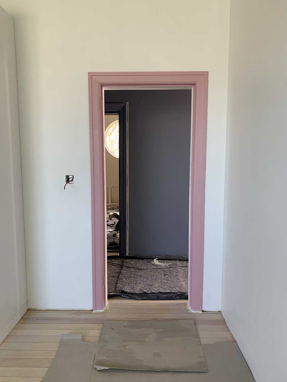
Watching wallpaper being installed is incredibly cathartic!
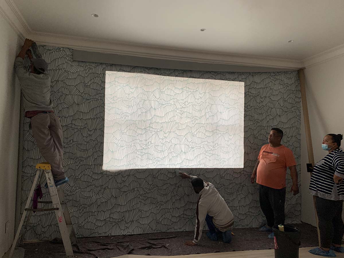
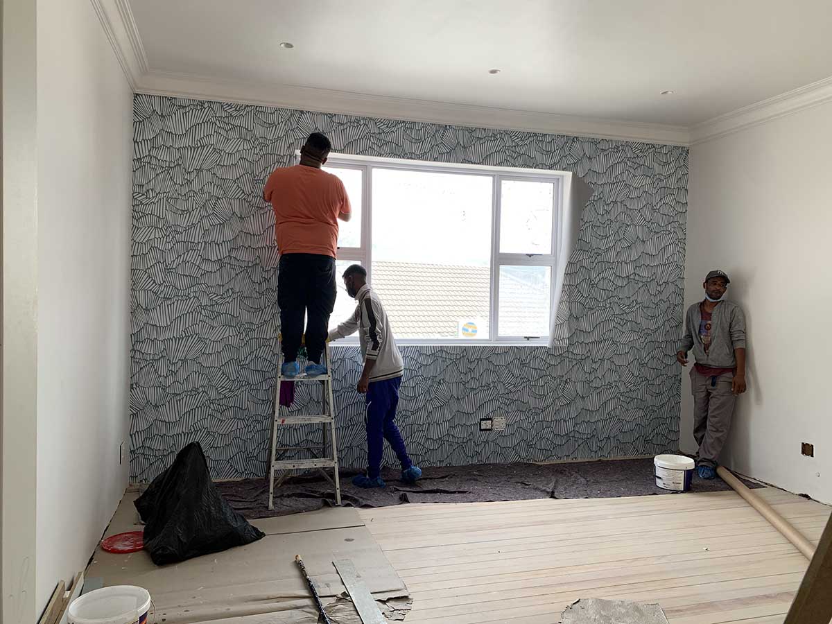
I’m taking a moment here to pause the wallpaper installation and talk about the feature wall. This image below, to me anyway, is a great example of why I think feature walls often need to be more than just one wall. Having the wallpaper only on the window wall leaves the room feeling more closed down and boxy. In order to open up the space and make the proportions feel wider than they are, you need to extend the feature across one of the adjoining walls. In this case, continuing the wallpaper behind the headboard is a natural extension of the design.
Join us back here tomorrow for the full reveal!


