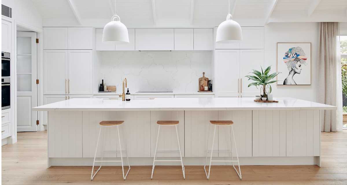
It might seem a little silly to call March ‘Makeover Month’, when that’s what we do 24/7, 365 – and is also pretty much all we talk about here on the blog – but this month we’re going to be digging a little deeper into the world of kitchen makeovers and renovations.
We’ve been working on many kitchens of late – my own included – so we felt it was good time to start talking you through some key pointers to consider when designing your kitchen. Starting with where to start!
One of the comments we hear the most is “I don’t know where to start”. While we know the look and feel you are after in your space is an essential part of the design process, I completely understand the decision paralysis people feel when undertaking a renovation – big or small.
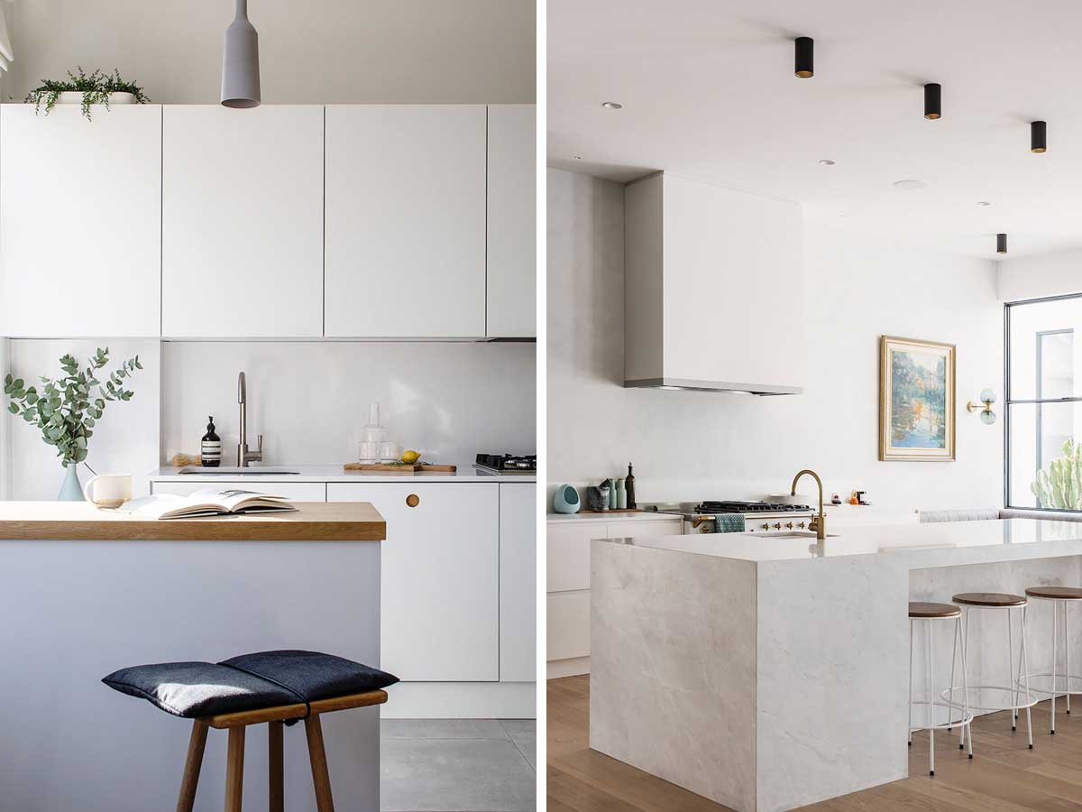 Images via Backsplash
When it came to designing my own kitchen, I could not commit to colour scheme or design concept for months. It became a stalemate situation. There were so many design directions I could take, because I loved them all.
Usually when we work with our clients, we dig into their preferences and consider what style we feel will suit the house, be interesting and not date too much. It’s a challenge to balance those things.
In my case, the problem is I love them all – white kitchens, dark kitchens, green kitchens, wood kitchens, traditional, modern, minimalist…. In fact, it was so bad that it came to the wire and a coin toss by the housemate on which way to go. I couldn’t commit, so then I scared him into not committing because he didn’t want the “wrong choice” to be his fault. So yea, I feel your kitchen design pain.
That said, I had spent a decent amount of time pouring over the space planning options, putting a provisional floor plan into place and drawing all the joinery and cabinetry elevations months before I even bought a fixture or swatched a colour.
This is true of the process whenever we work on a kitchen project. We start with the floor plan and overall layout of the space. Without knowing what is going where, your mind will never be able to settle and imagine the big picture and setting, before you start focusing on the smaller details.
And for sure, elements of the design plan will change along the way as you start incorporating your selected materials and finishes, but that’s all part of the process and the fun.
As always, we’re delighted that you’re following along.

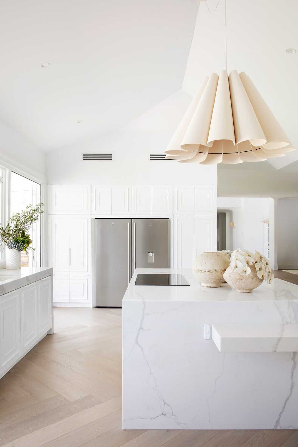
The White Kitchen.
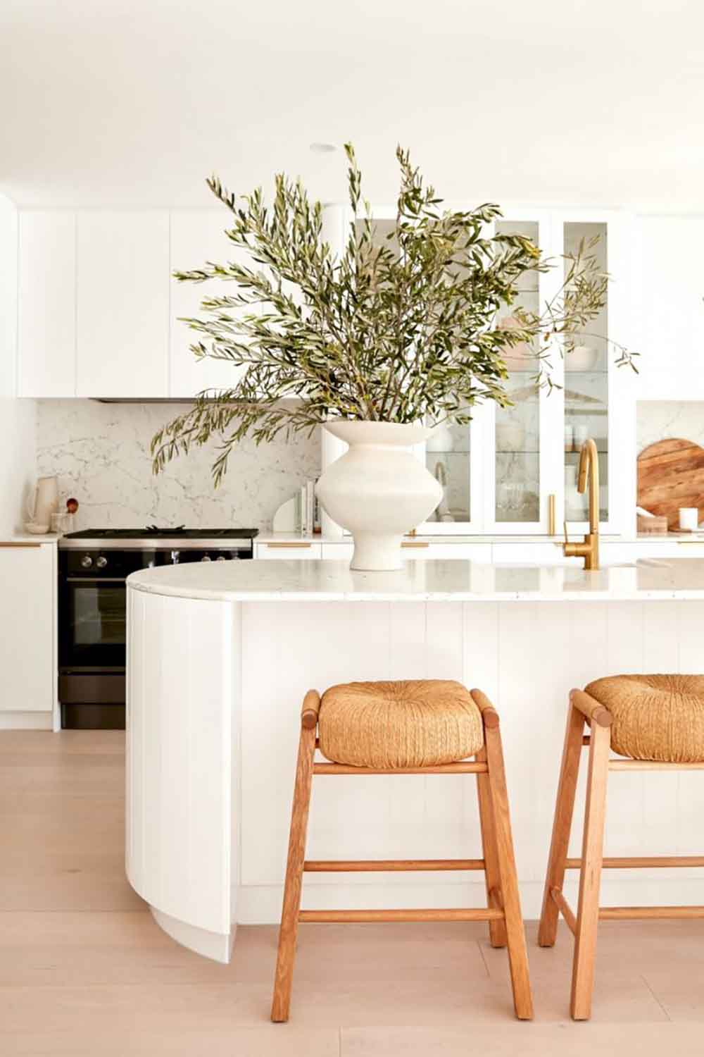
We’re starting our kitchen concept exploration with The White Kitchen. While some may say the ‘safe’ white kitchen is shifting out of favour, we believe that by adding the right texture and feature elements, these spaces will in fact stand the test of time. And we truly, truly love them!
Just remember, that while Pinterest and Instagram are useful tools for discovering what you love, don’t feel you need to re-create the space exactly!
This kitchen from Three Birds get’s a traditional twist, thanks to the shaker style detailing on the cabinet fronts.
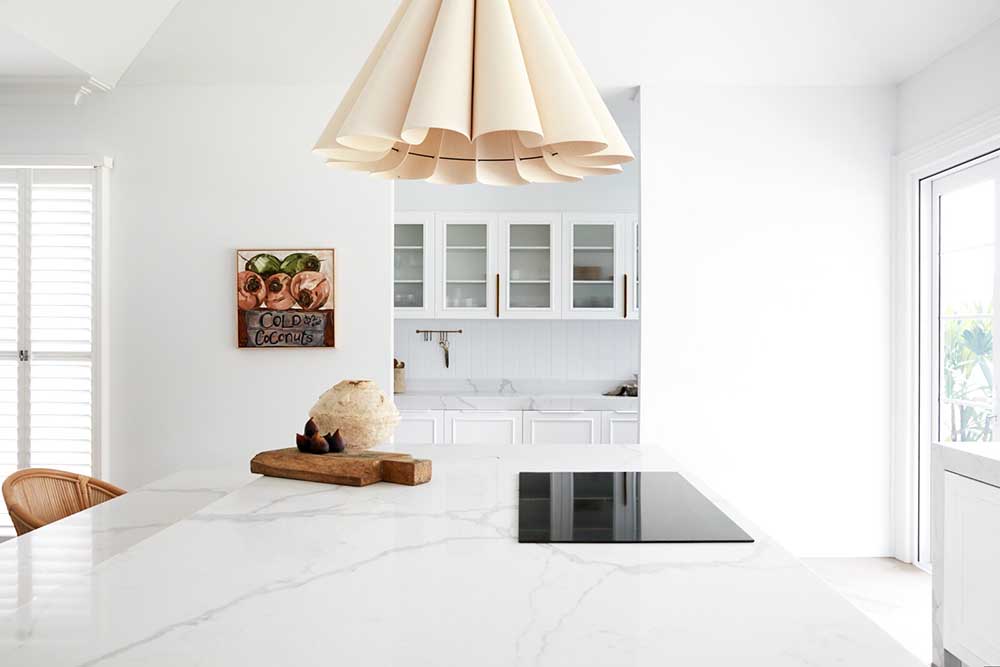
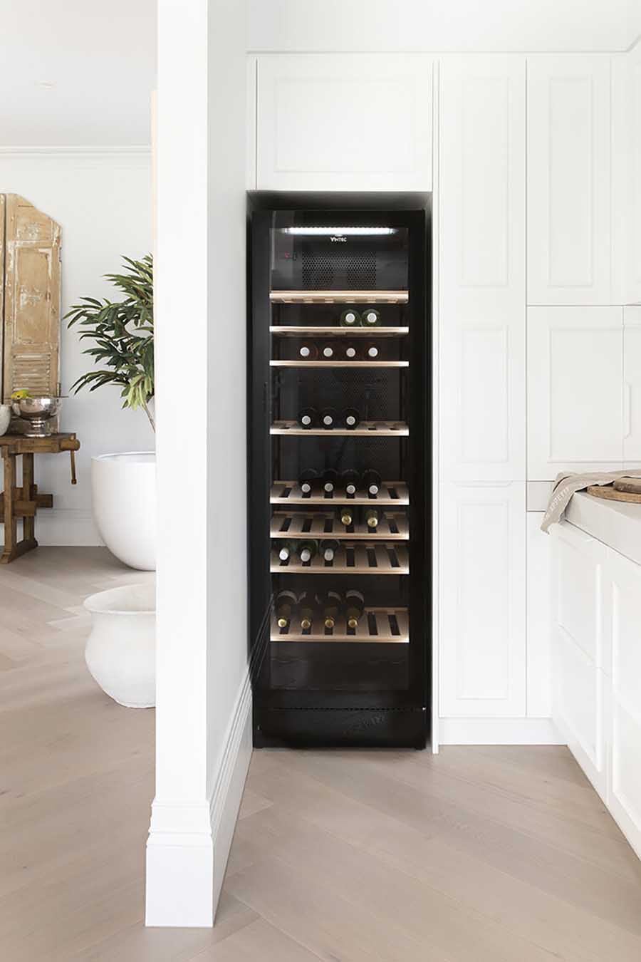 Images via Three Birds Renovations
In this kitchen a modern style is brought in through the gloss cabinets and recessed finger pulls in the lower units, as well as the panel effect on the large bank of cabinets. We also love the detailing of the white handles, in keeping with the overall style of the space.
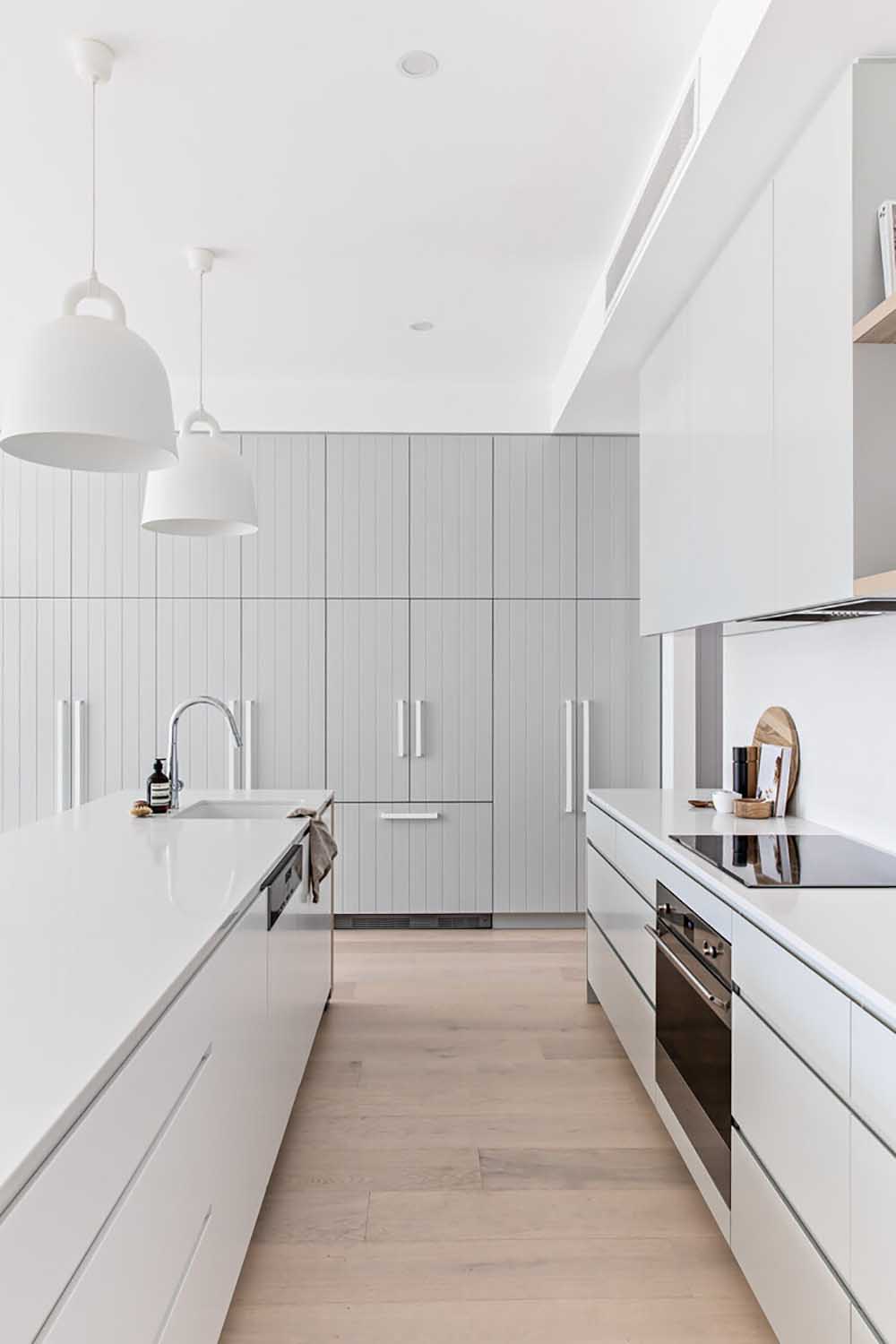
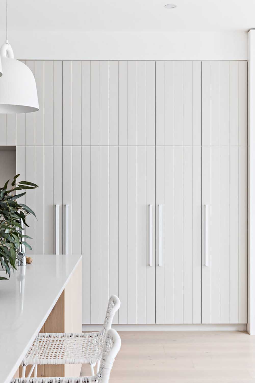 Images via The Palm Co
In this open kitchen, smart design solutions such as integrated appliances are used to hide the working elements of the kitchen, while a large display cabinet is strategically placed to capture your attention.
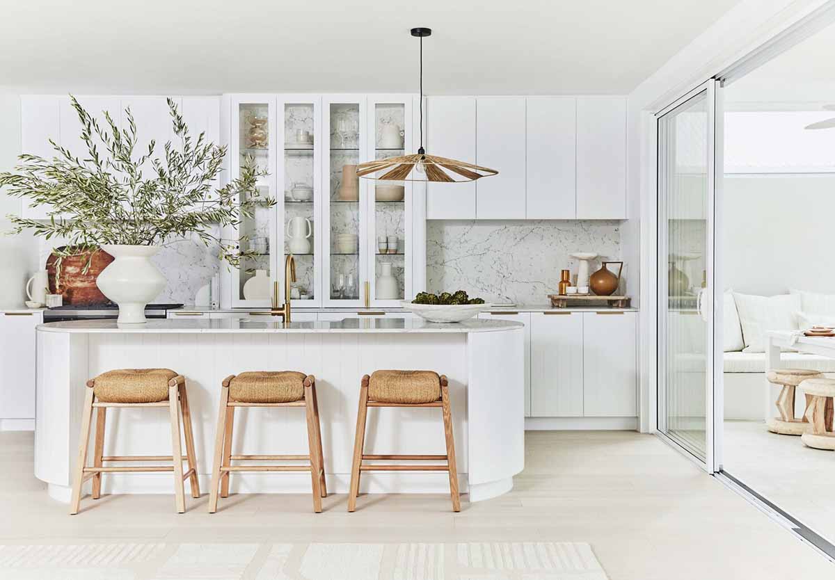
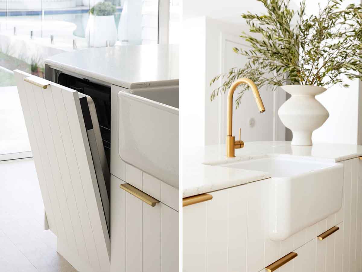 Images via Three Birds Renovations


