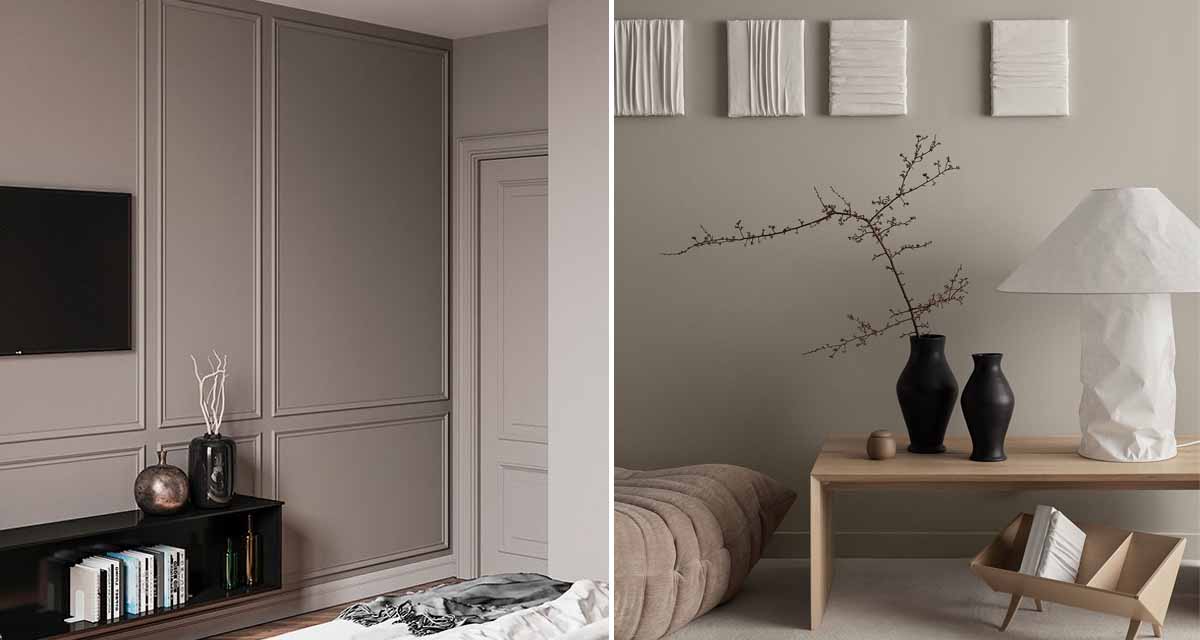
For many of our clients, we’re asked to come in and help them “finish” off the space in question. They may have nearly all the pieces they are after, but feel that the space is lacking somehow. Our goal is then to give the space a cohesive design plan, make it feel welcoming and look beautiful.
Here at House G, that’s pretty much how I’m approaching our main bedroom concept. Having lived in rental spaces for years (like always), we have only a few bedroom basics to our name. Or actually just one, now that I think about it. The bed. We bought it from Coricraft a few years ago, and it is full upholstered in their Thai Taupe fabric, and I just love it. It is the most comfortable bed I’ve ever slept in, and the upholstery give off luxurious vibes.
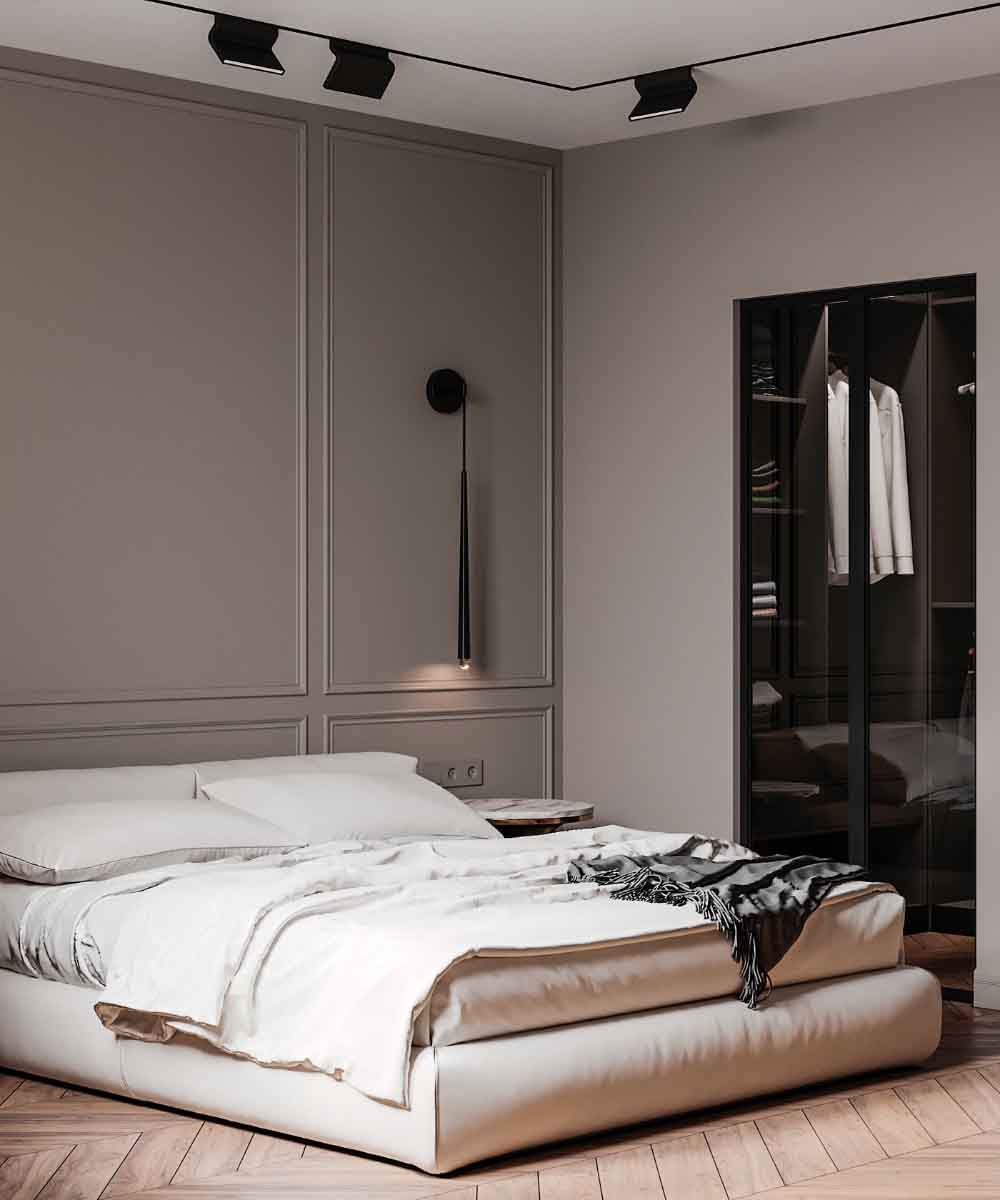
With the darker bathroom plan in place, the idea is to create the reverse setting in the bedroom. I’m really into sand, beige, taupe and earthy tones, which is then accented with wood elements and black pieces, for that contemporary edge. As far as the space goes, we will have a blank canvas (our bedroom is going to replace the current kitchen (!!), so it’s a full gut).
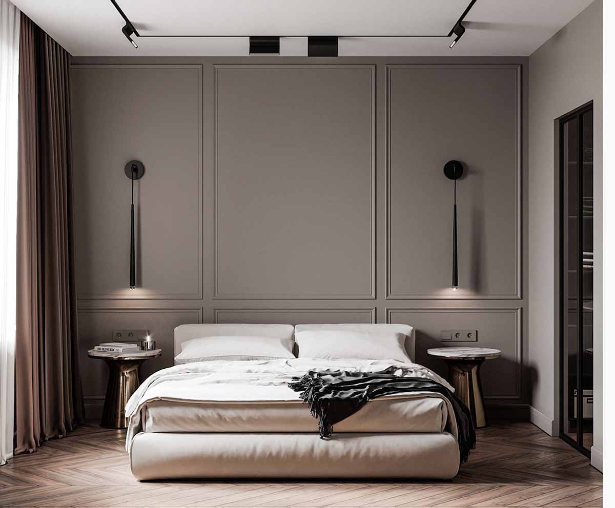
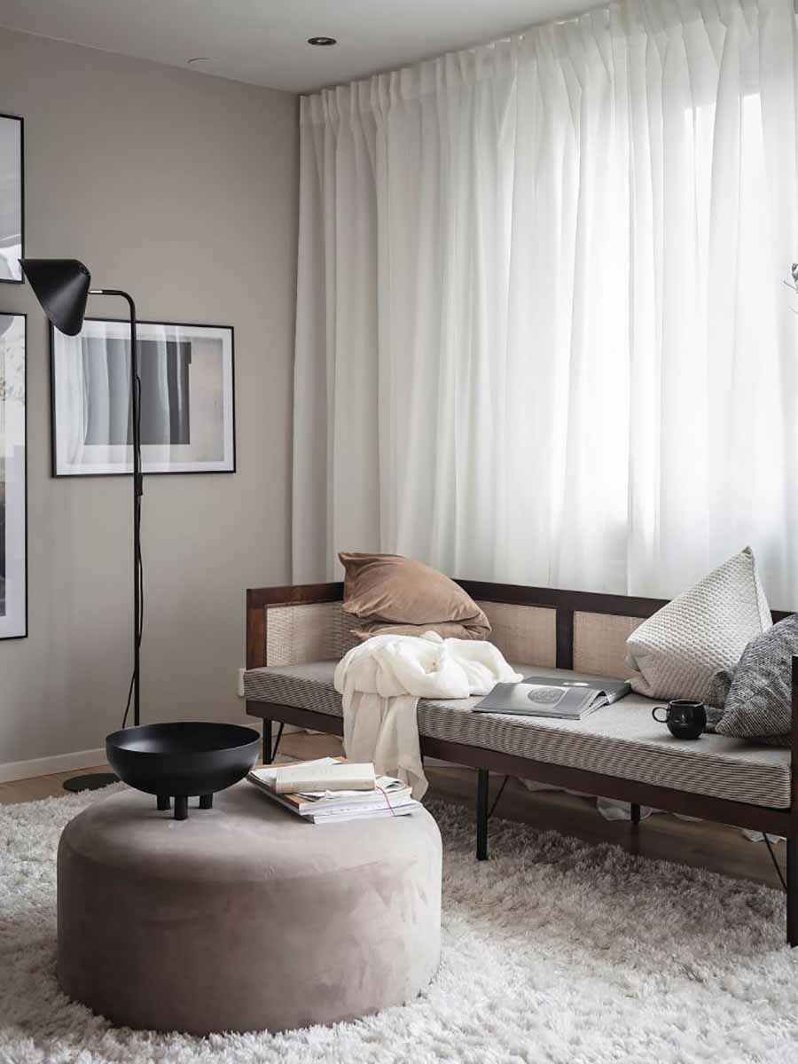
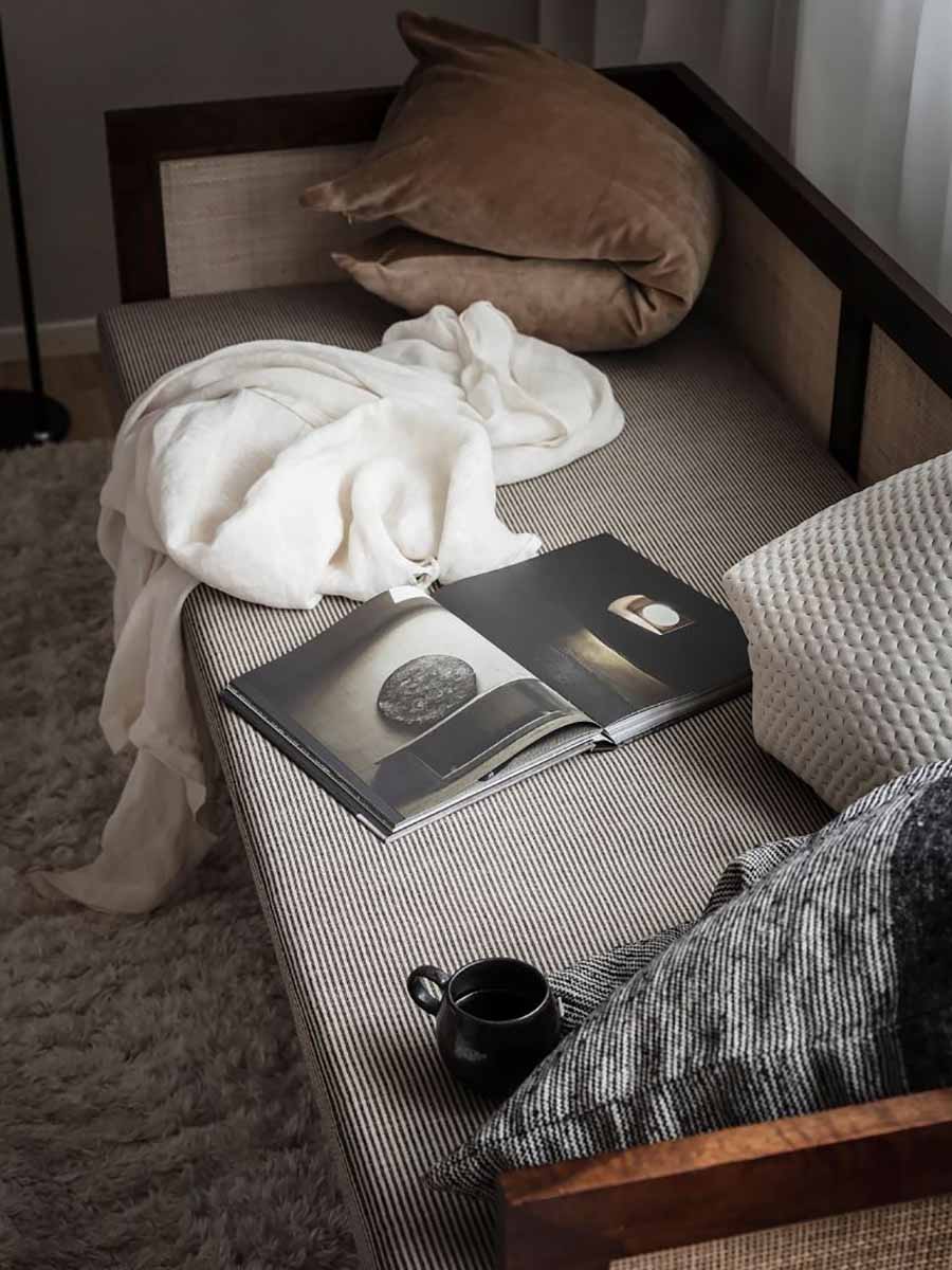
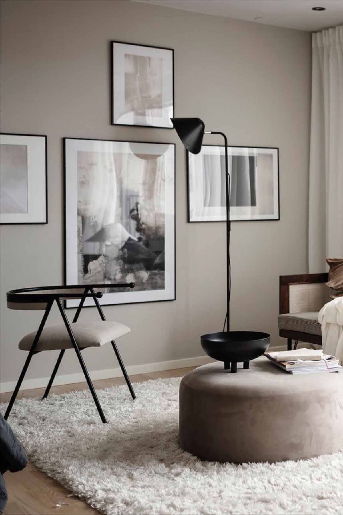
Given the older bones of the house, I’m really keen to add some architectural detailing and interest to the walls. These images are really speaking to me for the bedroom setting. Look how serene and soothing the spaces feel!
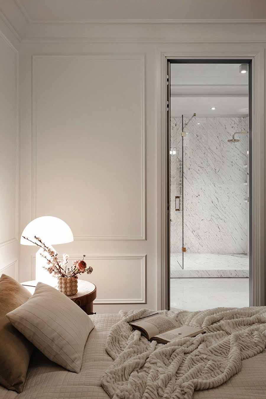
 Images 1 | 2 | 3
While we’re not putting a seating area in the room, these images speak heavily to the style and ambiance I am looking to create. Beautiful pieces, neutral tones and black accents. The floor to ceiling curtains bring the softness to the setting.
 Images 1 | 2 | 3
If you’re into this look as much as we are, we’ve pulled at the pieces together so you can get the look at home.
GET THE LOOK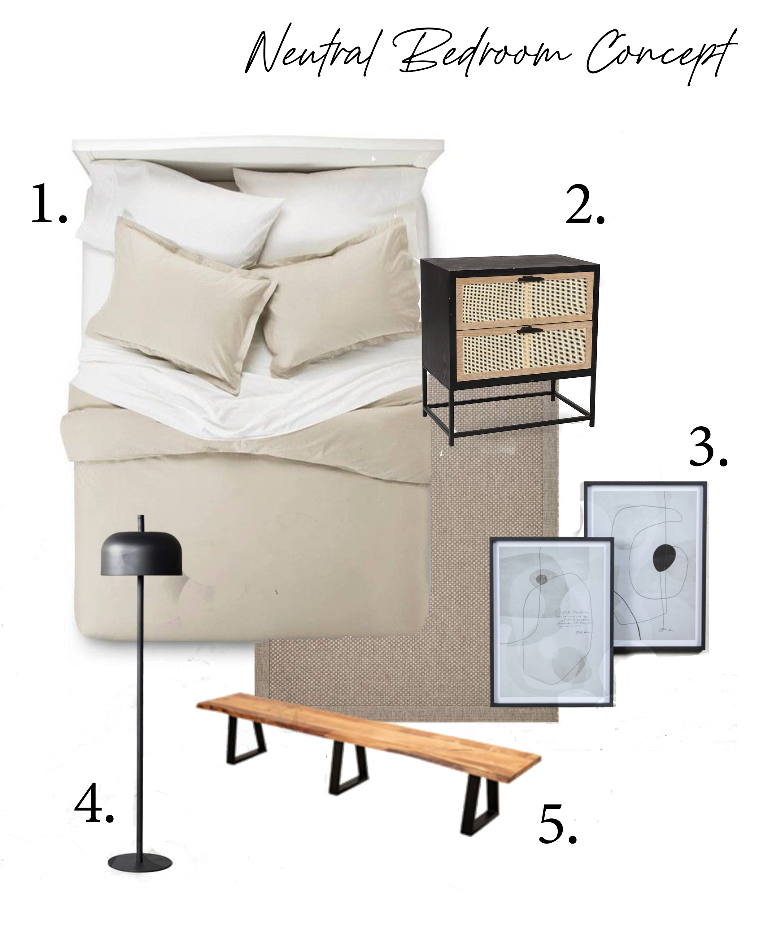
1. Bellisima Bedding from Hertex | 2. Oska Pedestal from MRP Home | 3. Catalonia Artwork Range from Weylandts | 4. Enoki Floor Lamp from Weylandts | 5. Dune Bench from @Home


