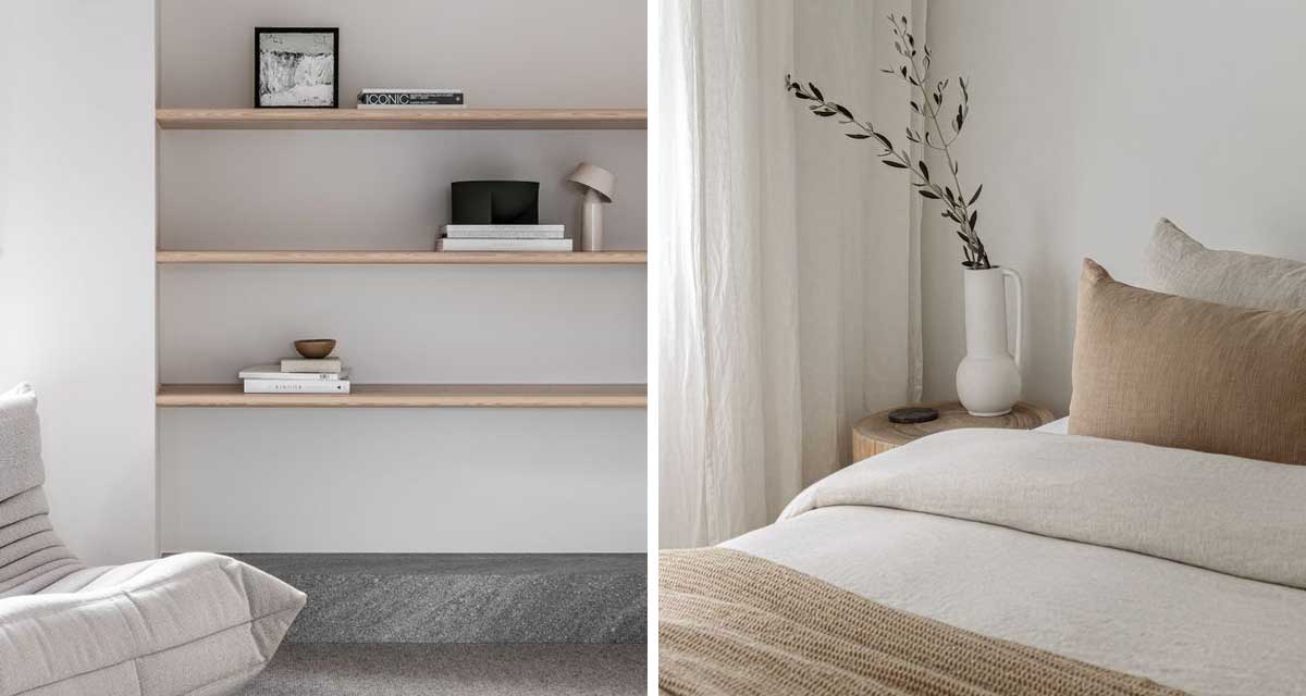
Images via Salt and EST Living
So hear me out on this one, because we know that talk of minimalism conjures up images of stark spaces stripped down to the bare minimum. However in our view the concept of minimalism affords you the opportunity for more.
Minimalist design prioritises essential element, optimising both aesthetics and functionality. Embracing minimalism through design also promotes a mindful an uncluttered lifestyle, encouraging conscious consumption and sustainable living practises.
Now we know this all sounds a bit like lofty goals when you think of your living room and everything you ‘need’ to have in it, and we certainly aren’t against curated collections of items and beautiful vignettes. However we do strongly believe that tidying up and taking away the excess is the crucial first step in any room makeover.
In fact, when we work with clients on projects for smaller spaces, for example living room or bedroom makeovers, we insist that the first step for the client is to take away before they bring anything new in. By eliminating that excess clutter and removing bits and pieces from the room, you remove visual distractions allowing you to focus on the big picture and consider what you really do need in the space.
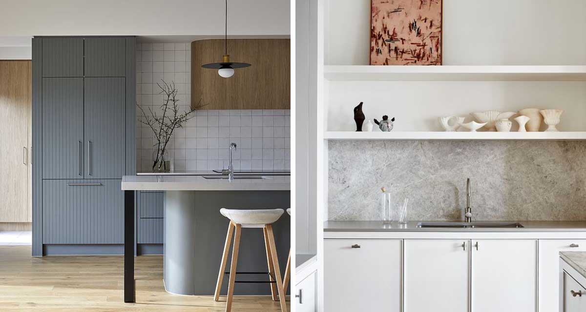
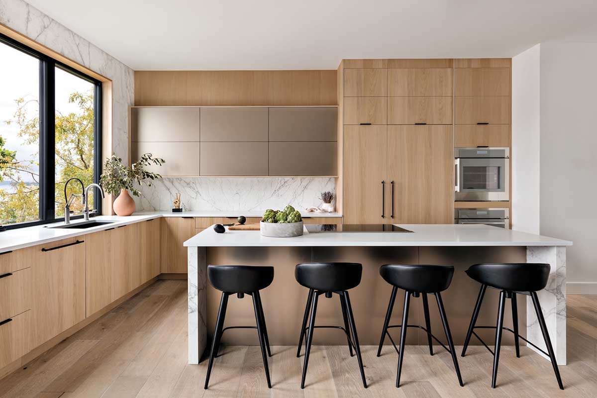
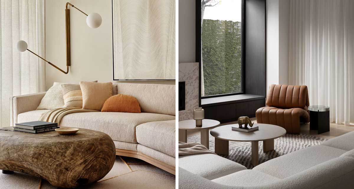
Images via The Local Project, The Local Project and Luxe
Consider Form and Function
When we start designing a space, our focus is on the functional elements of the room and the purpose they serve. When you’re in the process of updating / upgrading your space, first focus on and whether the piece still compliments both the style of the room and your personal style. For example, is the coffee table you brought from your last apartment the right size and shape for your new living room? Does the style work in your new living room and with your new pieces? Do you still love it? If not, consider selling or giving it away until you know exactly what you do need – if you even need a new one.
This step gives you the headspace to consider what you really want and need. Whatever you do, don’t rush a decision or buy something to simply ‘fill the gap’. Not only is this a waste of your money, but odds are you won’t get around to finding what you really need or want.
In this manner, we work through the bigger pieces of a space, ensuring that each piece has a functional purpose and that the needs of the room are met. This first layer can and should be beautifully pulled together and still feel warm and welcoming, setting the tone for the room.
Make It Cohesive
Our goal in the space is to create a cohesive feeling, so that the design and furnishings compliment each and bring a sense of harmony to the space, rather than having all the details competing against each making the room feel cluttered and chaotic. In order to achieve this you will need to start with a plan. Having a consistent theme or style to guide your choices is key to creating a cohesive setting. From there you’ll want to maintain consistency in your material selections, textures, and patterns throughout the room. Consider scale and proportions in your pieces, to ensure that there is a balanced distribution of visual weight of furniture and decor. Finally, edit and refine your design, eliminating unnecessary elements to achieve something that is warm and welcoming, but minimalist at hear.
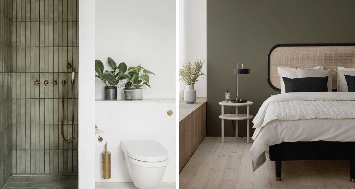
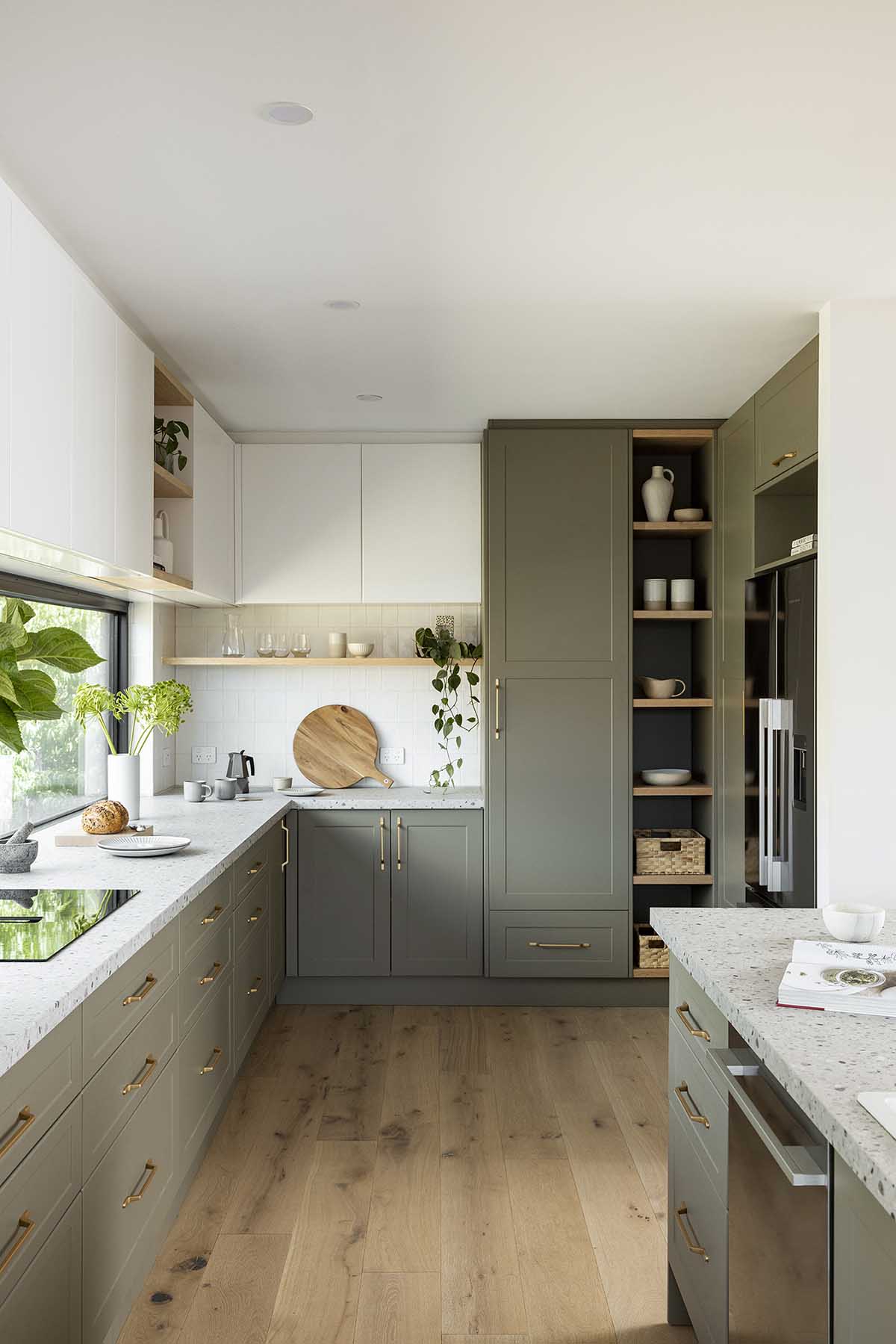 Images via Bobedre, Nordic Design and Kaboodle
Colour + Minimalism
While traditionally the palettes have tended to be more subdued, colour does play a crucial role in minimalist interiors, where it is specifically chosen to evoke an emotion. Neutral tones such as whites, greys, and beige are commonly used, creating a clean and timeless aesthetic. Warmth is introduced through texture such as natural woods and stone. However more recently we are seeing rooms painted in carefully selected deep saturated hues, creating a calm and tranquil setting. The judicious use of colour in minimalist design helps create a harmonious and balanced atmosphere, reinforcing our much loved principle of “less is more.”
Styling A Minimalist Space
Here again, people tend to think that minimalism equates to no personal items on display. This is definitely not the case. However your focus should be on reconsidering the items in your home that aren’t serving any purpose – and that could mean you no longer love them, they no longer serve a functional role or they simply don’t look good.
Not every space in every corner of a room (or surface for that matter) needs to be filled. Having more stuff isn’t necessarily better. Negative, or white space, is essential to allowing the pieces you already own to be seen. In the same vein, be prepared to take your time. Most likely you either can’t purchase everything at once, nor is it always wise to do so (especially if you are already struggling to define your style and needs). Consider your home a work in progress. Our end goal here are considered display areas and vignettes, that embody how you want your personal space to feel.
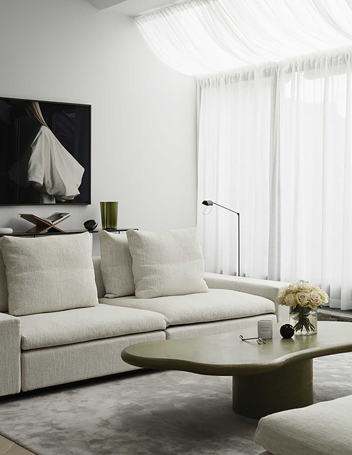
Images via Est Living, Workshop and Pinterest


