Have you heard of the unexpected red theory in interior design?
This concept grew more and more popular last year. The main idea behind the Unexpected Red Theory is to simply add a touch of red into interior spaces, where you would least expect it. This bold accent – whether something as small as a vase or as large as a piece of furniture – unexpectedly draws all the attention in the room, energising the room without overwhelming it, and becomes the main focal point.
Arguably this classic design concept has always existed, but applied in a different way. So why the unexpected now? For as long as I can remember red has been a pretty polarising colour, and definitely one that people have tended to avoid in interiors.
As a colour it is bright and impossible to ignore, and historically this notable hue was central to the Bauhaus basic palette, and equally popular in mid-century designs, most certainly when pop art design was at its peak. Then came the 80s and 90s, where red made a comeback in postmodern interiors, often as an accent paired with black and white for gold contrast, and it started to lose favour with designers.
The key to its comeback? Balance. Red works well as a focal point, breaking potential monotony and infusing warmth, passion, and a little sophistication into the space. And do we love it? It can definitely be considered a confident design move, and one that turns simplicity into statement, perhaps proving that a single daring choice can redefine the personality of your space.
So how should one use it?
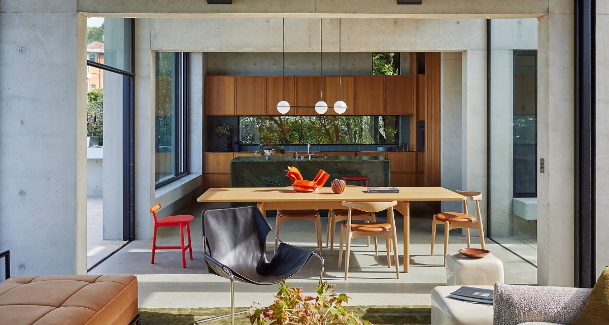
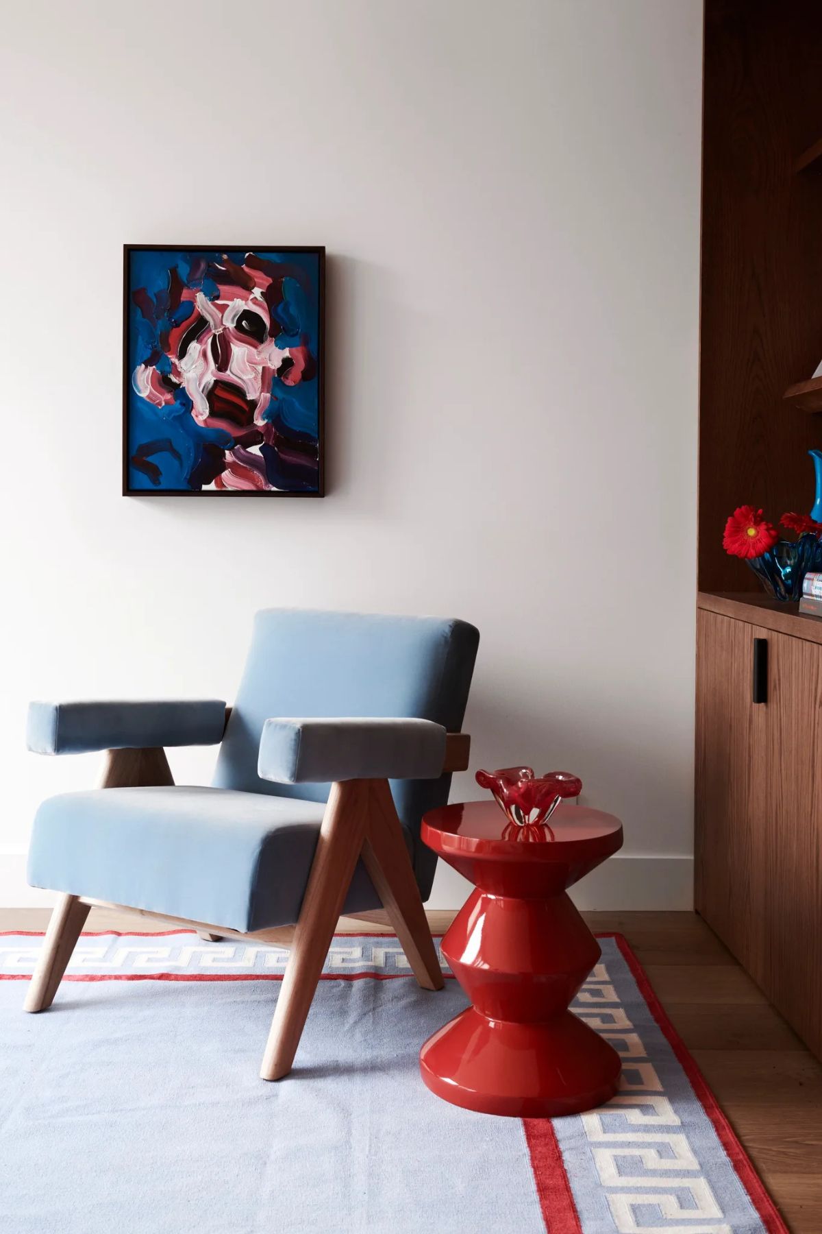
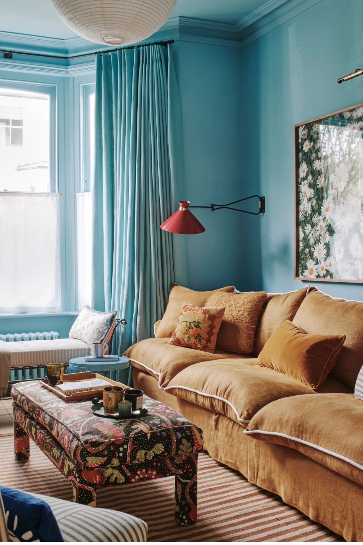
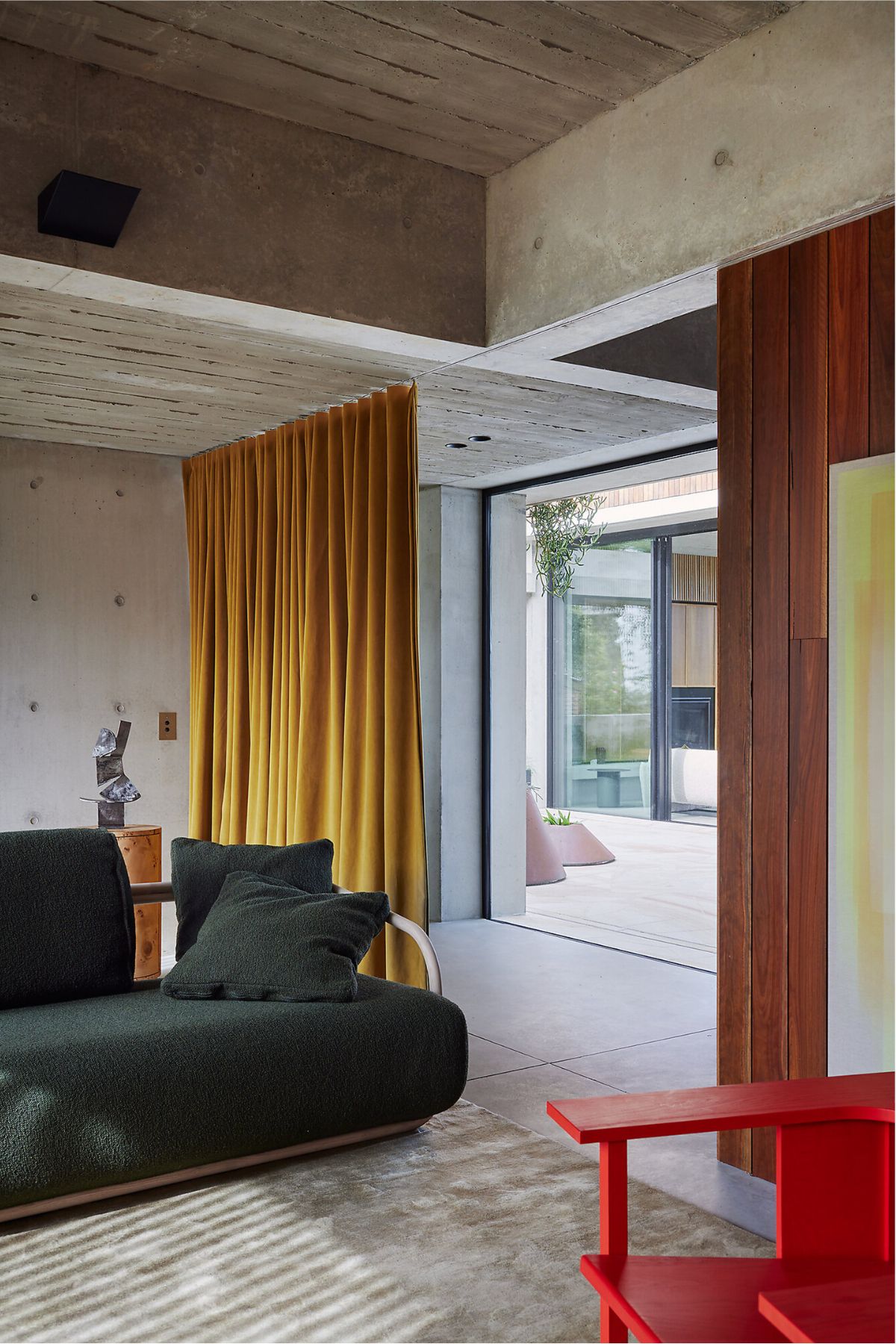
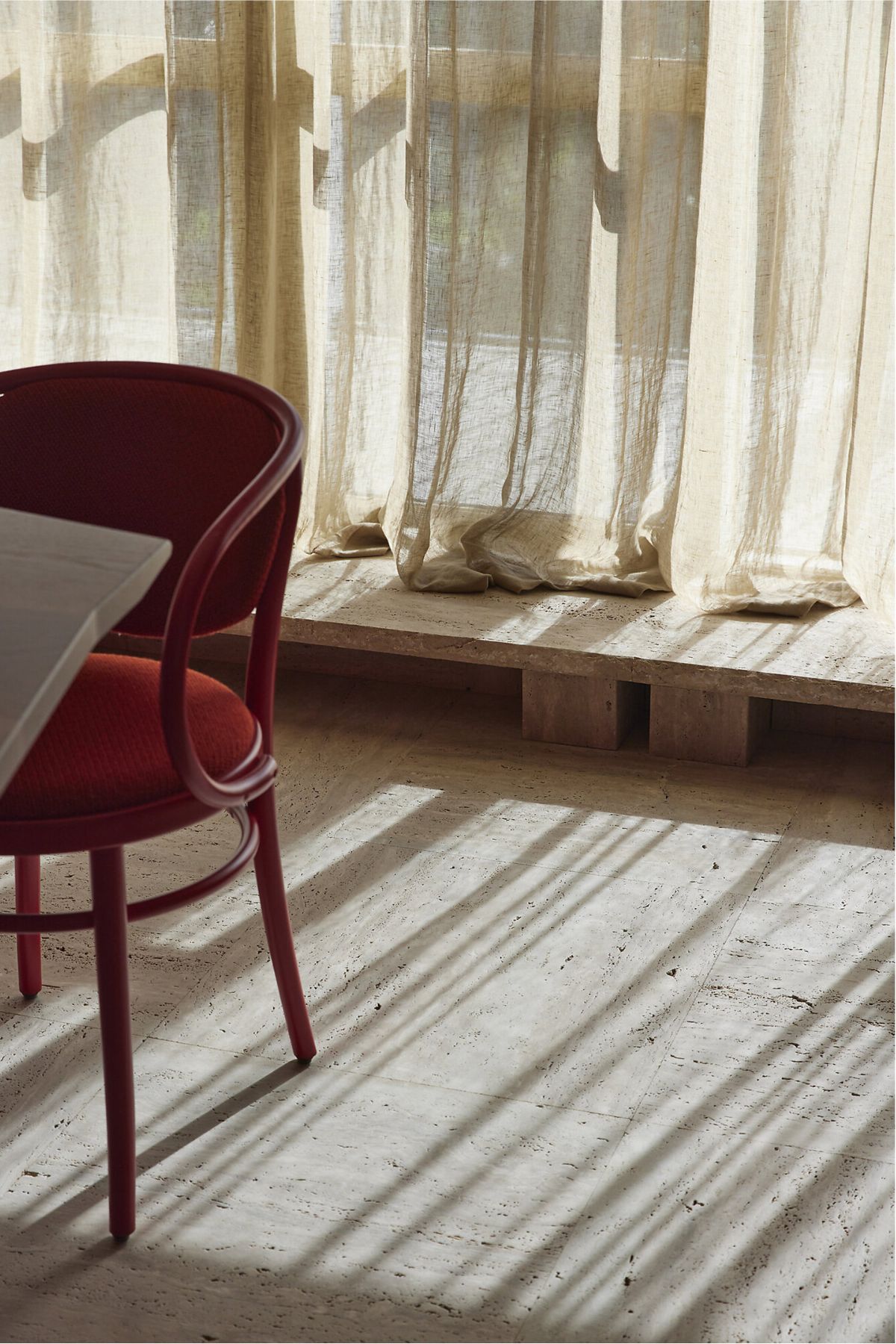
Well it’s often easier to test the water of a colour when you don’t go all in – and by that we mean no all red walls!. Bringing in a beautiful red side table, like in the image above, not only feels rather chic, but also far more manageable.
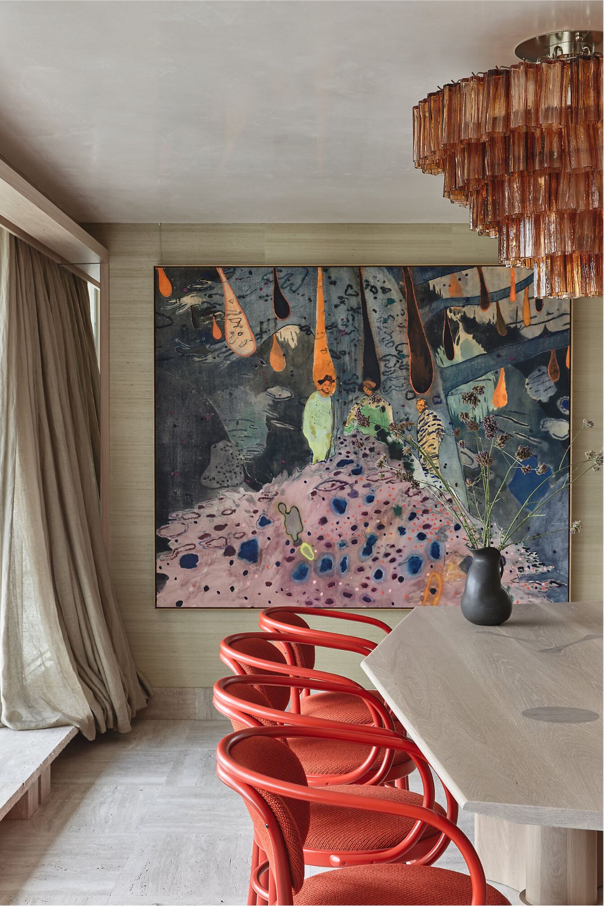
Pairing it with a contrasting shade is also a winning combination. Enter my love affair with all things pink and red.
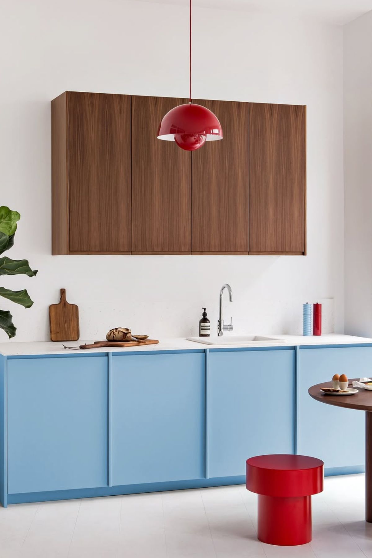
Blue and red is another mix that is harmonious pair, thanks to the calming visual effect of blue and its ability to take the bite out of red without neutralising its overall impact.
If you are red to bring this expected theory home, start small and remember that less is more!