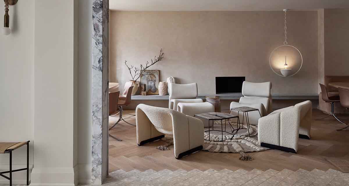
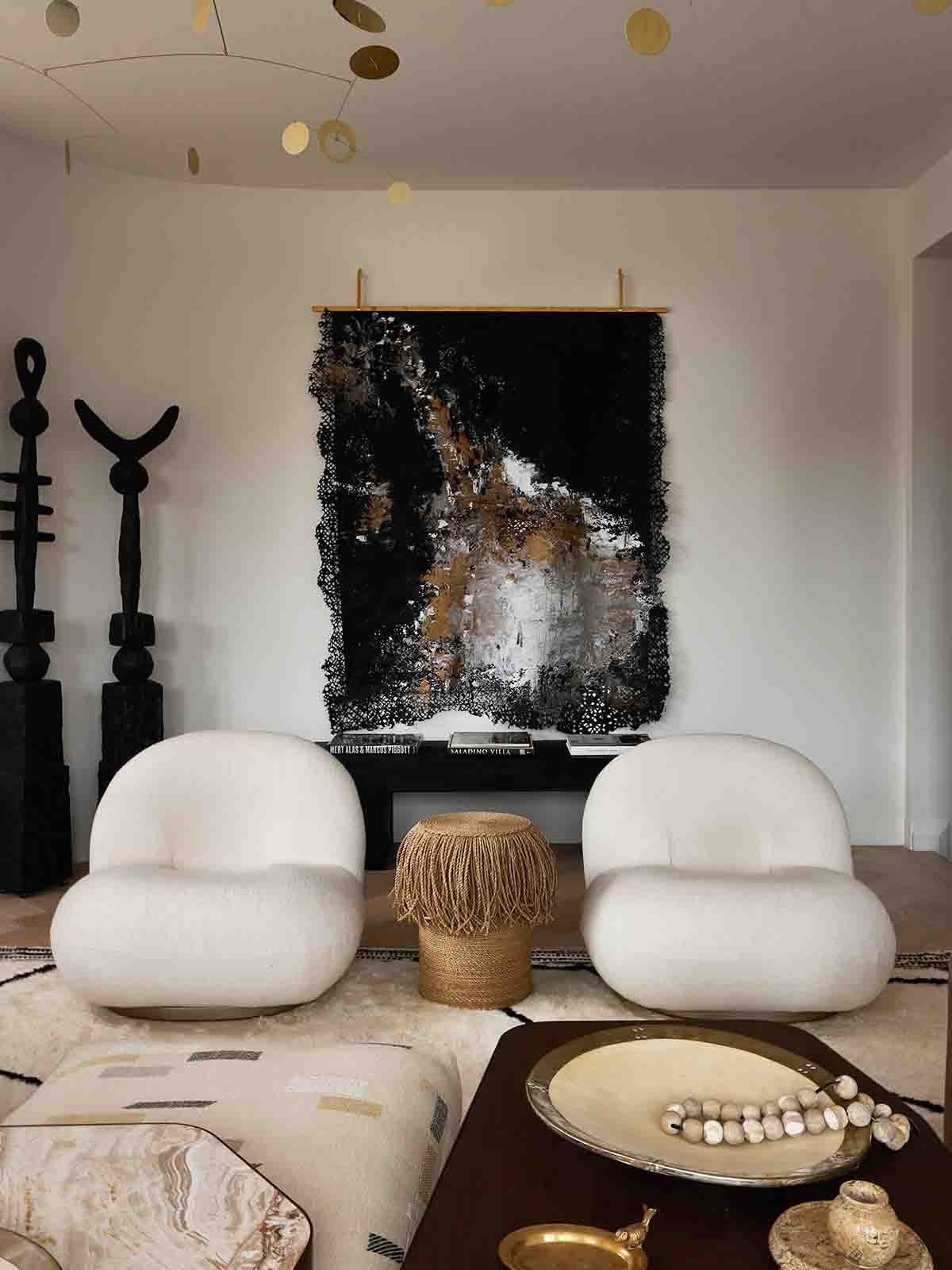
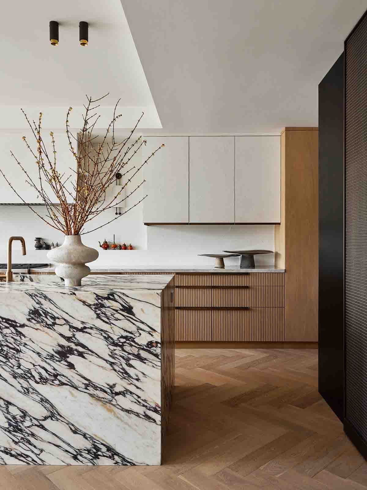
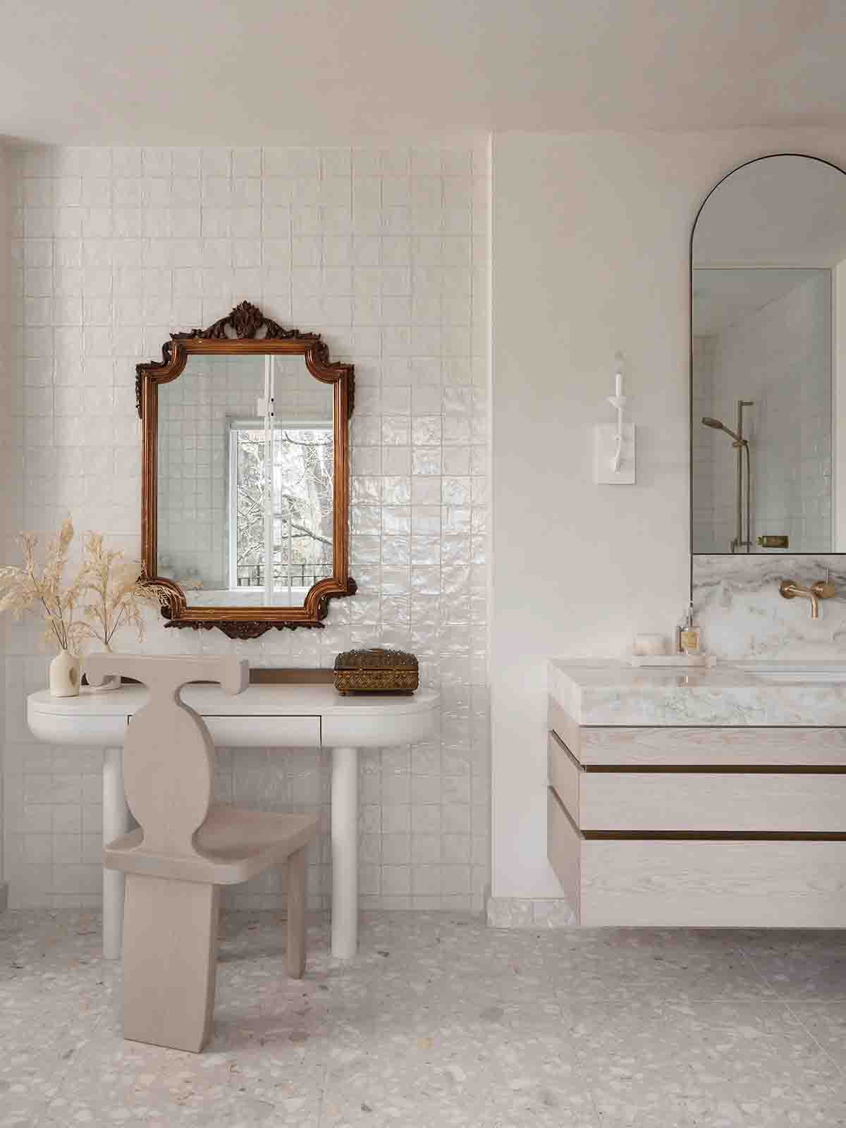
A palette of creams, alabaster, pale blush and oysters tones, combined with blond timbers has created a soft, cocoon like atmosphere in this family home. The overall style is a balance between classic and contemporary, with a slight eclectic edge, thanks to many of the decor items being purchased during the owners travels.
It is fair to say this home is a work of design art, and that in all likelihood there was a healthy budget for the design process. The attention to detail is evident from the marble archway detailing to mark the threshold between the entry space and open plan living and dining area, right the way through to the collection of vintage designer chairs and beautifully decor pieces.
Once I had swooned over every detail in every picture, I went through them again and was struck by these three simple, but clever design ideas, that I am definitely going to start using in our projects going forward. You can too.
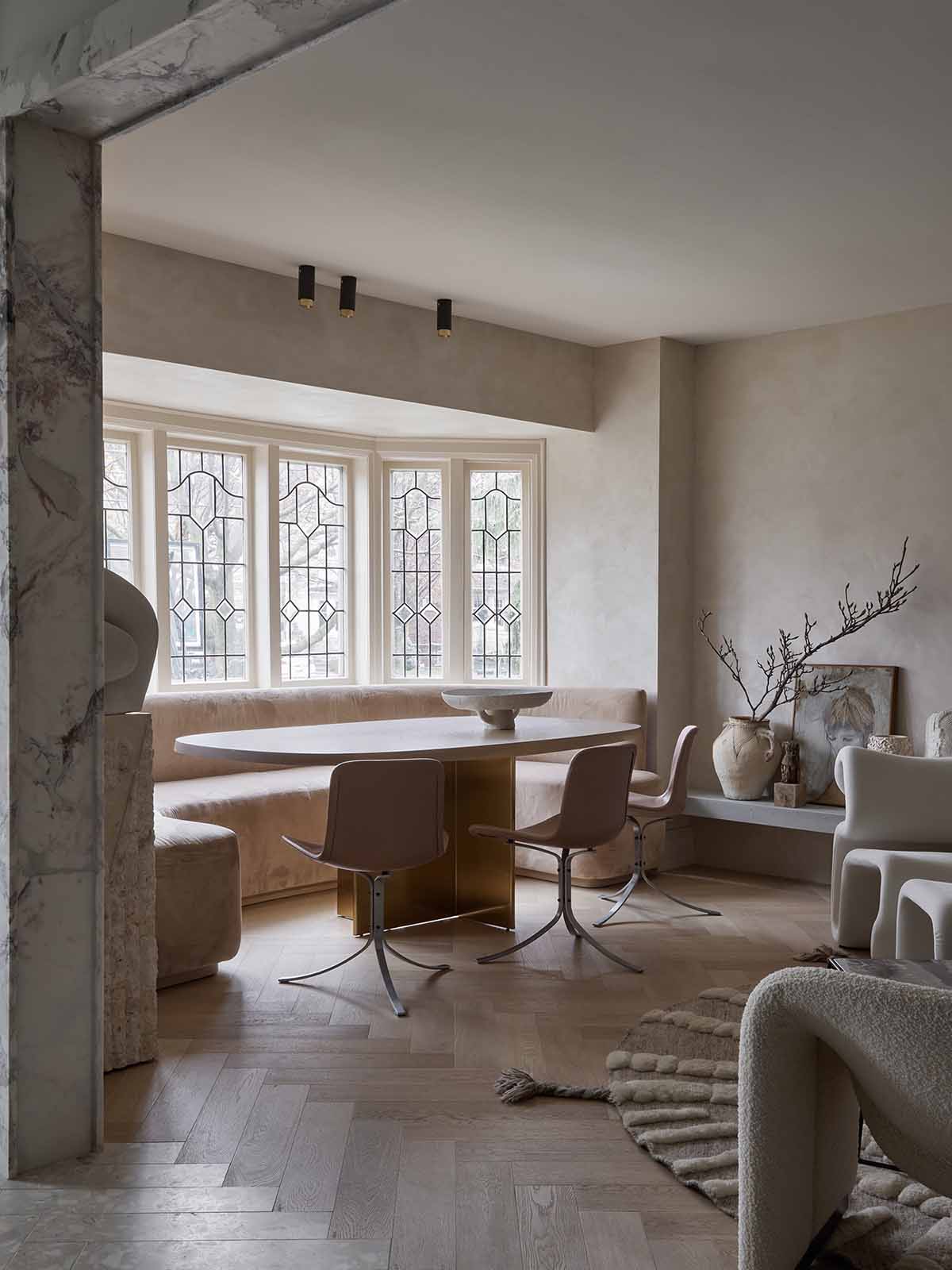
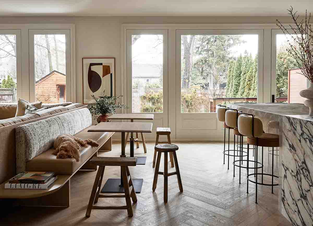
Cafè Style Dining Banquette and Tables
In most homes when the kitchen flows into the open plan dining space which flows into the open plan living space, we would expect a rectangular dining table surrounded by 8 – 12 dining chairs, and mostly likely with a pendant hanging down from the ceiling to help demarcate the space. And I’m sure it would look lovely.
However this addition where the dining banquette backs onto the sofa is not only amazing from a space saving point of view (it really does down on lots of wasted circulation space), but looks bespoke and beautiful.
The absolutely cherry on the top for me is the idea of using a combination of smaller tables, to help keep the space feeling light and open. Of course these smaller pieces can easily be pushed together to create one larger table as needed, but on a day-to-day basis they look interactive and welcoming.
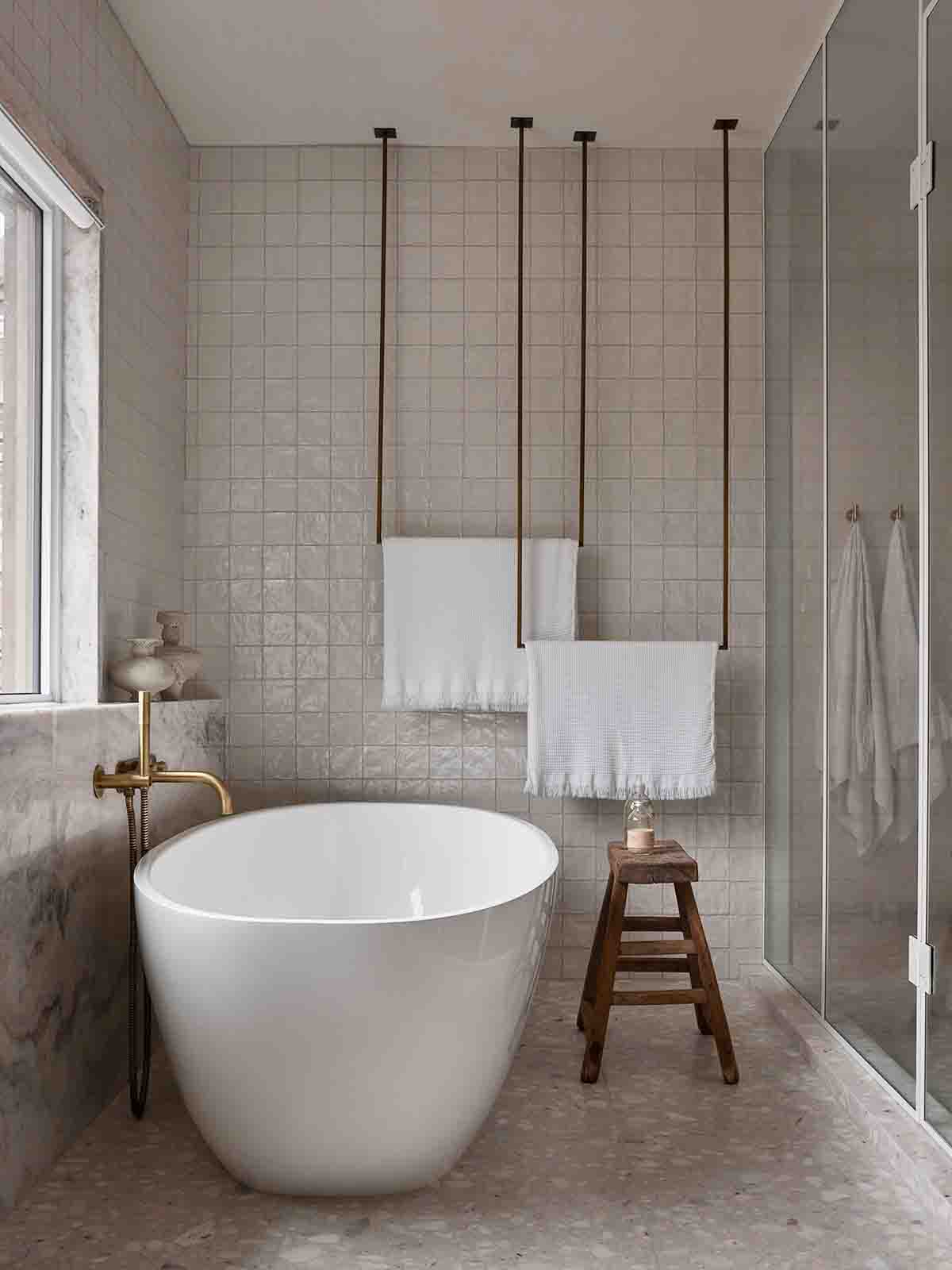
Ceiling Mounted Towel Rails
I have seen similar concepts before, but this double installation looks more artful than others I have seen.
Having recently struggled with where to place the towel rails on a recent project – even in the large bathroom space – I now really wish I had thought of something like this. A single wall mounted towel rail never gives enough drying space for two towels, so this double layering over the two heights is design perfection for me right now.
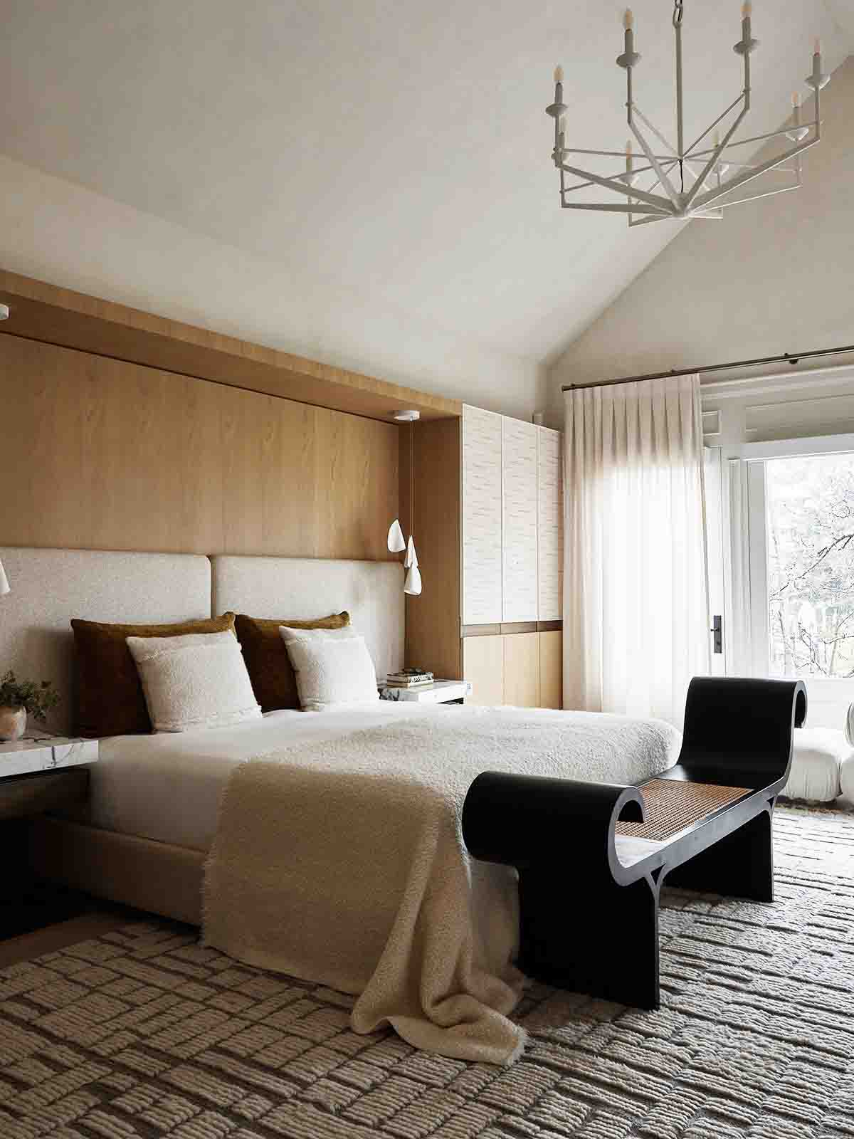
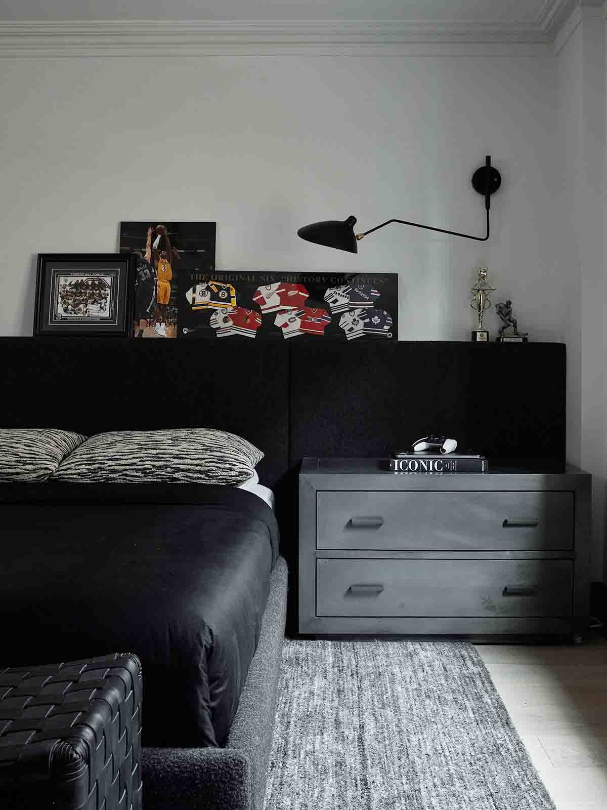
Using Two Headboards To Make One
Hello obvious! For many people the thought of having the join of the two headboards down the middle of the bed would be a design problem, but here we see just how chic it looks. Arranging the pillows on either side of the line also helps.
Instead of going down the custom route for an extra wide headboard, here we have two pieces placed side by side for the same effect. And it looks so great!
All images via EST Living


