Welcome to Apartment T, a beautiful loft apartment in the heart of Cape Town, which we ‘quickly’ gutted and renovated during builders holidays!
If you’ve ever tried to get contractors in to work during December and January, you’ll know it’s almost impossible. Luckily for us, our team was up for the challenge and we managed to turn this Cape Town based apartment around in record time.
Let’s talk through the changes and the plan:
This is a one-bedroom loft style apartment is located in a beautiful historical building in the centre of Cape Town. While small in footprint, the vaulted ceilings make it feel spacious and full of light.
The key areas of focus for this apartment included:
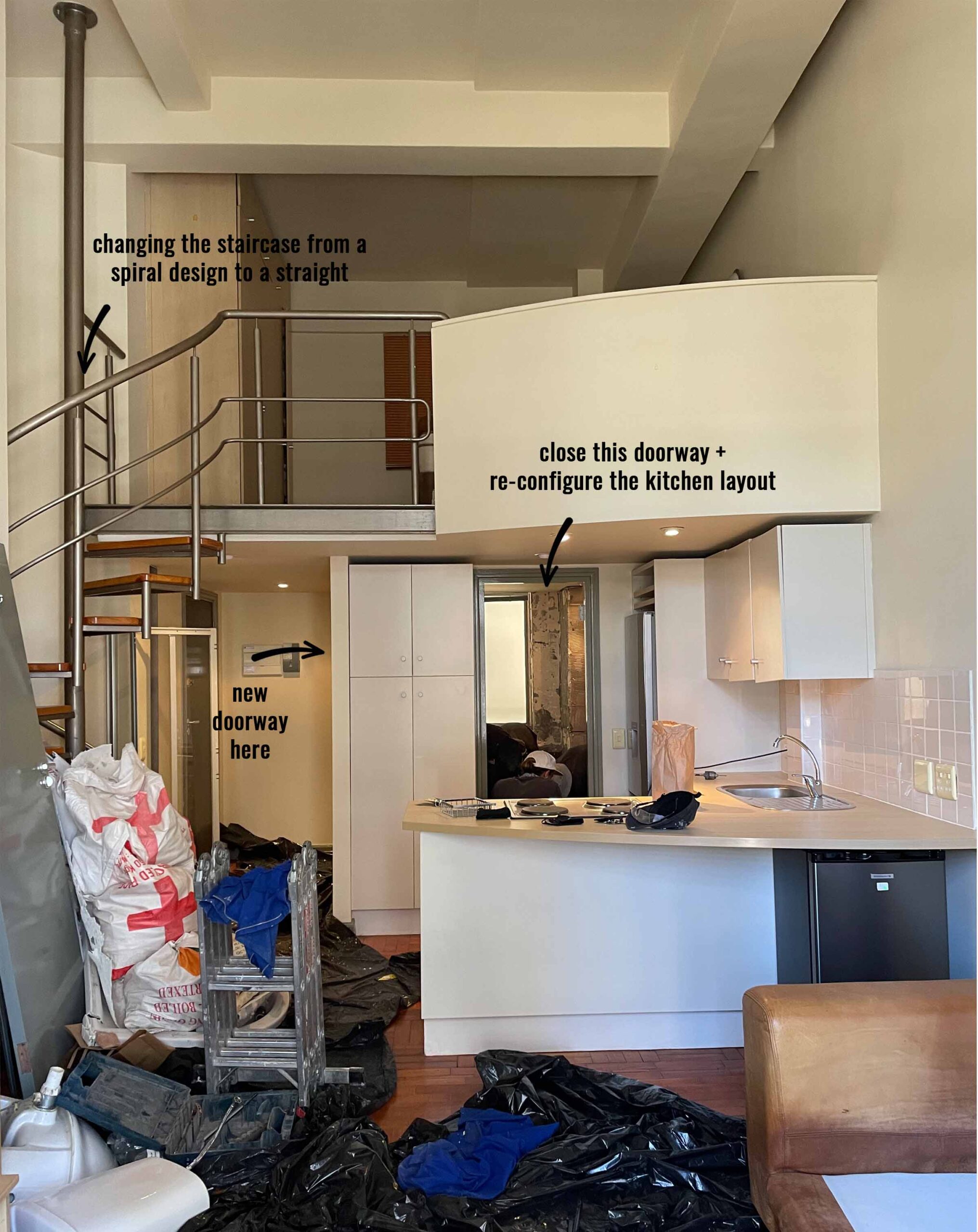
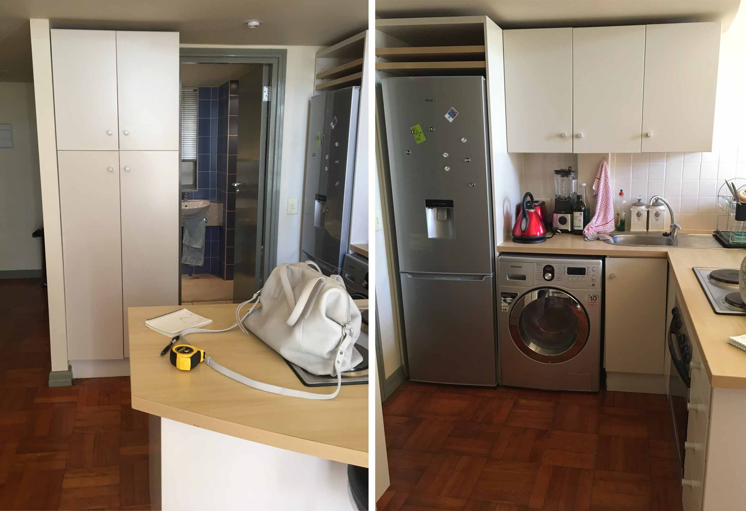
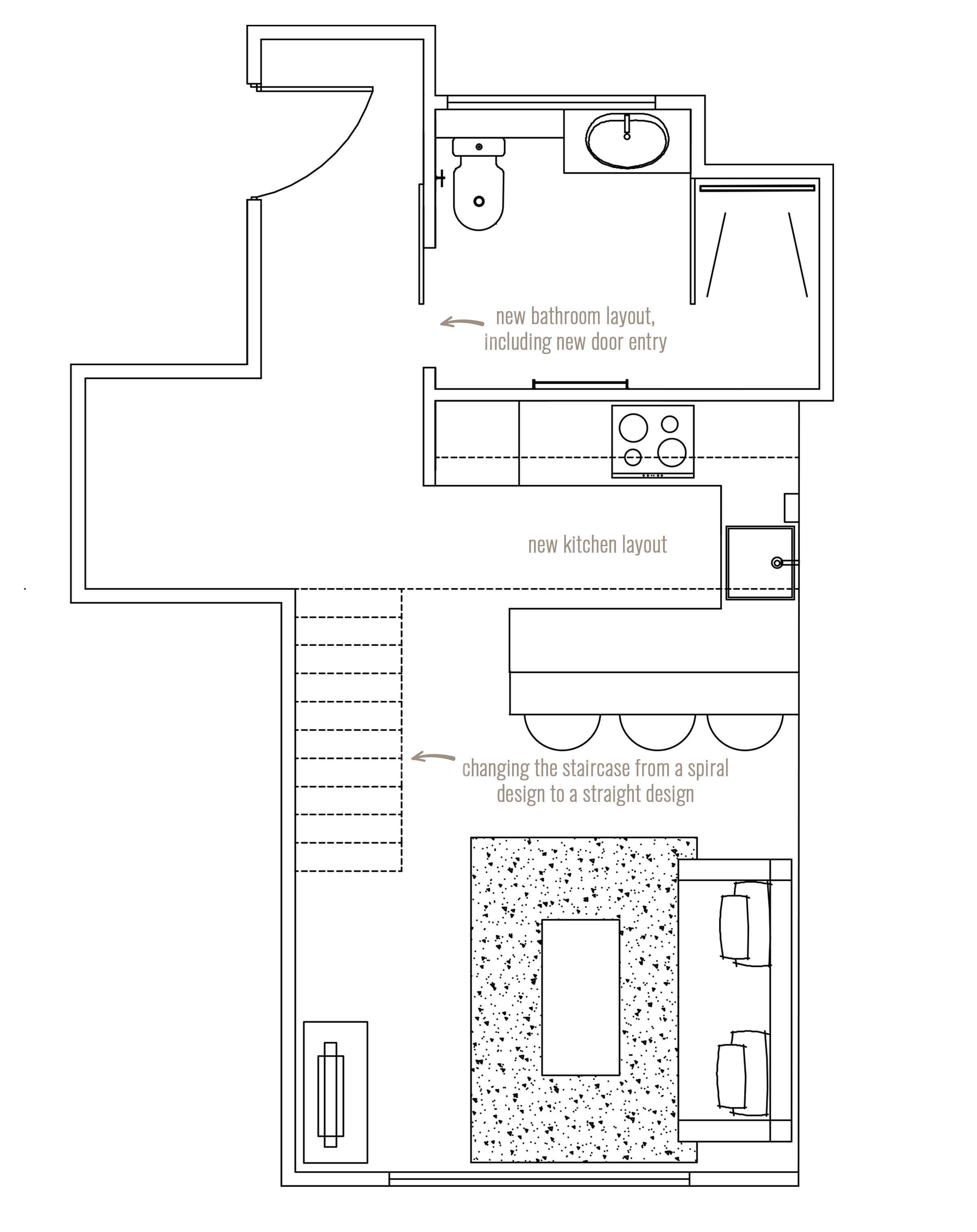
– Gutting the bathroom entirely, creating a walk-in shower and moving the door from the kitchen to the apartment entrance
– Re-jigging the kitchen layout now that the bathroom entrance has been moved. Re-using cabinet carcasses where possible, bringing in new door fronts, adding more storage and replacing the countertop
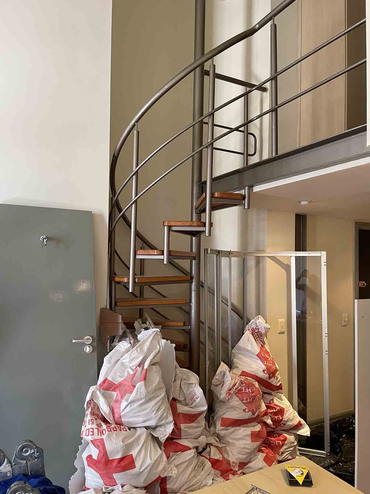
– Change the staircase from a spiral unit to a straight staircase.
– Changing the flooring
– Painting the apartment
Renovating an apartment always comes with its challenges, including building access and upsetting neighbours with the noise. In small apartments we are also dealing with space constraints for materials, including those gutted and those coming in, as well as the potential of damaging work done. It’s a true balancing act!
BEFORE
PROPOSED LAYOUT
DESIGN CONCEPT
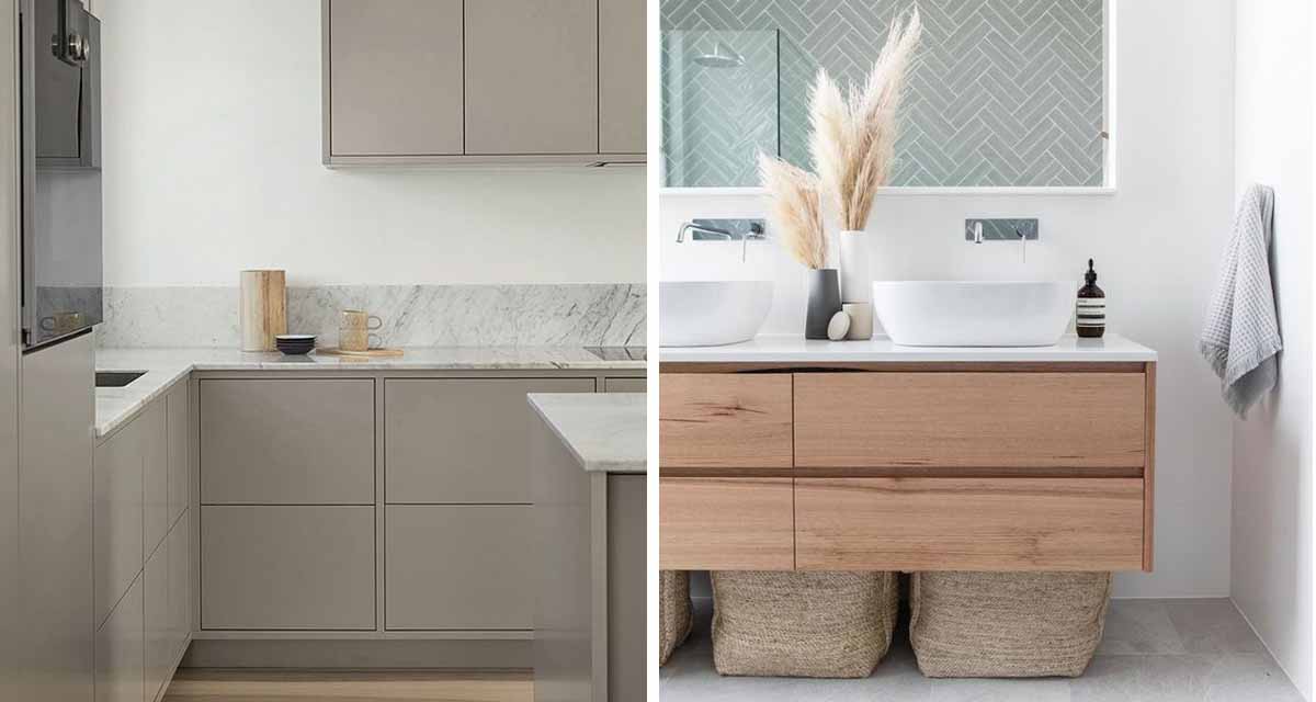
The overall goal for the apartment was to basically give the space an updated look – a lighter and brighter finish, in a new contemporary style. Given that the apartment is rented out, the client also wanted good style on a budget.
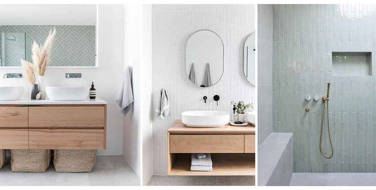
This applied even more specifically to the bathroom, a dark blue, dated and cramped space. This seems to be a common theme in apartment bathrooms, as we faced a very similar situation in our Apartment D project. So we employed a similar design concept here.
Wood look tiles set the scene on the floor and were carried through from the apartment, which is great for a seamless feeling in the space, but also so much better from a practical installation point of view. No weird join lines.
White walls brighten the room, and for a pop of colour and lots of interest we lined the shower box in mint green subway tiles. Here we opted for a gloss finish, which is ideal when you need some extra brightness in the room, and a flat edge for the contemporary style. A wood style vanity brings a natural element to the setting.
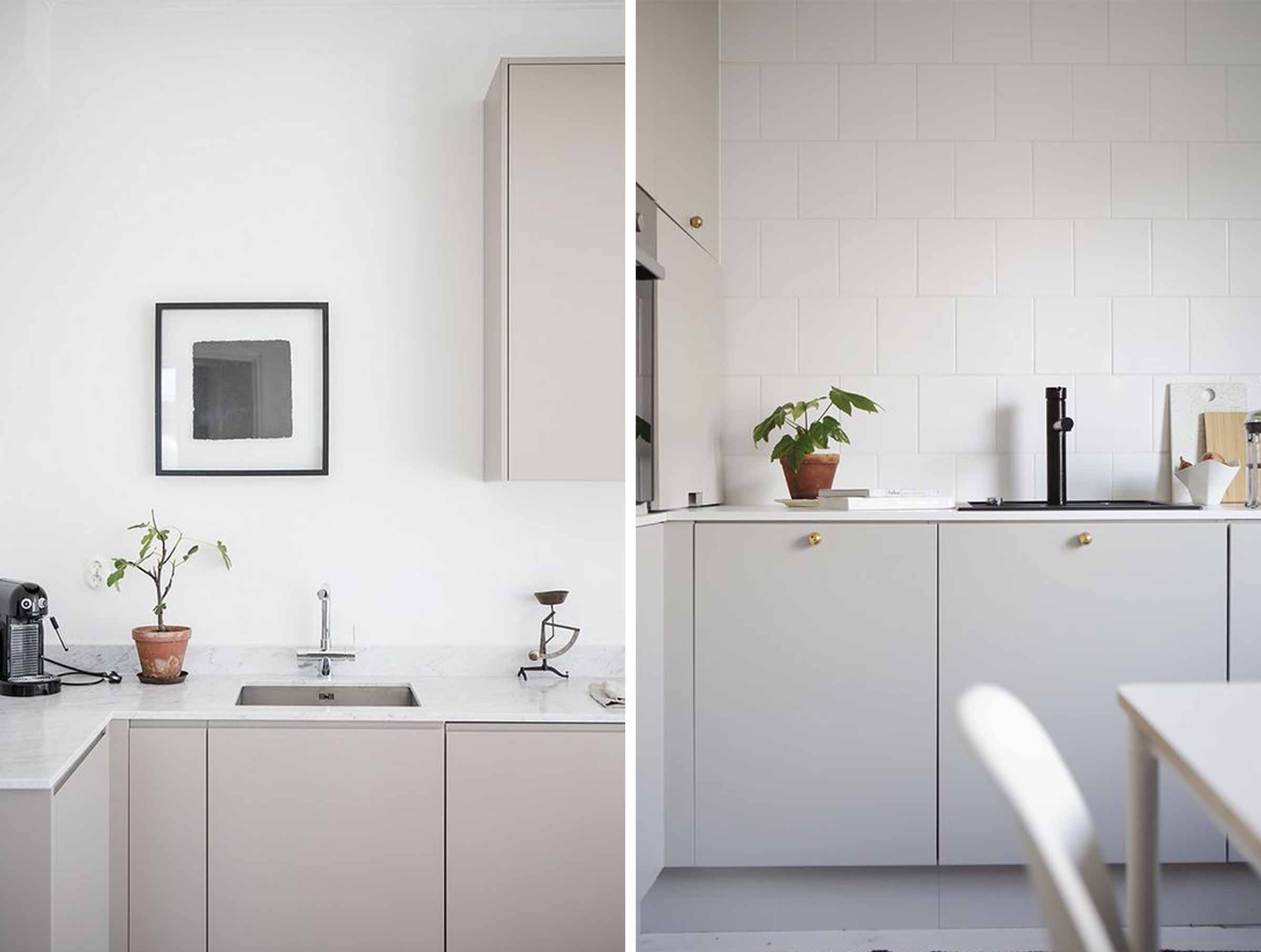
Given the apartment would be rented out, we needed to create a neutral setting in the kitchen that would be classic and timeless. Enter the light grey kitchen, that universal style that is easily accepted by most, even if they don’t love it.
The plan was to bring in an eeziquartz finish in a light grey colour to match the cabinets, which would be easy to maintain and durable. Simple black cabinet knobs finish off the contemporary edge.
WORK IN PROGRESS
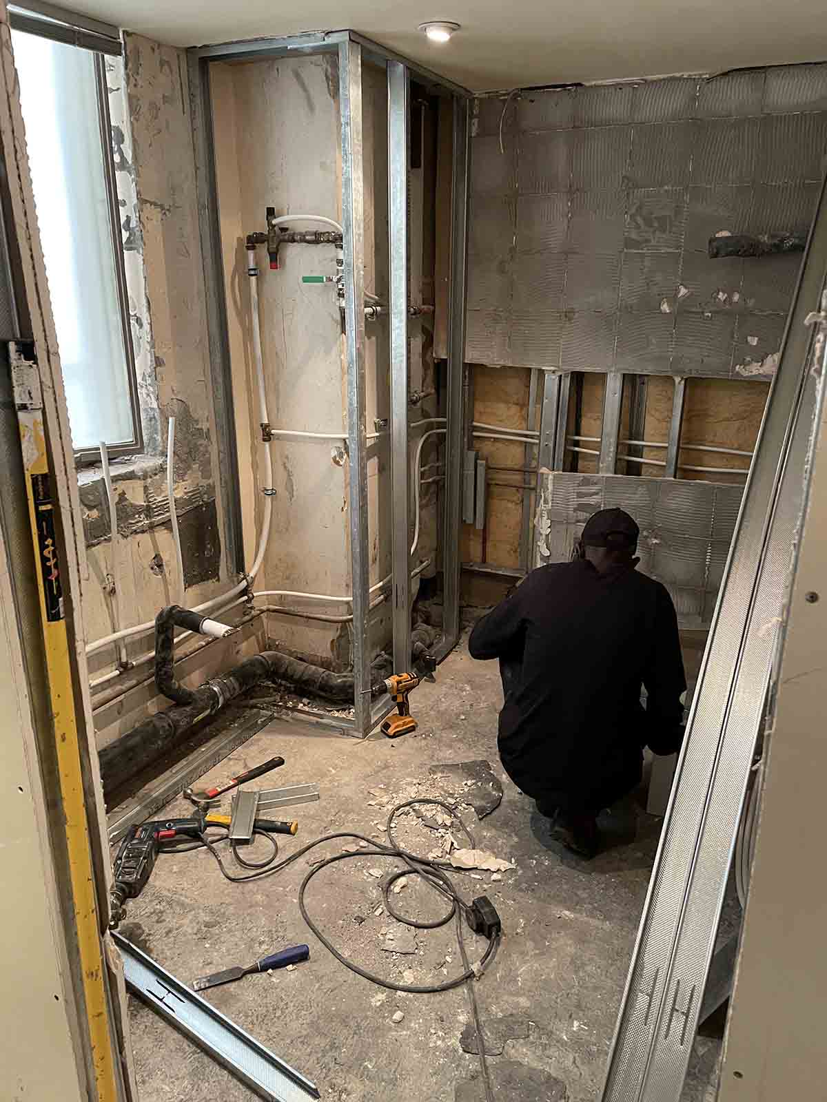
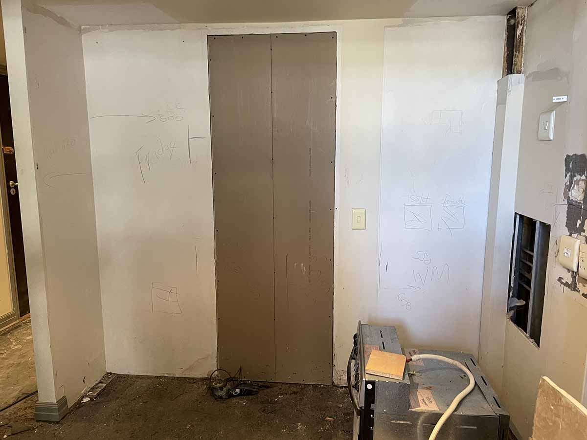
I know this might a little weird, but I get such a kick out of seeing the demolition phase of a project. It ALWAYS amazes me how quick the demo process is, versus how long it takes to put it all back together again.
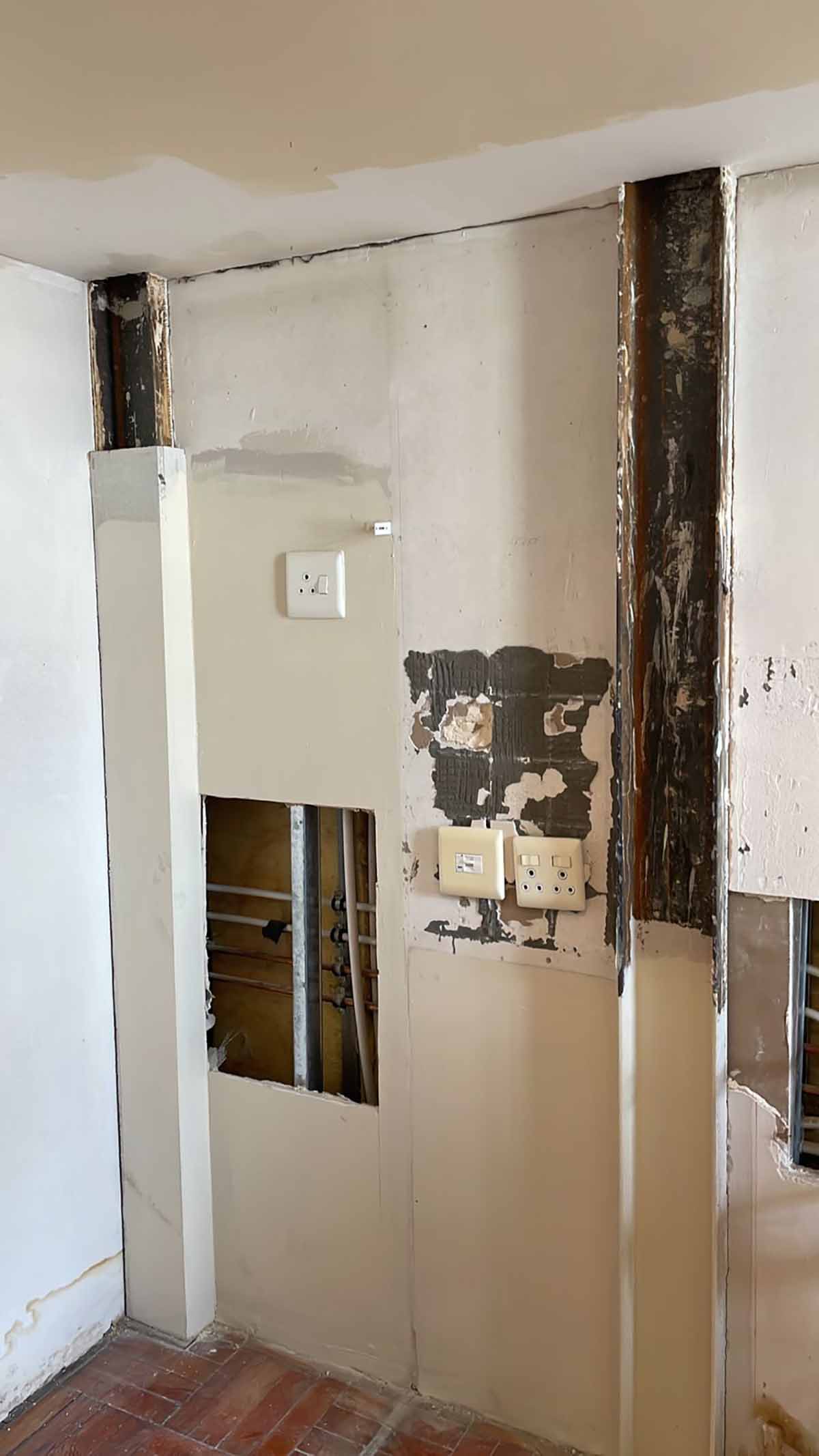
Former Bathroom
Former Kitchen
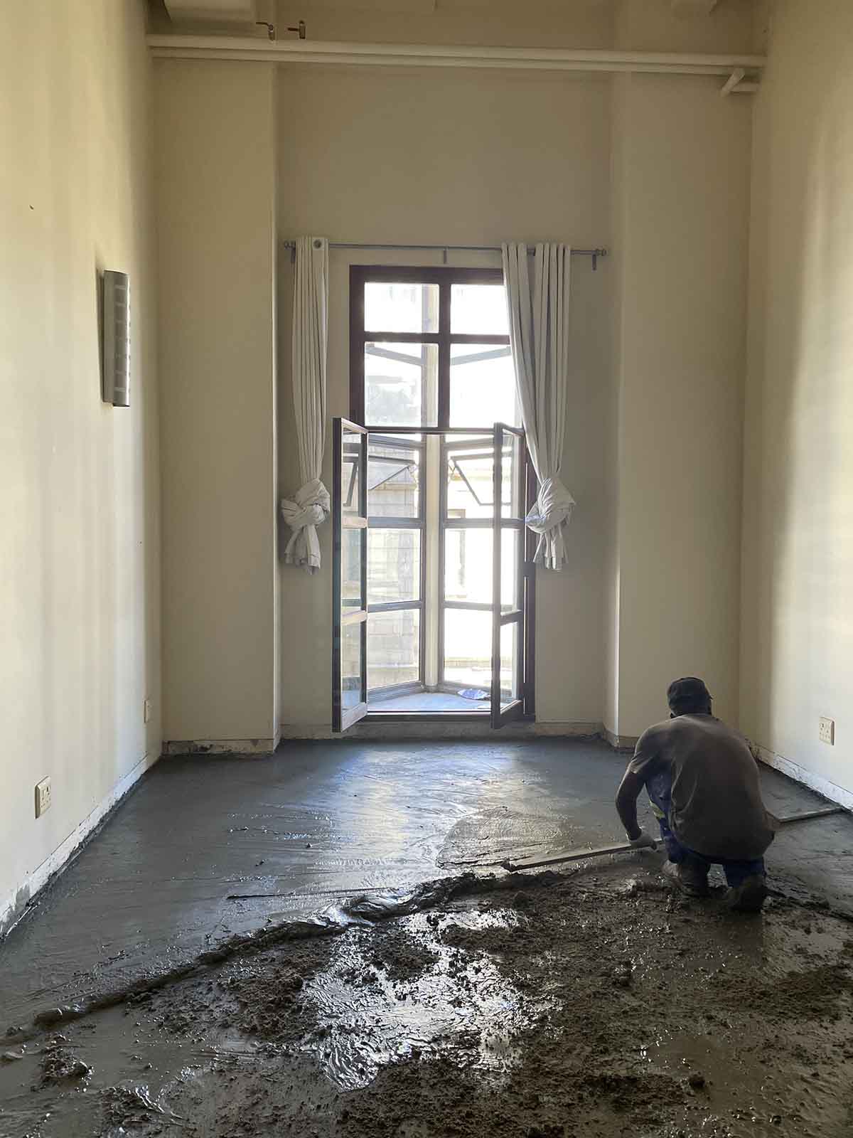
If you think laying a screed is an easy process, think again!
Say goodbye to the spiral staircase….
…and hello to the floating design
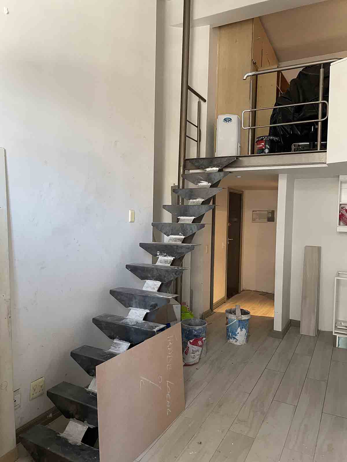
Lots of questions on why this was changed. In a nutshell – functionality. The spiral staircase was not good for guests who needed to carry their suitcases up and down the stairs. The straight design is far more user friendly.
Yes we know it extends into the living space more and of course you need to walk around it when entering the apartment, but it really isn’t as invasive as you would think.
You can already see that a few coats of white paint has a brightening effect on the apartment, while the wood look tiles have also lightened the space.
Stay with us this week as we talk materials and finishes, and show you more of the finished space.


