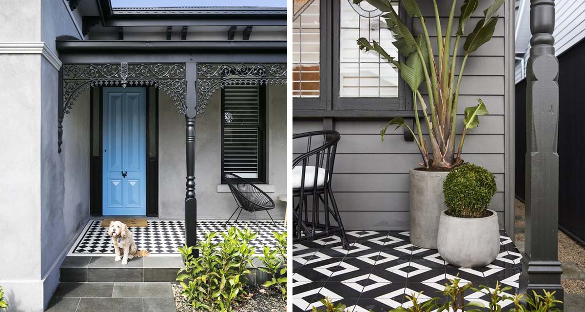
Yesterday we waxed a little lyrical about our love of the stoep. But what about those of us without a stoep? Well, like our clients at House G, it’s about working with the space you have, to create your own version of your “entrance stoep”.
You don’t need a huge space or budget. With just a few tweaks you can easily create a welcoming ambiance.
Firstly, take a step back. All the way to your entrance gate, or even across the road if you don’t have a front wall. It’s good to get a different – and visitors – perspective on the entrance to your home. Pick the first three elements that catch your eye – good and bad – and work on highlighting the good and fixing the bad.
Then we say focus on these three elements, to turn your entrance space around.
One.
We say it on repeat – the power of paint goes a long way – and the front of your house is no different. Every few years your house exterior will need a new coat of paint, but for an immediate pick me up consider just painting your front door a beautiful, bright colour to make the whole area feel special. We’ve been crushing on pink front doors, as well as all shades of green. While front doors painted black or charcoal are also popular and work well on most houses, we are all about the colour.
Two.
There is something about a bench or a chair at the entrance to a house that makes it a home. No matter how small the space, there is surely room for a little bench. Add a scatter cushion or two to really make it feel welcoming.
Three.
And don’t forget plants! One or two large potted plants make all the difference at your home entrance.
If you are looking to create a feeling of privacy and intimacy, but still want to maintain some connection to the street, consider introducing elements such as potted plants, a trellis or hanging decor to for a screen effect.

 Images 1 | 2
HOUSE G
So let’s talk about House G and their no stoep stoep. While our clients love the idea of a front verandah – in particular those echoing the Klein Karoo with a bull-nose verandah roof, broekie lace fretwork and real shutters – their new home entrance is quite a bit different. Let’s have a look.
BEFORE


While the house falls under Heritage codes due to its age, the style is more Mid Century Modern meets Art Deco. With the interiors having a more traditional style, our client was keen to echo this feeling at the entrance.
The client had a few “non-negotiables” as part of the process. They colour of the roof had to be changed, the boundary walls needed to be raised and filled in for security, and most of the trees had to be removed as the roots were ruining the walls and paving.
For the overall look and feel, our clients were after a light grey and white colour palette for this area, with the aim of softening the feeling as you walked in. This would compliment the pink front door coming too.


As we mentioned, this area is typically low on the budget priority, so naturally our goal was to get maximum impact with minimum input. However the list above included some decent build work, so some costs were going to have to be incurred.
If the flooring was in decent condition and could have been saved, then our advice for a budget makeover would have been stoep paint. We love stoep paint for the ease of application, the lovely thick coverage it gives and how it feels underfoot. But since we had to chop into the tiles anyway, we ended up pulling them all up. If you are feeling particularly creative, with a tile pattern like the above already in place, you can easily paint yourself a checker board tile effect. Something like the below DIY we saw here.

However, at House G, when the opportunity to redo the flooring presented itself our clients asked how we could emulate at similar victorian pattern and border, as cost conciosuly as possible.
We were quite surprised how difficult it is to find a tile options to suit this style. In the end we sourced the border tiles from Quadrata. Instead of using the small checkerboard tiles within the border, to help reduce costs we sourced a larger decorative tile from Womag, that will be used to fill the pattern.
Since we just started working on this area last week, it’s very much a work in progress.


The new pink door is in place and today we started a dry run for the tile pattern.


Still lots more to be done, but we can’t wait to be able to share those “after” pictures!


 Images