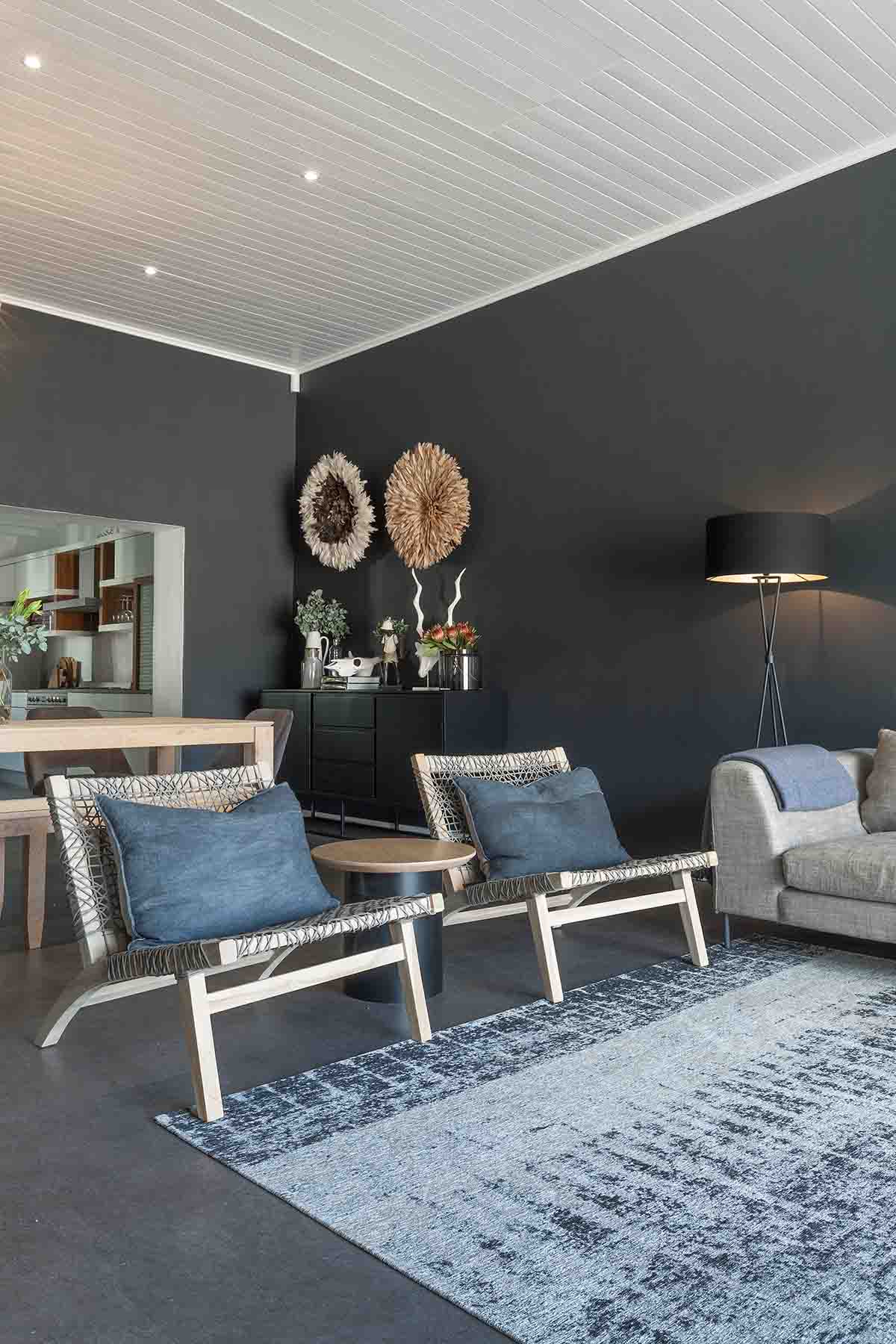
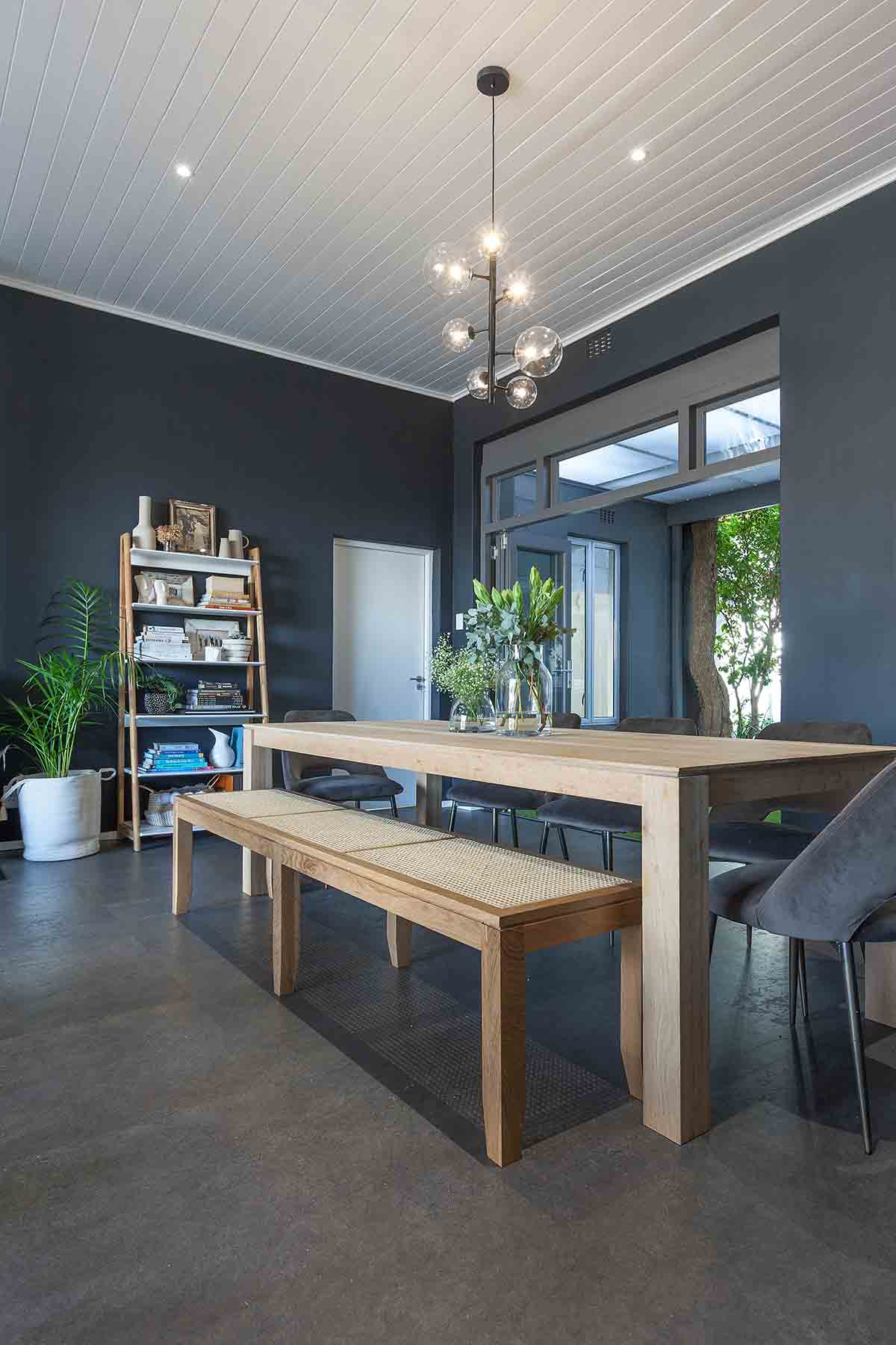
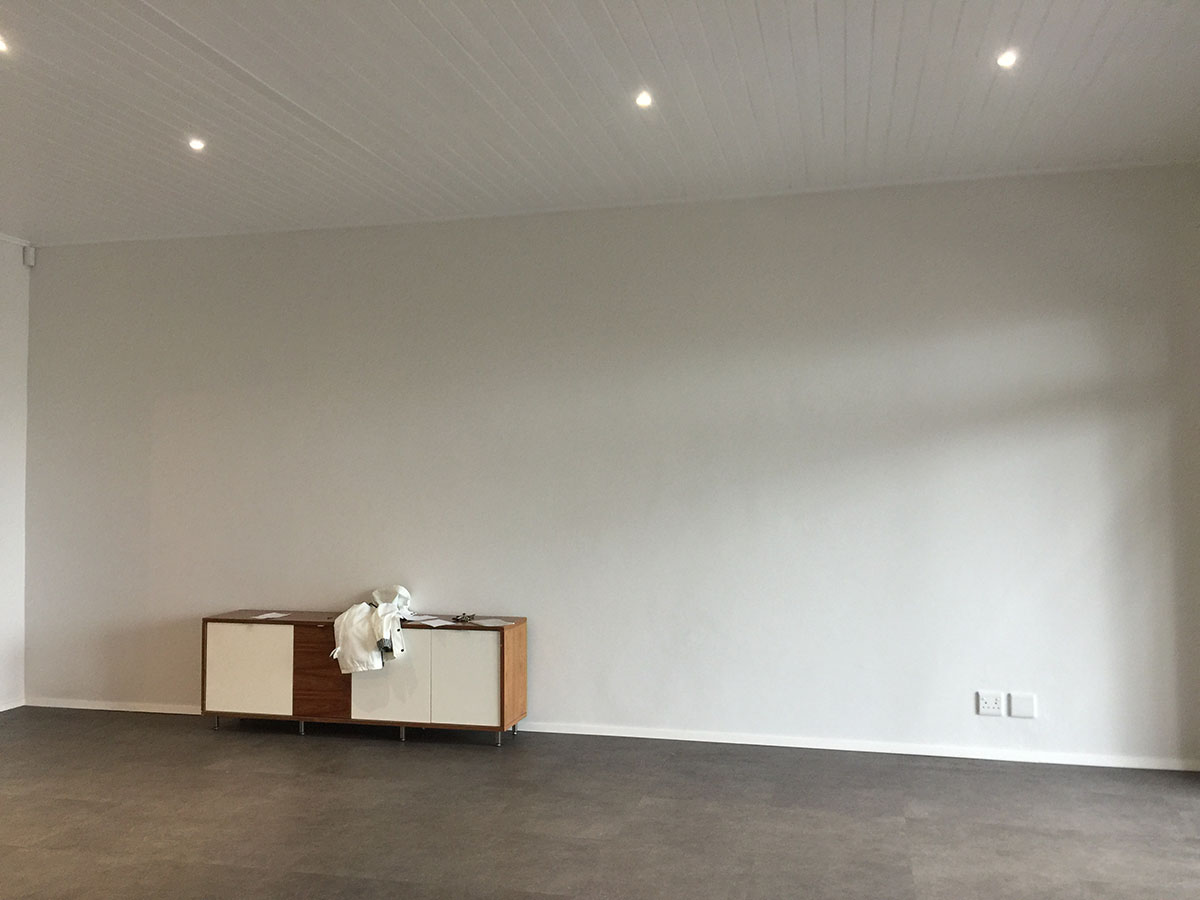
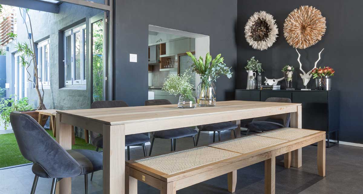
The makeover of this open plan living space is once again testament to the power of paint (and what you can do in a rental home!). When presented with the space – a big open box with dark floors and white walls – it completely lacked soul and personality.
BEFORE
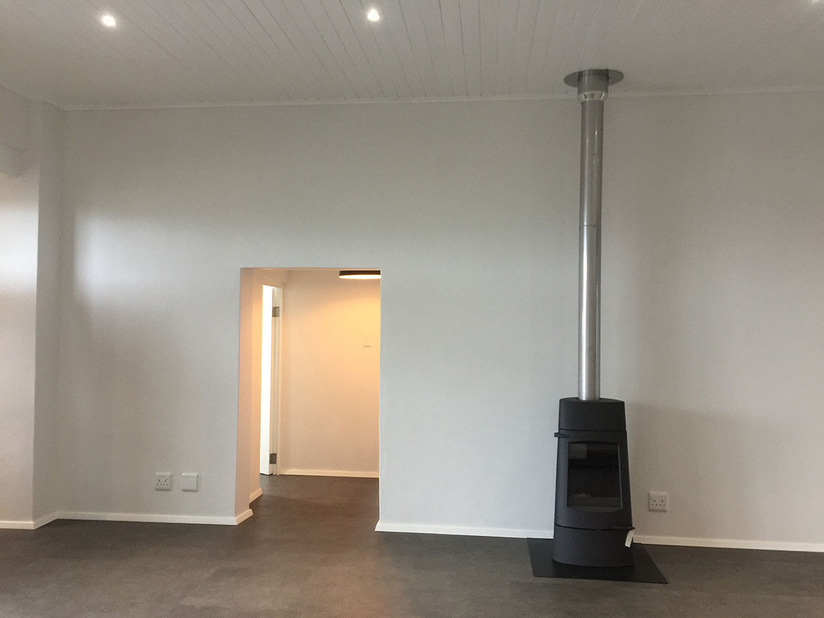
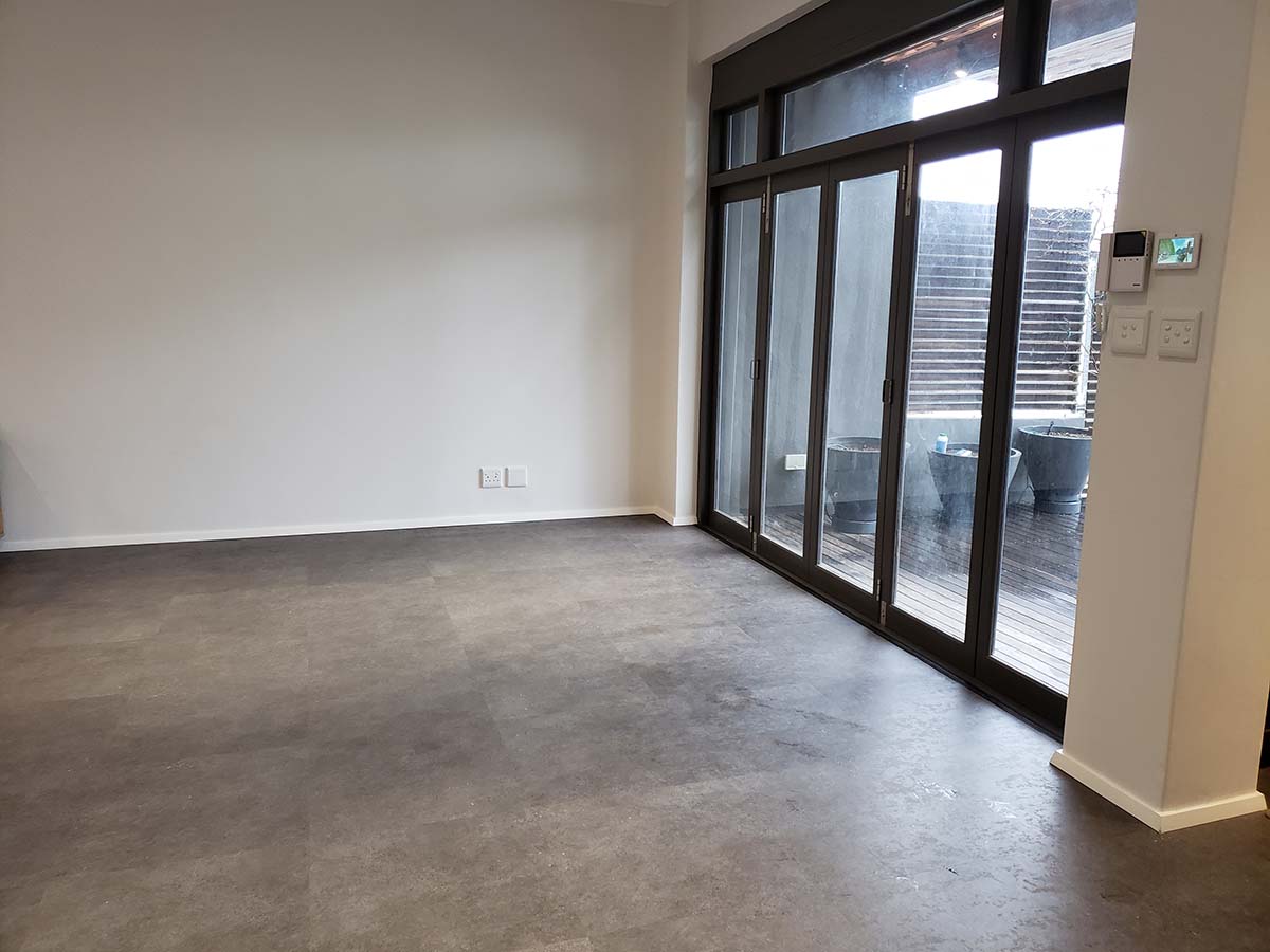
Here we have a quick snap shot of the living area as the big empty box when our clients moved in
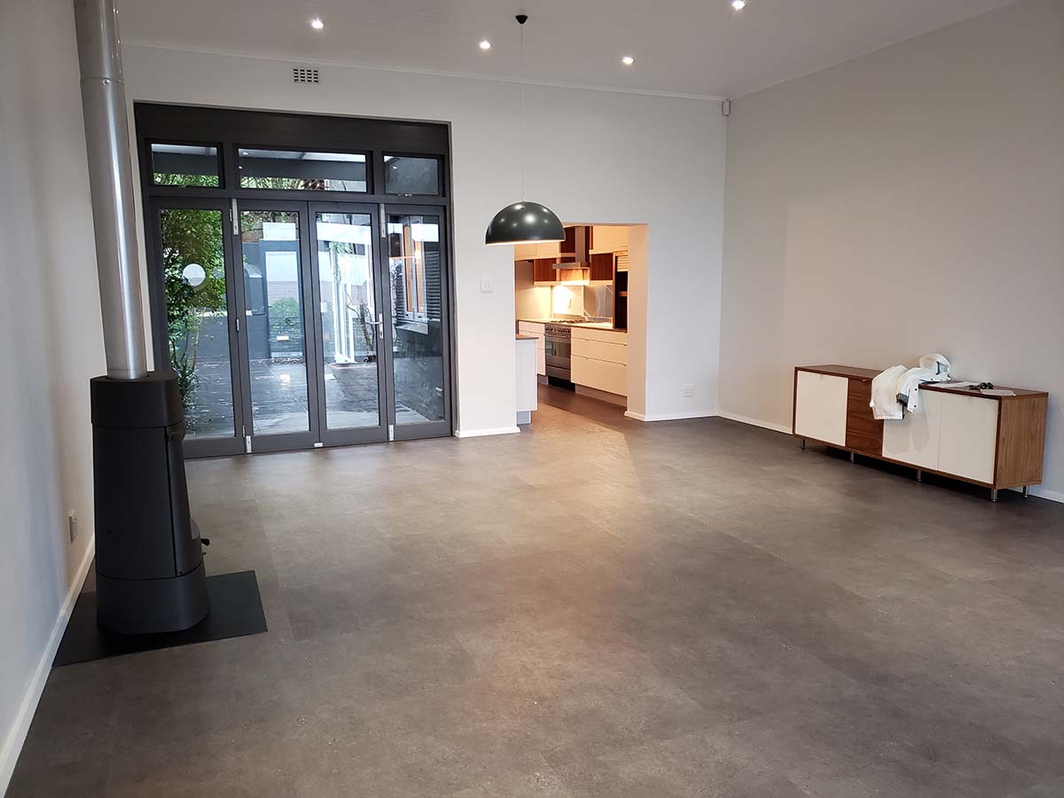
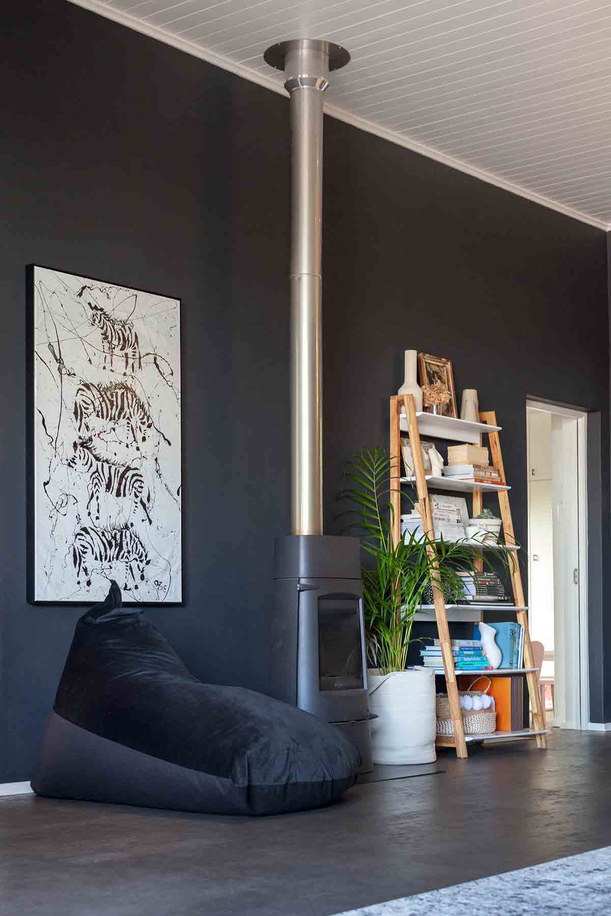
The fireplace, while necessary, was also unfortunately plonked in the middle of a strategic wall in the room, thus limiting layout options in the space. The very dark unit also became a bit of an eyesore against the all white walls. .
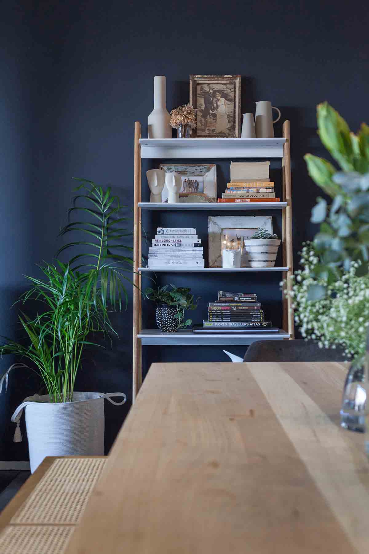
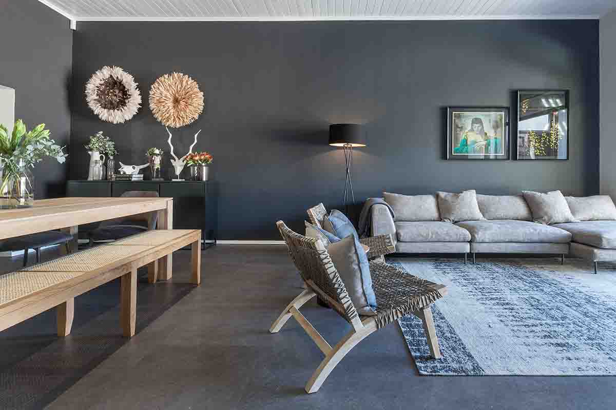
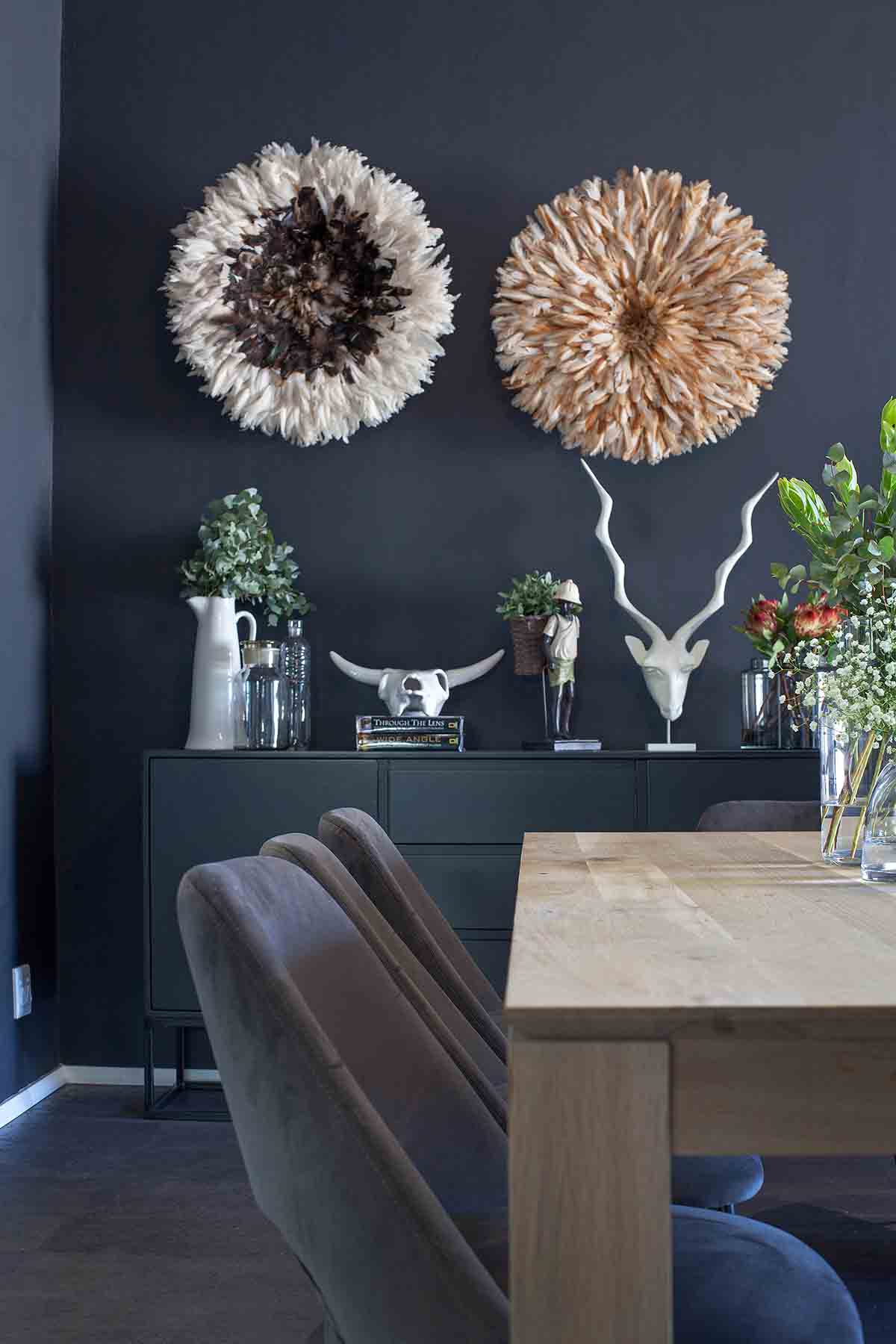
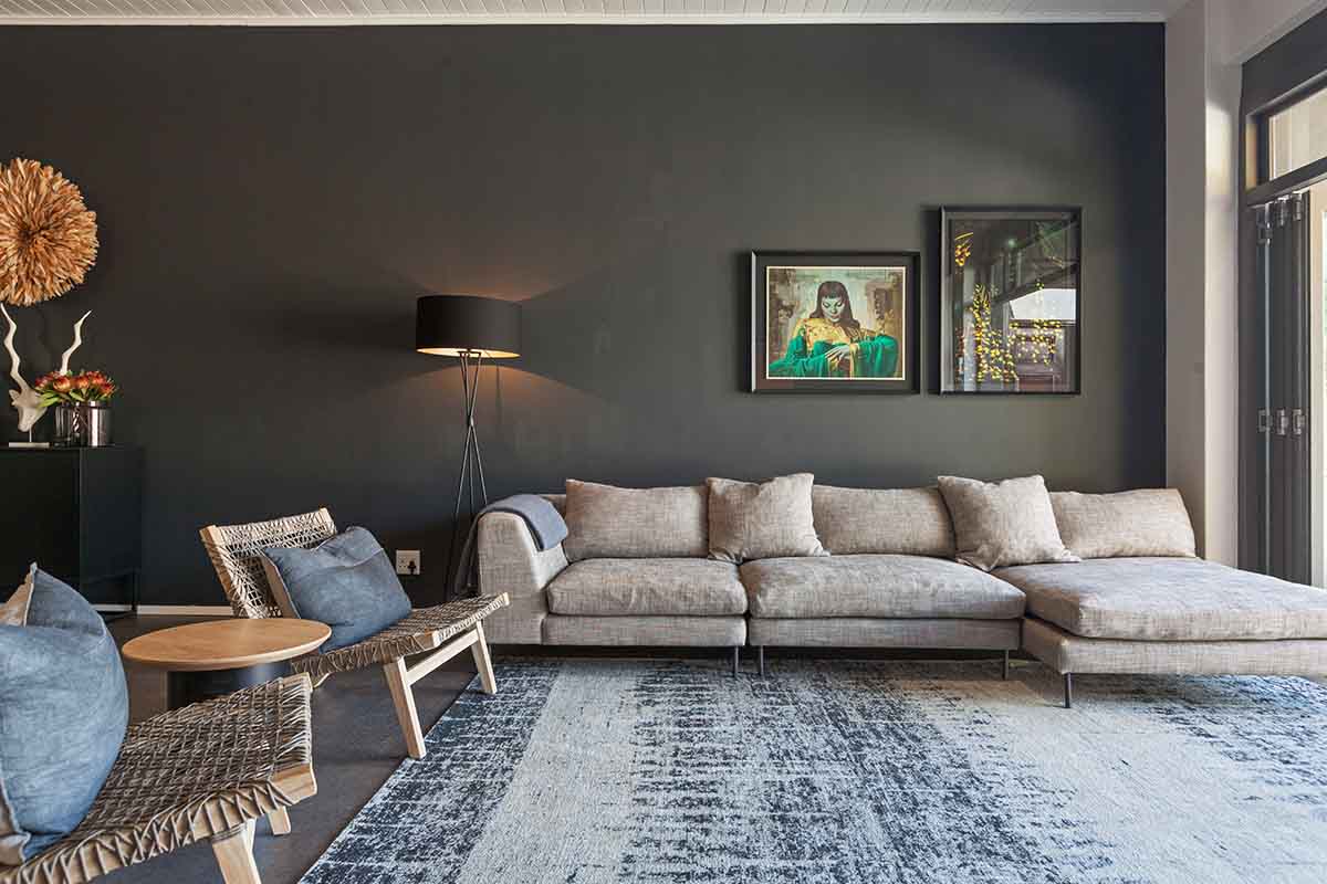
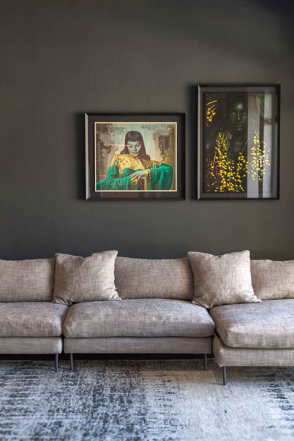
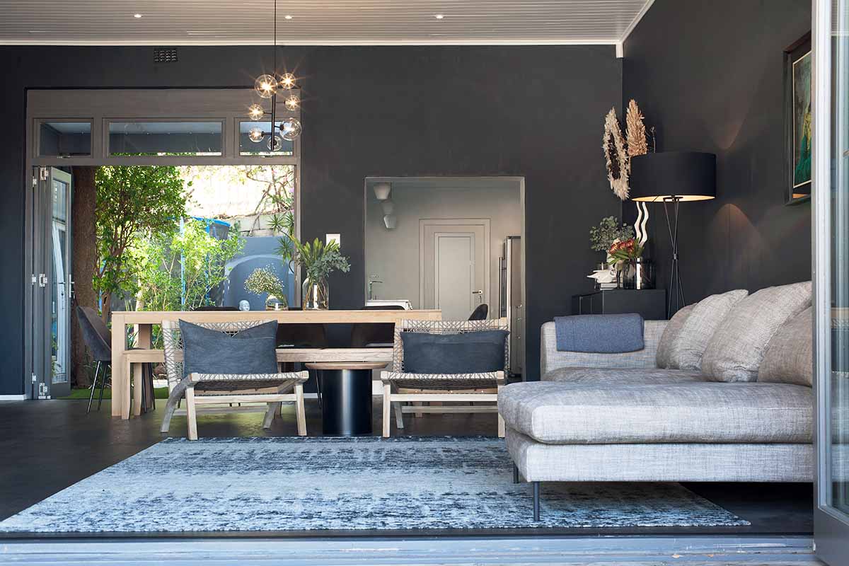
By extending the darkness from the floors, window frames and fireplace through the walls, the room immediately felt warmer and more purposeful, more considered. The dark wall added a little extra luxe to the room too.
Once the overall design concept was in place, we then began the process of sourcing the additional furniture items to work alongside the clients current pieces. Tomorrow we will talk you through a few key decisions and how you can get the look at home.
AFTER
