We’re back at our AirBNB apartment project today, looking at the design for the second bedroom in the apartment. The apartment is multi purpose – it is going to serve as a holiday apartment for the owners when they visit Cape Town, and it is also going to be rented out to holiday makers. With three young boys, it means the second bedroom needs to have some boyish charm, but also be chic and sophisticated enough for adult guests.
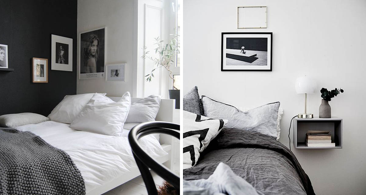
Again working with the overall colour scheme of the apartment we started off looking at monochrome kids rooms for inspiration. Minimal spaces with a few select accessories.


We love how the design of these rooms are so similar in setup – its just the styling accessories that seem to differentiate them from adult and kids spaces.


The secondary bedroom has a more contemporary, scandinavian feeling to it with a black and white colour scheme and minimalist pieces. We decided to move forward with light grey walls to soften the stark colours. Again we’ve tried to subtly nod to our African location through the Clinton Friedman wallpaper and the Vogel wooden nguni wall features.


The space has been laid out with a long custom headboard on the back wall, to easily allow for the re-arranging of the beds in the room from single to double. At the moment only the roman blinds are up and currently the ceiling is being dropped, so we look forward to sharing real progress in the next few weeks.


