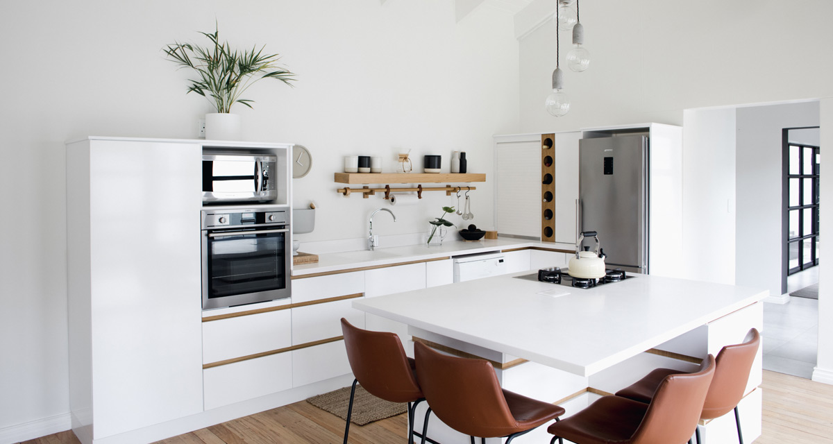
Hold onto your hats, because today we’ve got a beauty of a reveal for you!
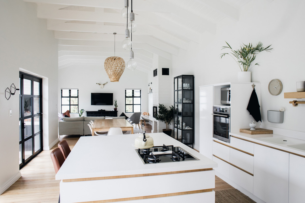
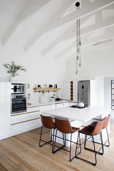
The brief for this kitchen was to create a simple space – yet beautiful and functional of course – that was cohesive with the open living and dining area, but played to the clients love of minimalism. And our designer Claire couldn’t have done it any better.
As part of her design process Claire of course spent some time in Pinterest gathering inspiration and putting her mood and concept boards together.
INSPIRATION
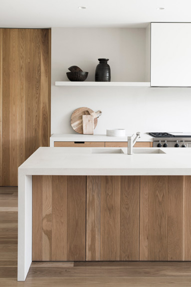
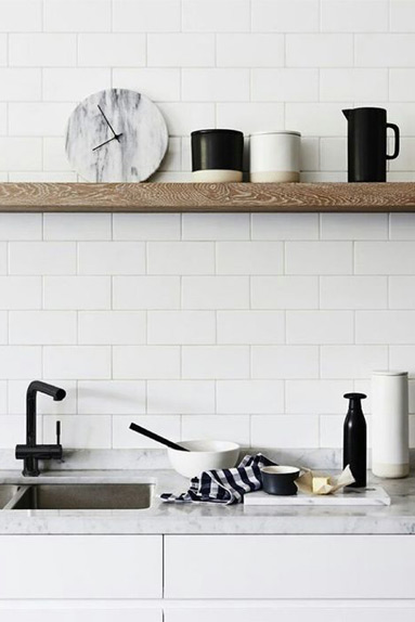
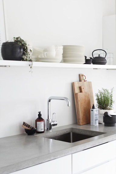
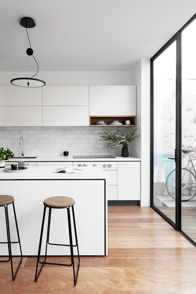
Claire’s focus was to create a mostly white space with subtle uses of natural wood to tie in with the reclaimed meranti wood flooring, and then bring in touches of tan leather and black ceramics for added personality.
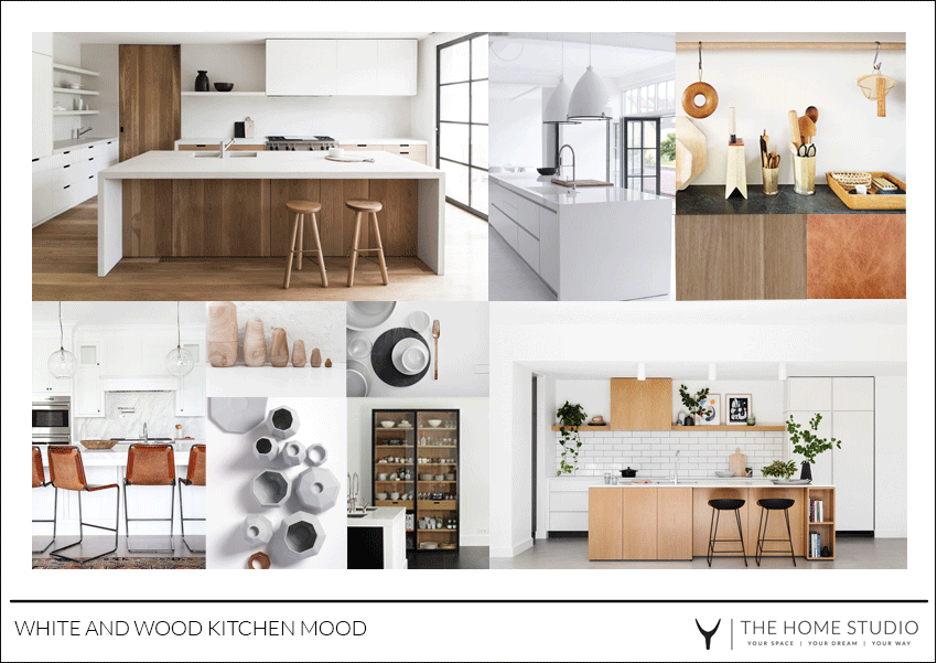
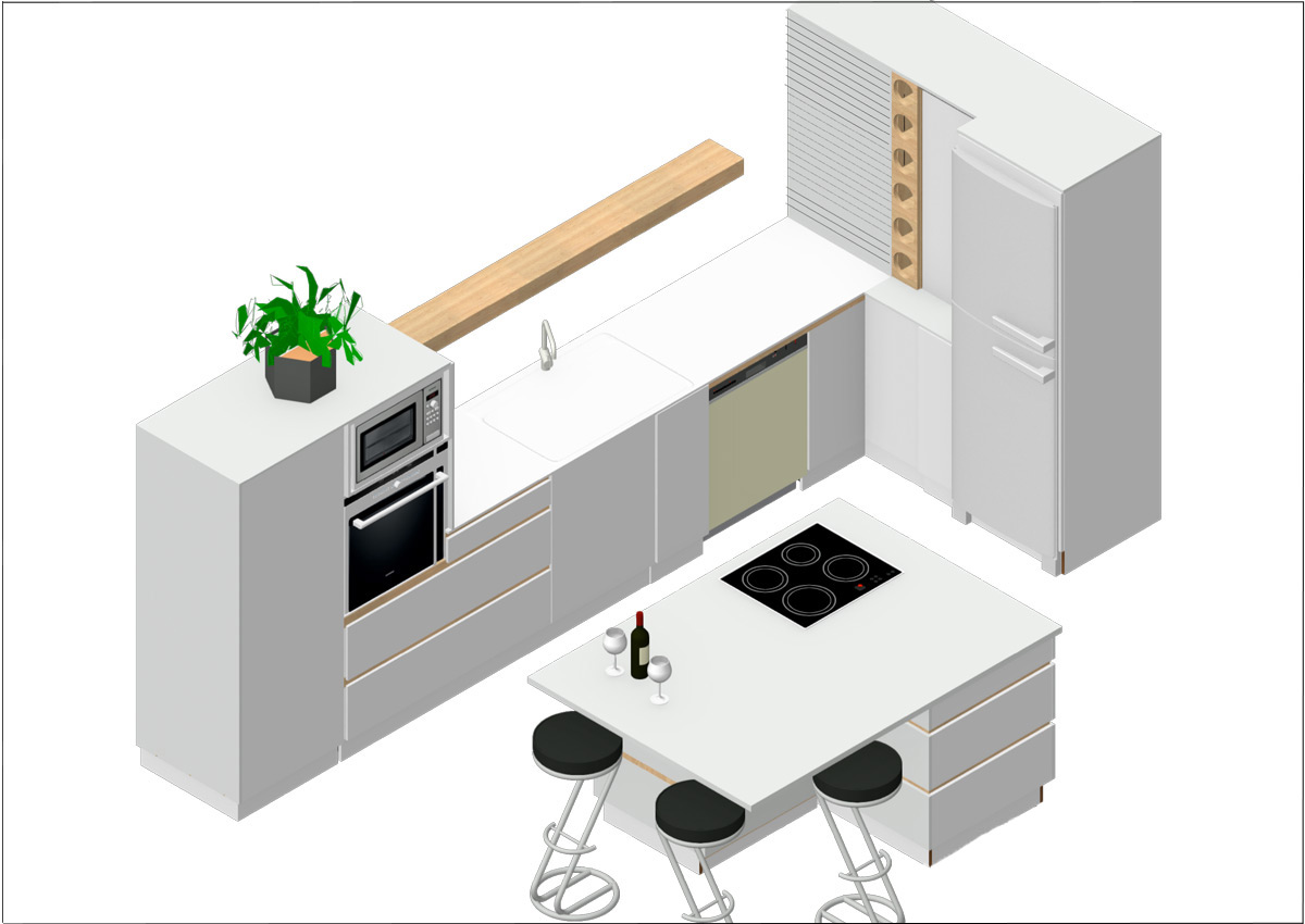
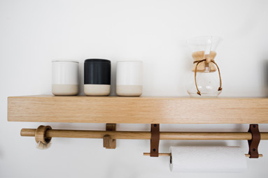
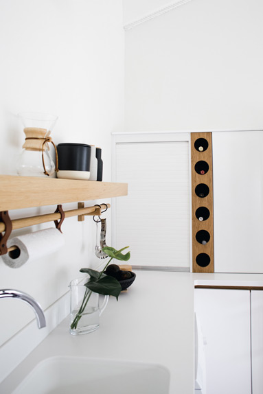
In order to give the kitchen a more open and airy feel as well as the impression of being an extension of the living and entertaining spaces, Claire decided to use a wooden floating shelf as opposed to overhead cabinets. The shelf was fitted with down lights ensuring sufficient light at the sink area.
The cabinets were kept at a fairly low height to ensure they were all easily accessible and in line with other furnishings.
Below is the final 3D layout plan.
And here we have it…..
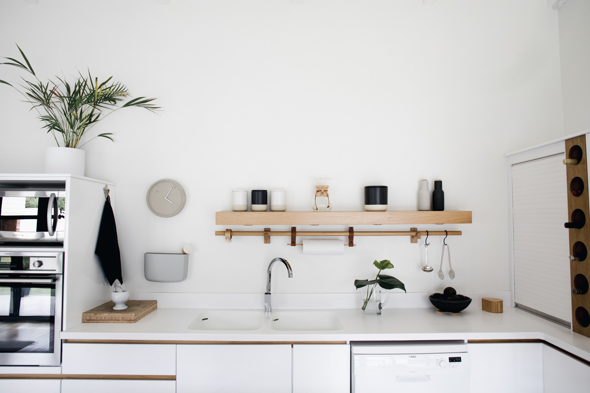
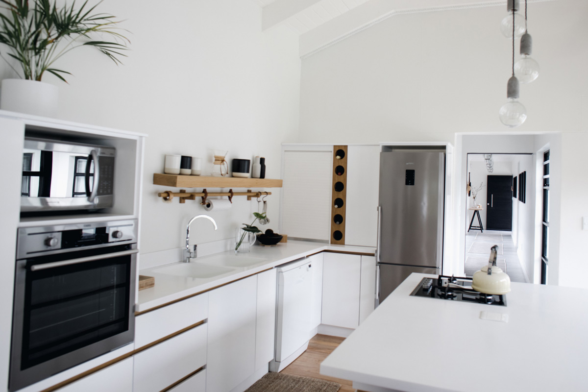
To achieve a modern and minimalist look Claire opted for handle-less cupboards and drawers in a satin white finish. The countertops and built-in sinks were made using Dupont to create a seamless and easily cleanable surface
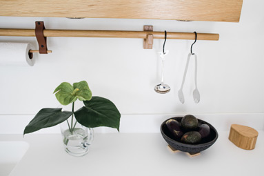
The wooden rail provides the perfect place for hanging utensils, brushes, tea towels or paper towel.
Sigh. An absolutely beautiful kitchen! Keep watching the blog too as we start revealing the rest of the house too….
Photography by Lerike Burger Photography


