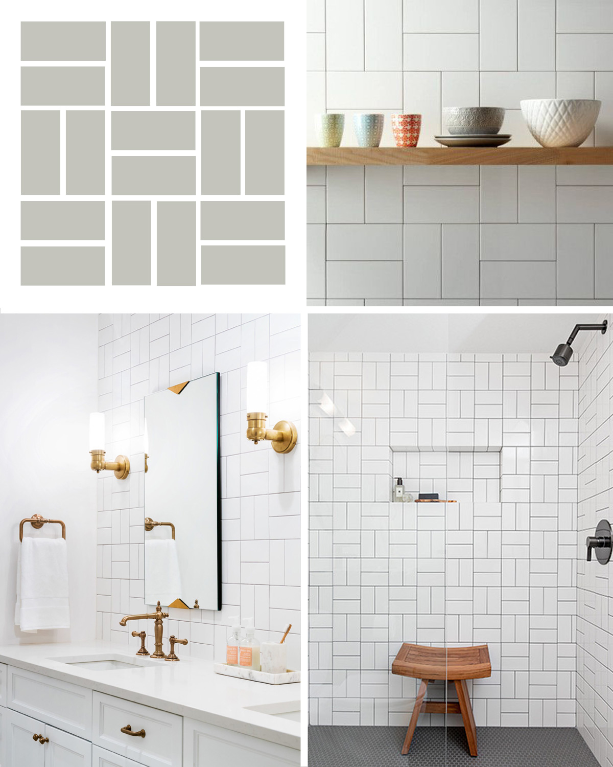
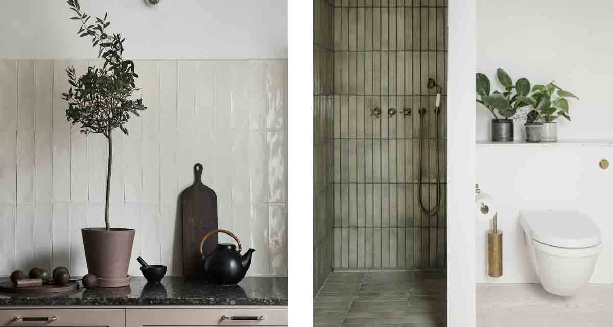
We think it’s fair to say that subway tiles are here to stay. They are loved for their simple sophistication, cost effectiveness and their versatility. The ability to create unique and playful settings simply by tweaking colours and installation patterns is what makes them so great.
Certainly it can seem at times that the subway tile is done to death, but then you see their application re-imagined and they return to their classic cult status.
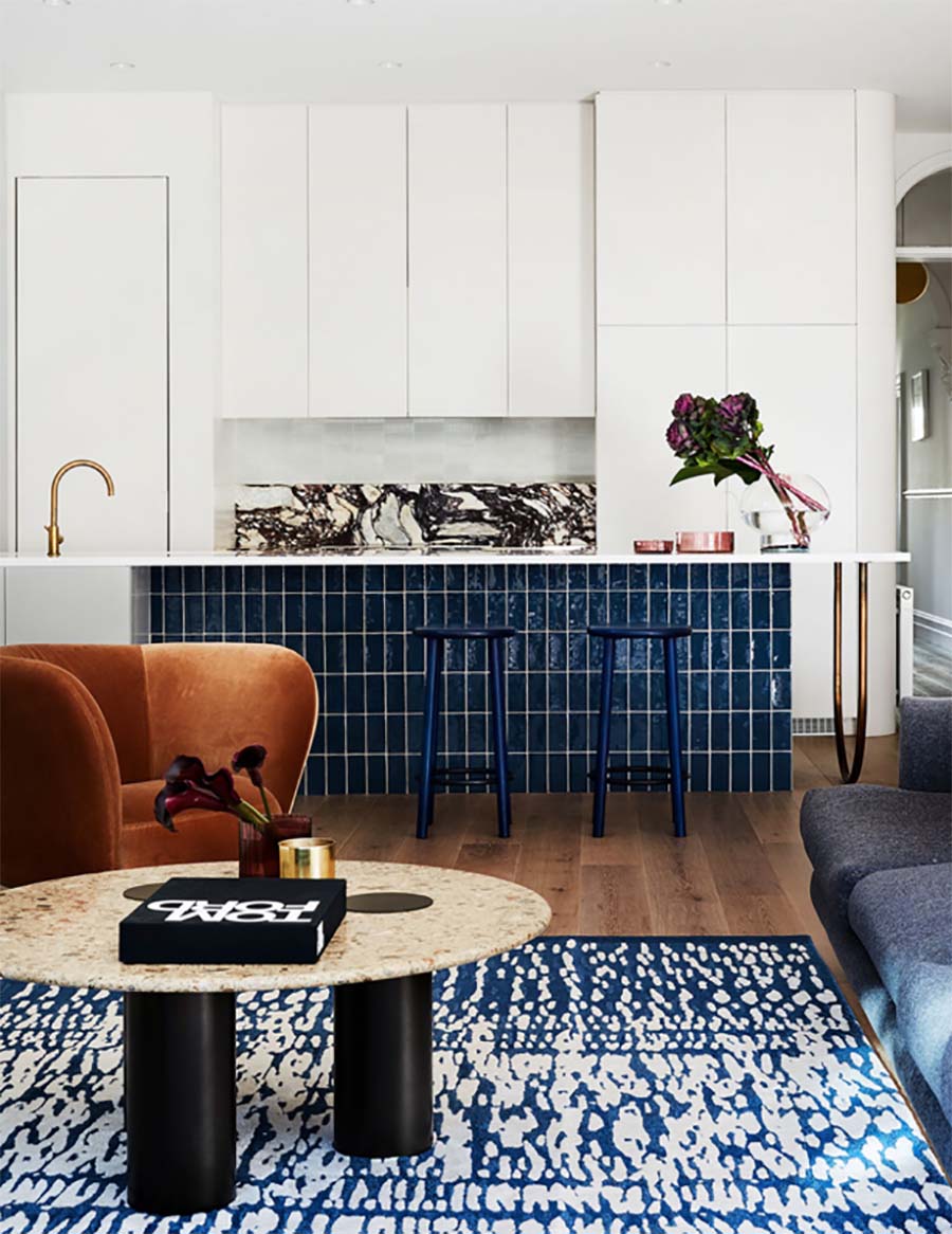
This home has used subway tile beautiful on the base of their kitchen counter. It’s striking and so very durable!
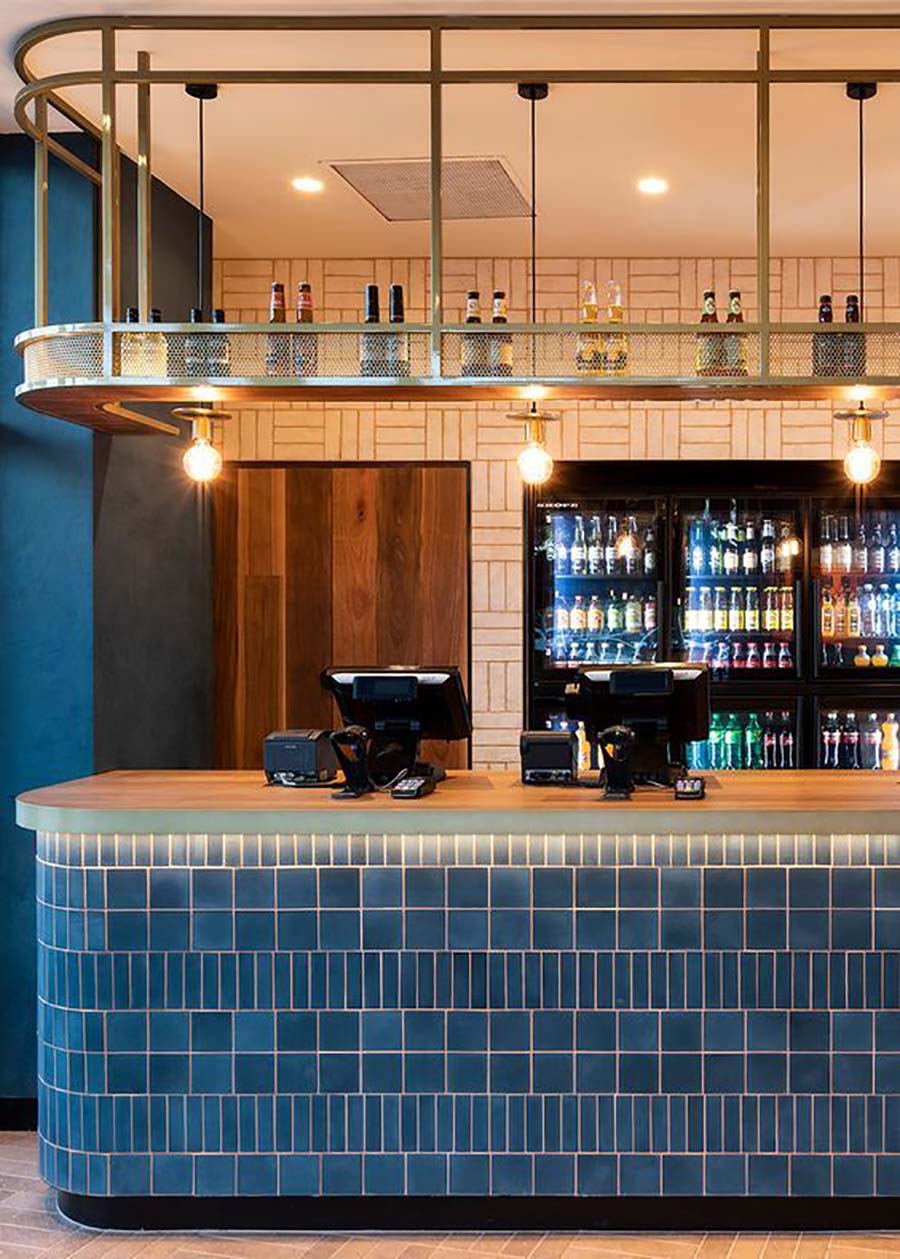
This bar has used two different styles in the same colour way for a striking cladding design surrounding the bar. The back wall is also finished in subway tiles, again in a different colour and installation pattern.
 Images via 1 | 2 | The Design Files | 4
Whether you are using subway tiles for a kitchen backsplash or covering your bathroom in subway tiles, you can change up the entire look and style just by changing their orientation.
These are 8 of the best.
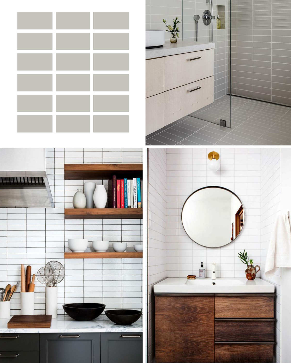
1. Horizontal Stack Bond
This pattern gives a fresh, modern feel with a simple repetition.
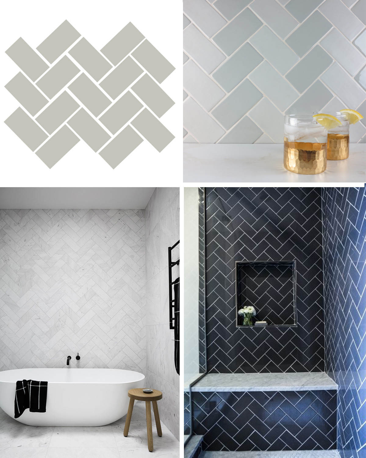
2. Traditional Herringbone
This pattern not only gives visual impact, but also makes an inexpensive subway tile look more luxurious.
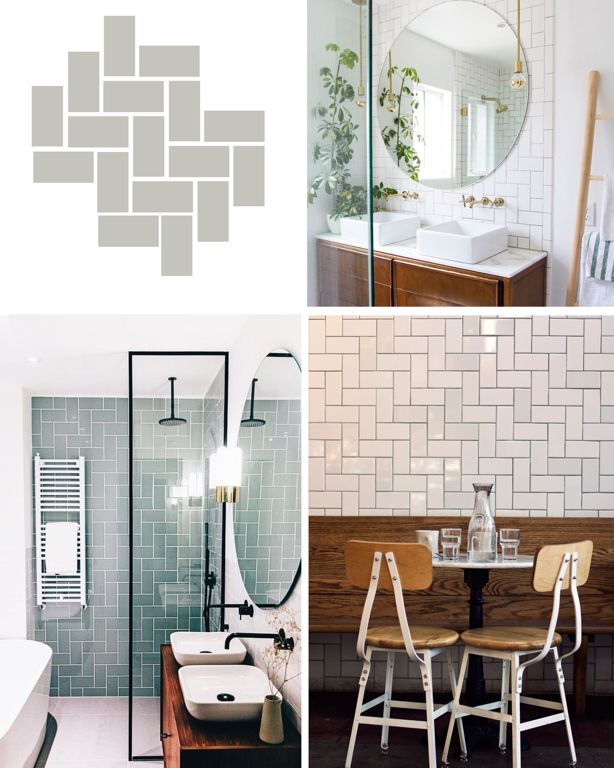
3. Straight Herringbone
Classic and traditional with a twist!
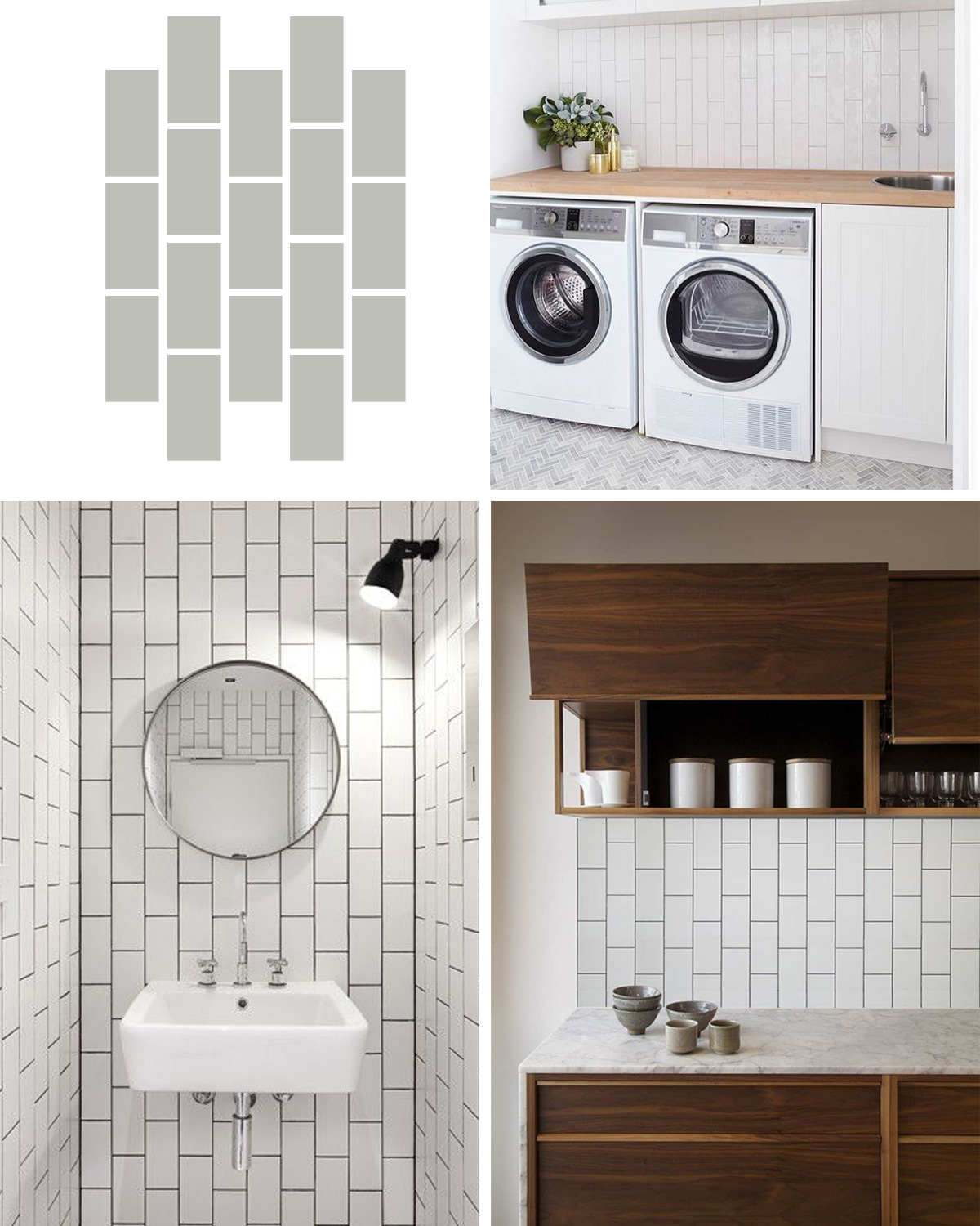
4. Vertical Running Bond
Great for making a space appear taller.
5. Diagonal Offset
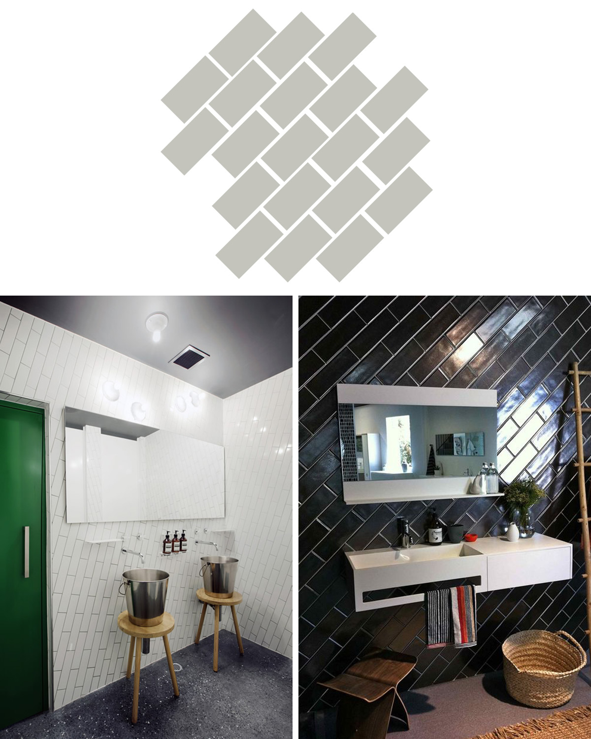
6. Vertical Stack Bond
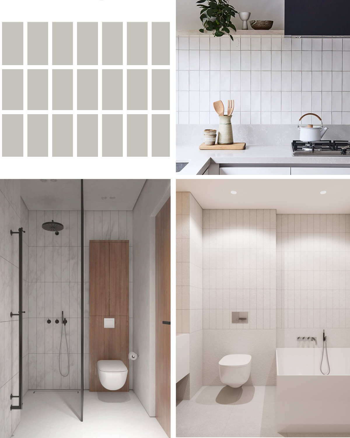
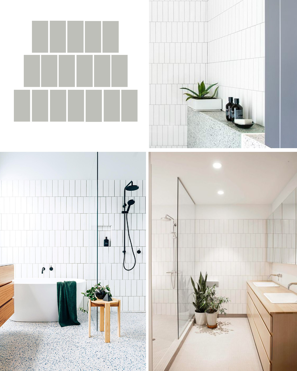
7. Vertical Offset
We love this application. There is something so retro modern about it.
8. Crosshatch
This pattern gives the illusion of squares and can add subtle pattern to a neutral space.
