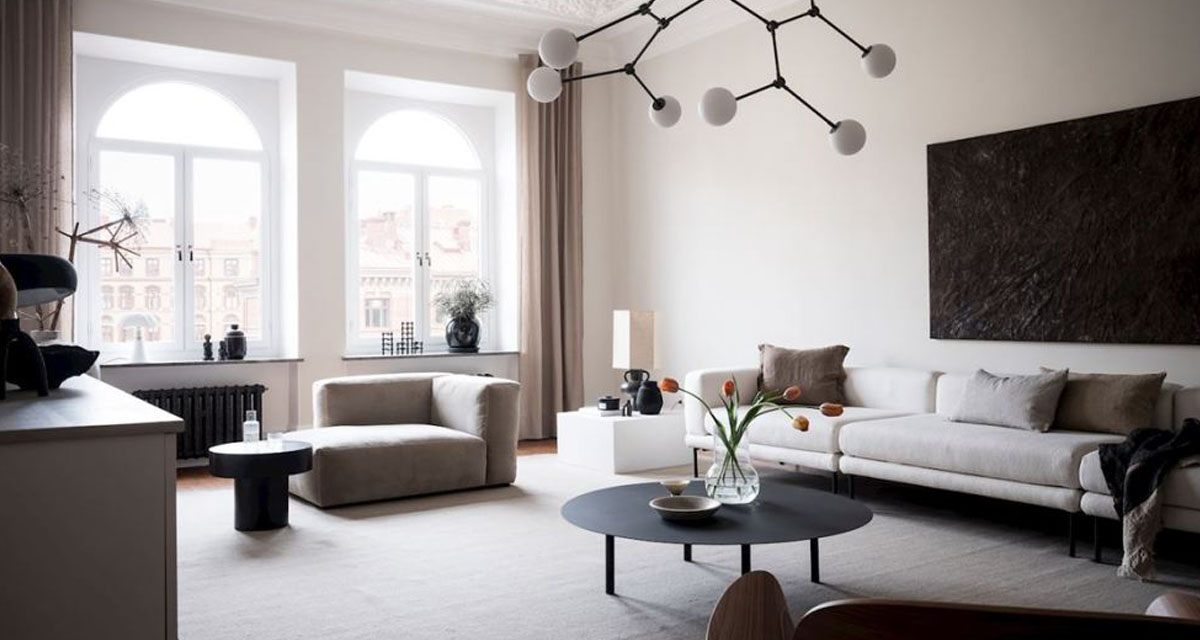
We’re hesitant to call these rules. They’re merely guides to help you think about all the elements of your living area working together. Let’s rather call them ‘rules of thumb’ for designing your living space.
Of course there are exceptions to every rule, and what is most important is to find what works for your personal space. However these guides should help get you most of the way there. And if not, well, you know where to find us!
Sofas + Finishes
Sofas are a big investment, so it is worth spending time choosing the right sofa for your living space – and also the life that you live. Nothing is of course “life proof”, but thinking about how your pets, children, partners, housemates will interact with your sofa is all a good first step.
As is the placement of the sofa. For example is your sofa going to get loads of sunlight? It’s no good choosing a lovely bright fabric only for your sofa to sit in the sun all day and the fabric to fade within a week.
I’m a fabric over leather gal myself, and a beautiful linen is my favourite choice. However a full-grain leather can withstand a lot of wear and tear, so if you are particularly worried about damage to a sofa then perhaps this is the route for you. Dark fabrics easily hide marks, but could possibly fade or discolour with regular washing.
Even with two small people in my house and many sticky fingers, I’m still a fan of white and light fabrics that are much easier to wash (or bleach) on a regular basis. I’m told cats avoid velvet furniture, however I believe their hair also sticks to it. Sofas with removable or slip covers are a requirement for anyone with a need to clean.
If you are keen to bring in a statement fabric or colour into your living space we recommend starting with the armchairs. They will give you a taste of the style, and are easy to style with scatter cushions. They are also a more affordable option to reupholster down the line if your fabric experiment doesn’t work out.
Space Planning + Layout
If possible, don’t push your sofa flush against a wall. Even if the intention is for the sofa to back up to the wall, try to leave a little breathing room behind it. This is especially relevant if you have drapery hanging behind the sofa.
Considering the circulation and flow of the room is essential. When planning the layout of your room you need to leave enough space for people to move about freely. With the sofa as your focal piece, you can layer in armchairs, benches and stools to add more seating to your space. These items are also easy to move around and re-arrange as it suits your needs and visitors.
You’ll need to scale the size of your furniture to match your space. Just remember that smaller pieces don’t make a room feel bigger.
Coffee Table + Side Tables
As a general rule, your coffee table should be at least half the length of your sofa. This way the scale of the pieces work together and it creates a more pulled together look overall. For round coffee tables, considering grouping of medium sized and smaller options to help with the scale.
You’ll also need to take into account the layout and other shapes happening in the room. A rectangular coffee table can help with needed circulation and thoroughfare, while circular tables tend to work better with corner and L-shaped sofas.
The same thinking applies to your side tables. If all your other pieces are rectangular or square styles, then when it comes to the side tables, consider round pieces to balance the overall style. And of course they should not be deeper than the sofa or armchair next to which they are placed.
It’s all in the legs!
Once you’ve identified your key furniture pieces (but before you make any purchases) have a quick look over the style of each piece. Does everything have a leg? If it is all starting to look to matchy matchy, mix your styles to break it up.
Rugs
We talk about rug sizing time and time again, because it can really make or break a room. The rug needs to be large enough for at least the front legs of your sofa to sit over the rug, as well as all of the chairs in the room too.
A rug that is too small for a room is like watching someone wearing a pair of trousers that is one size too small. It just looks uncomfortable.
Lighting
This one often surprises people, but remember to layer your lighting too. Mix up ceiling, wall, table and floor lamps for variable lighting options. Scale is also important, and needs to work with the available space in the room.
Floor lamps are great for filling corner spaces, but if floor space is at a premium, in your home then rather consider wall lighting instead. Think about placing it at a similar height to a floor lamp, to get the same lighting effect.
Make sure the shade of your floor lamp covers the bulb when you are sitting down. Otherwise it will feel like a spotlight in your eyes. And don’t forget to plan for power outlets and cords!
Finally, don’t forget to have fun!


