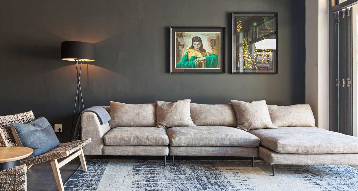
We recently revealed the makeover of the box-like white open plan living and dining area in our client’s rental home, into a much darker and slightly more masculine space. Today we’re behind the scenes, talking through a few decisions and helping you get the look at home.
In the living area the clients brought with them their sofa, media unit and the TV. The dining table and benches they owned were small legacy pieces from their days of living in small apartments overseas. Our FF&E list included a rug, light, occasional chairs, side table and some artwork for the living area. A new dining table and chairs/ benches and a sideboard were listed for the dining space.
There were a few minor constraints in the room due to the fireplace that had been installed in the middle of the main wall, which then affected where one could hang a TV. The space to the left of the fireplace was too small for the TV and too close to the heat, the area to the right could probably take the heat, but was too far from our ideal sofa location. In the end we squeezed the clients current media unit – which fitted with 1 cm to spare – onto a small wall near the entrance to the room.
While the high ceilings had recessed lighting, there was also a very low hanging pendant light, which not only knocked people on the head, but also indirectly dictated where the dining table was to be placed. The client also wanted to swap this out for a modern, lighter looking piece.
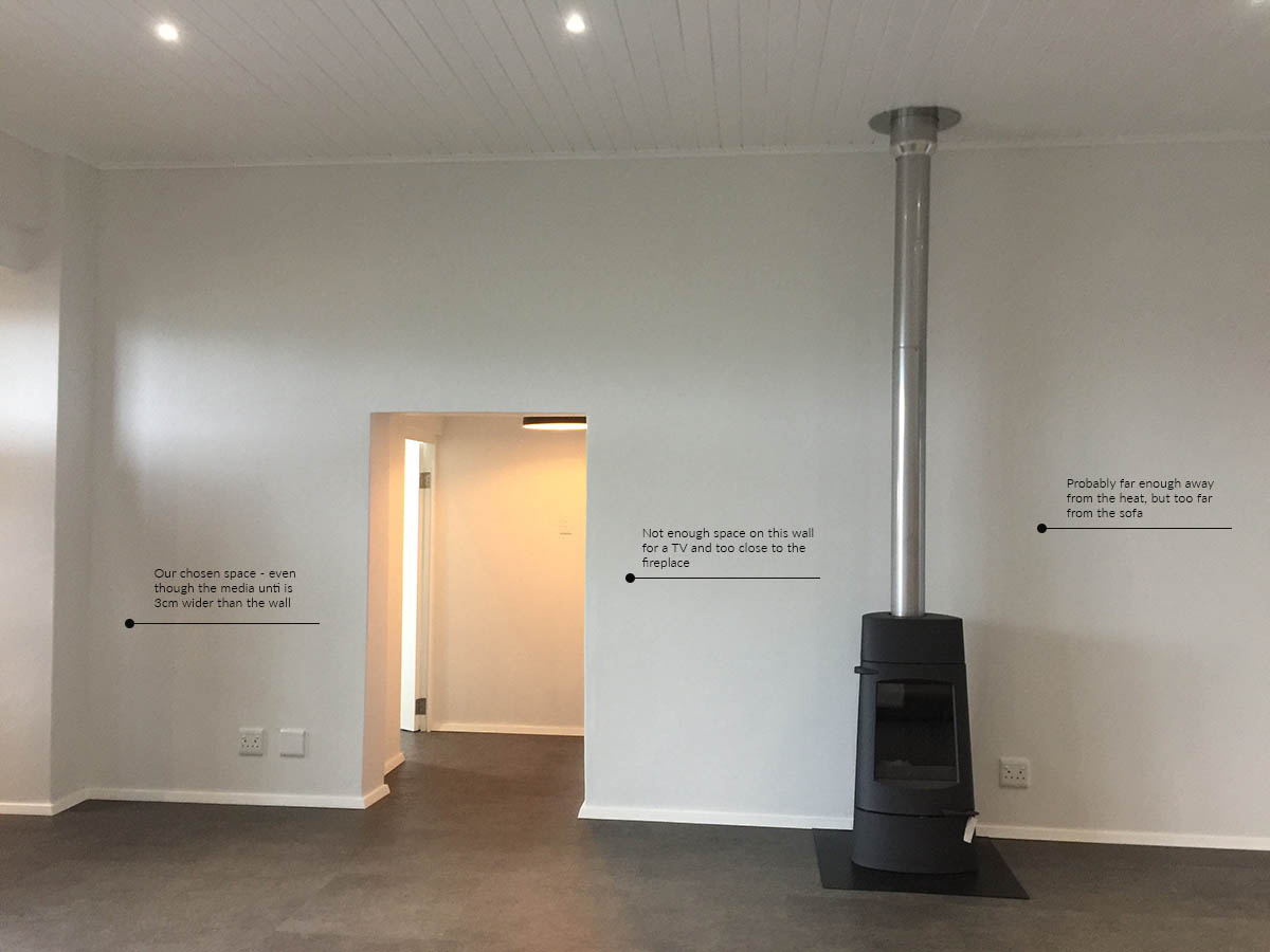
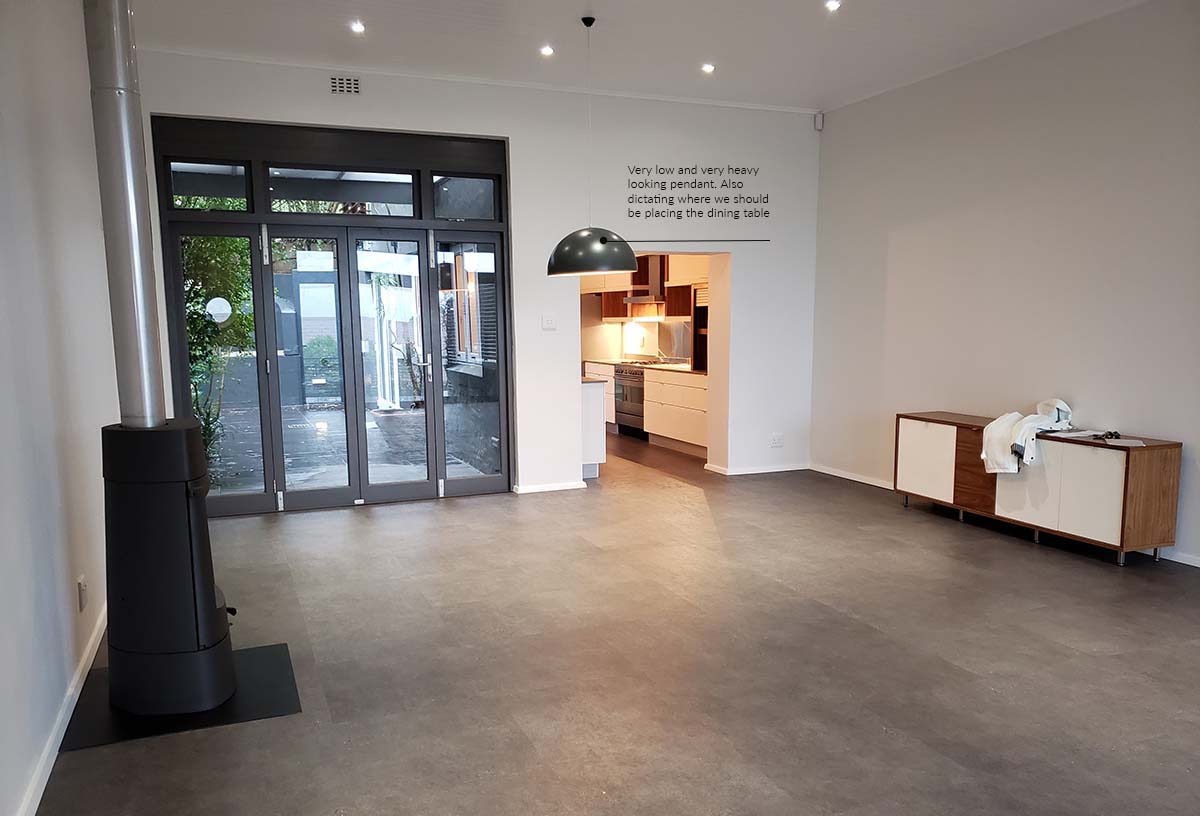
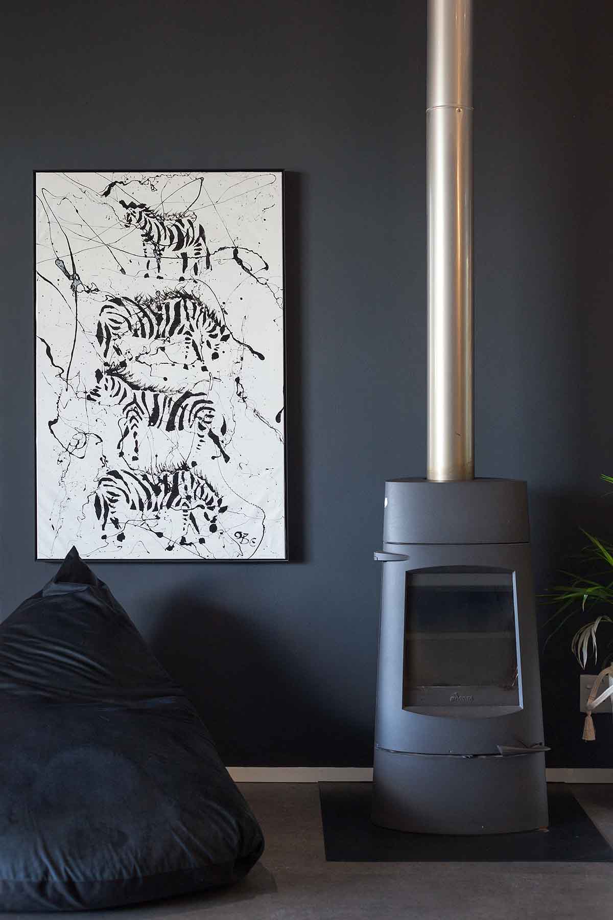
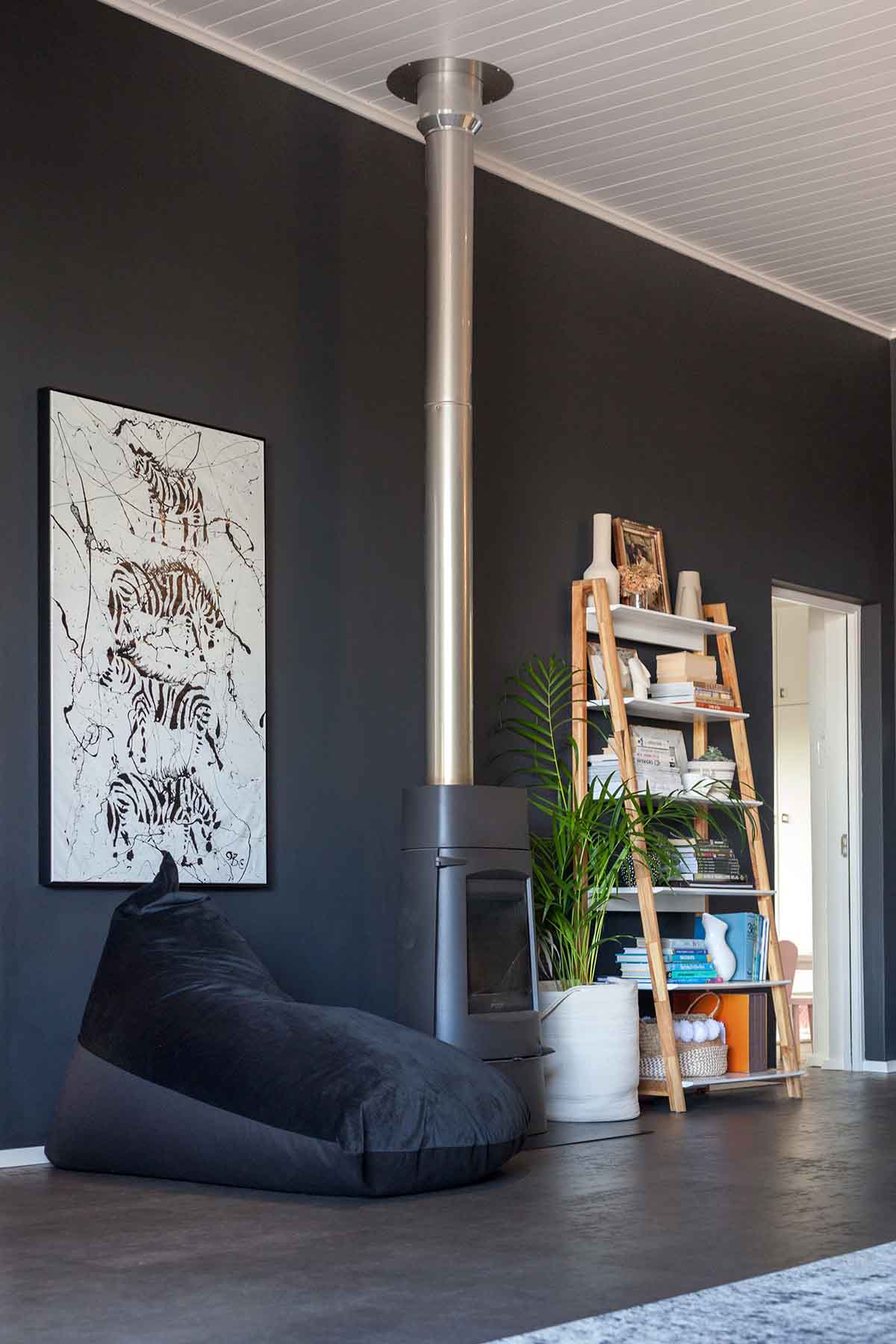
Once we painted the walls the fireplace was ‘absorbed’ into the wall, making it far less of an eyesore in the space. The walls on either side became more styling props than anything else, as practically you can’t really have people sitting on either side of the fireplace.
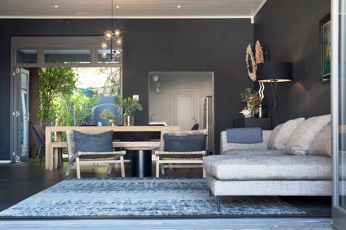
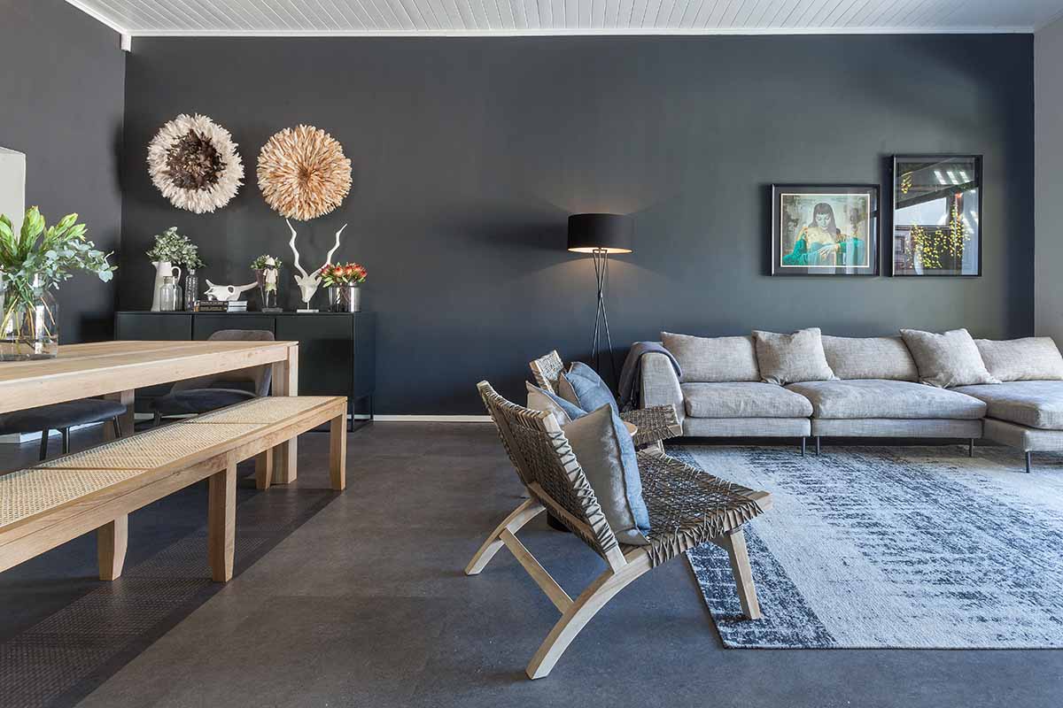
When it came to the rug, we decided on the Bargello from Hertex pretty quickly as it fitted all our requirements. We wanted something with an abstract pattern and low pile – this makes it low maintenance for dirt and wear and tear – and also something that had a mix of dark and neutral colours to tie in with the walls, sofa and wood furniture.
The occasional chairs proved more of a challenge, as the client could not decide on the style they were going for here. This is just a little selection of the styles that we went through.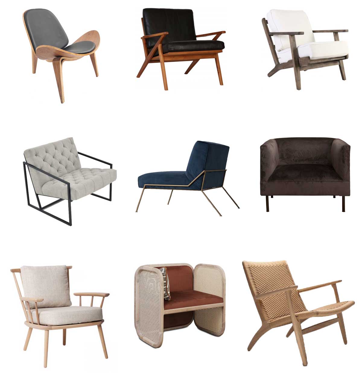
Ultimately they fell in love with the Hans Wegner CH25 chairs, which even if they are readily available here in South Africa, way exceeded the client’s budget. Aren’t they stunning?!
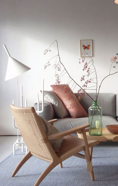
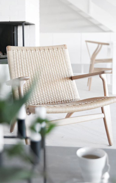
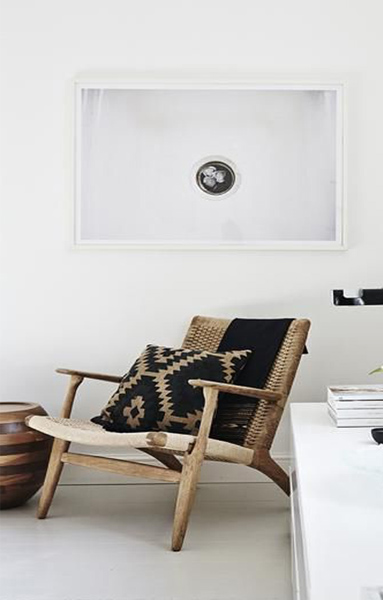
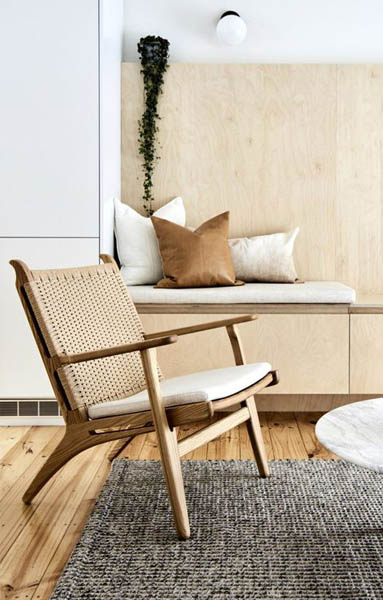
Finding something similar brought us to a bit of a dead end. The client was after the low reclining chair style, and they loved the woven element. Since nothing was living up to expectations we decided to tweak the end goal.
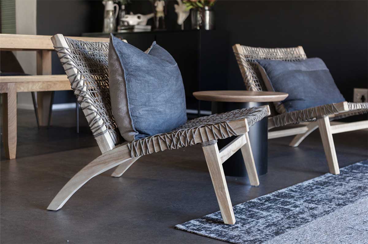
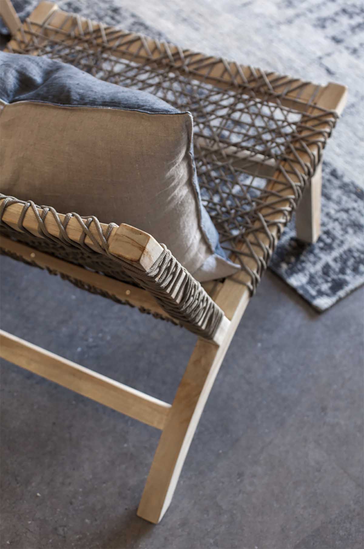
The Ashanti chair from Weylandts offered them a low reclining chair with a woven seat and back – albeit a much looser weave. However the chair itself is far more chunky and masculine than originally desired. The client went with these chairs because they are outdoor pieces and come summer they can move the chairs outside onto their deck and upgrade the indoor chairs when they come across pieces they love.
With the new dark walls in placed, the client took it as the opportunity to finally make the investment in a Krisjaan Rossouw print, knowing it would sit beautifully against the dark backdrop.
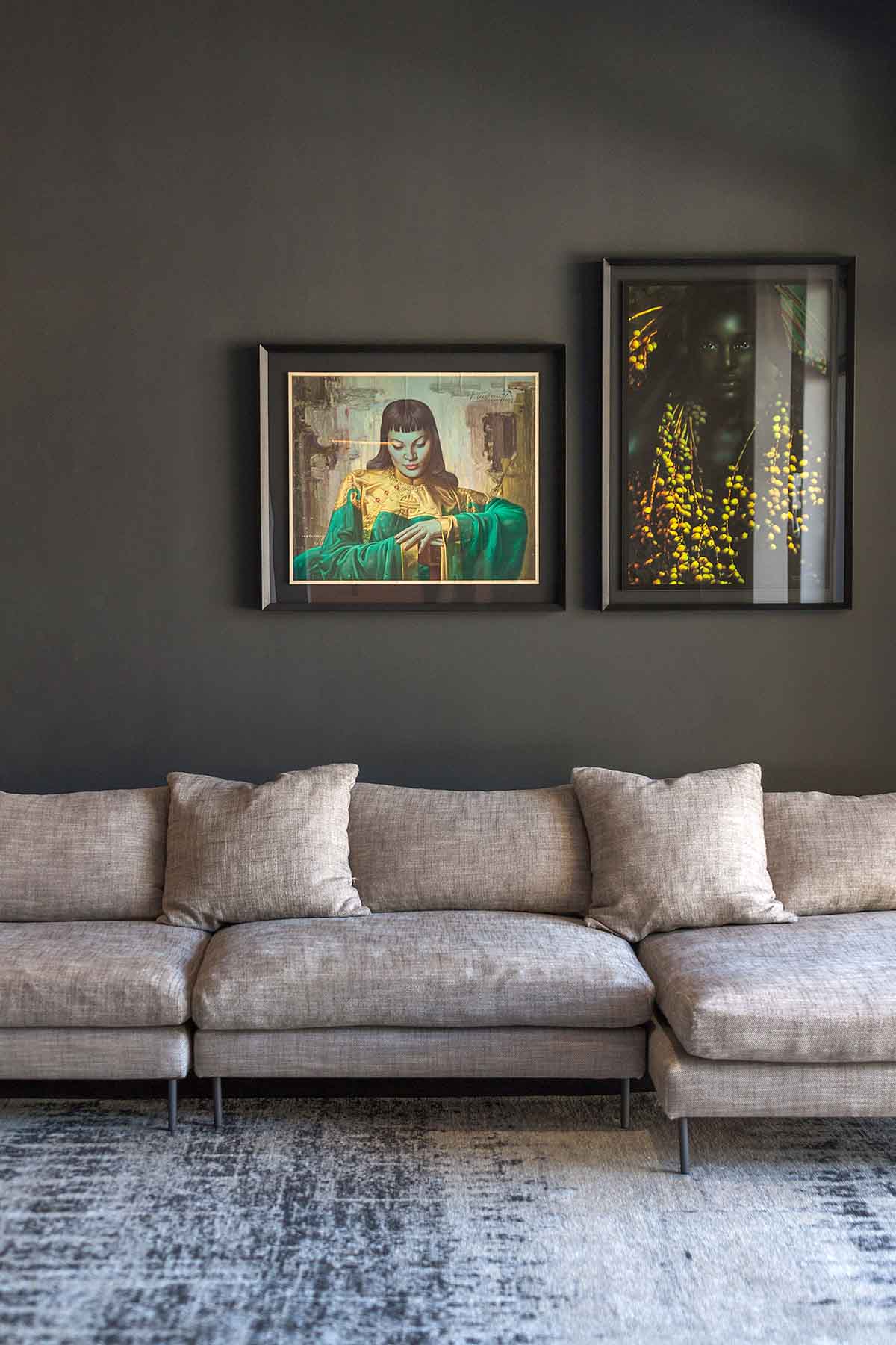
The question of the coffee table gets raised a lot too. Why is there no coffee table?Ultimately we decided that because the flow of this space is very indoor outdoor, and with two small children running around and playing on the rug, we didn’t want to fill the space unnecessarily. We believe that the coffee table would get in the way, rather than be a useful addition to the space.
Should we have brought one in for the photoshoot and styling? Quite possibly yes, as it would certainly make the space look ‘finished’, but we decided to go ahead with the real life reality of the space.
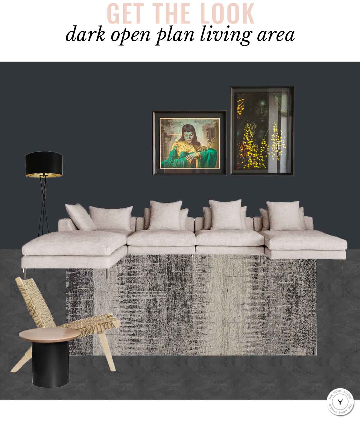 Paint is Tribecca Corner from Plascon | Como Modular Sofa from Weylandts | Bargello Rug from Hertex | Ashanti Occasional Chair from Weylandts | Drum Side Table from LIM | Mia Black Tripod Floor Lamp from Knus


