Every minute of every (working) day of every month we are focussed on creating beautiful spaces for our clients. This could include a home that reflects the needs and personalities of the people living there, a visually motivating and productive office environment, or a unique restaurant experience that engages all your senses.
This act of personal expression is available to everyone. The creating, designing, imagining what it will be – well, that’s the fun part. Then there is the maintenance side – the less than thrilling and often expensive side
I often wonder how any of us tackled our home design projects in the days before Pinterest and Instagram? That being said, the flip side to having so many amazing resources available at our fingertips is that you can easily be overloaded with information and suffer from decision paralysis. We know that thinking about which of the 50 flooring samples is THE perfect one for your home can leave you spinning in circles!
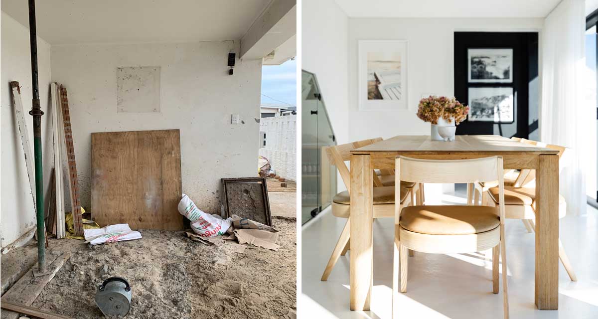
When it comes to makeovers and renovations, what we really want to impress here at The Home Studio, is that size does not matter. Small budget makeovers are just as exciting and important as those homes undergoing full gut renovations (and certainly a lot less stressful, costly and messy!).
Just remember, you don’t have to go from nothing to something incredible for the process to be worthwhile. Most of the time it’s just about enhancing the space you already have.
Small changes can have a big impact on your space and don’t have to cost an arm and a leg. With the change in lifestyle we’ve all experienced over the last few years, and the renewed focus on our homes, we know that bringing a little change and possibly some order to your surroundings goes a long way to how you use and enjoy your personal space on a day-to-day basis.
And since we are always happy to share design advice, you might be surprised to hear our stance on these long running design debates.
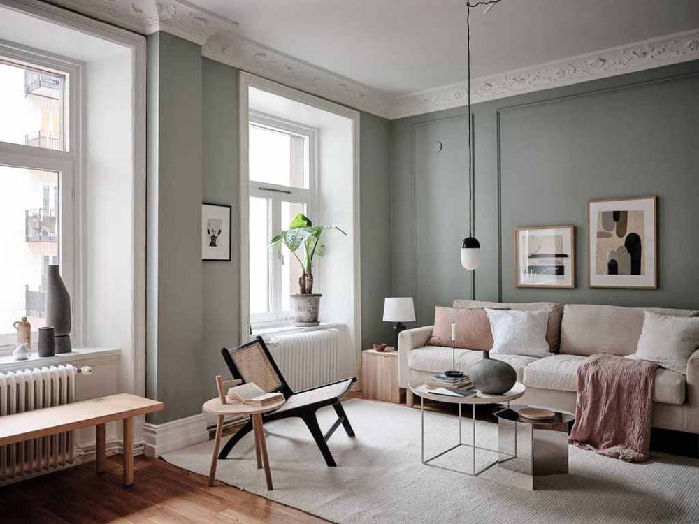
ACCENT WALLS. NOT OUR FAVOURITE FEATURE.
 Image via Coco Lapine Design
We believe there is a specific time and place for accent wall, making them difficult to pull off and most people don’t get them right. Using paint colour in small doses, like accent walls, can so easily go wrong. Thinking about where the colour starts and ends, and whether to incorporate skirting, cornice and ceiling are all part of the result.
If you are bringing in colour, we say go for it and go bold. The results are far more powerful and the space feels considered, rather than an afterthought.
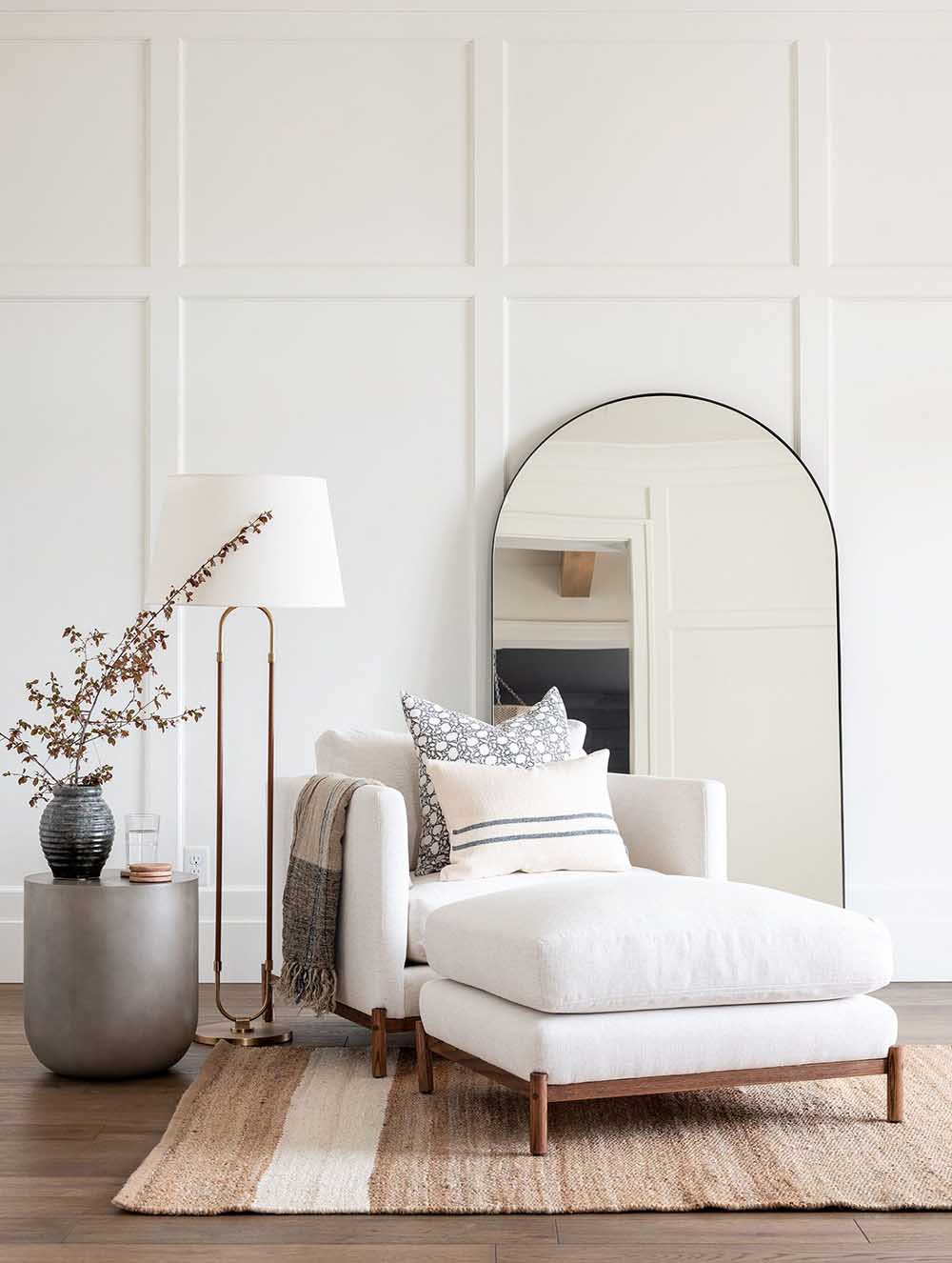
MIXING PRINTS AND PATTERNS. WE ARE HERE FOR IT.
 Image via Studio McGee
Mixing prints and patterns have long had a bad rap, but we are here for it. If there is one way to make a simple space feel glamorous and luxurious it is with the addition of prints and patterns.
When we talk about bringing prints and patterns into a client’s home, they immediately think colourful and bold and are ready to bolt. With so many options available in the market you can still achieve a neutral and tonal palette even while incorporating prints and patterns into your home.
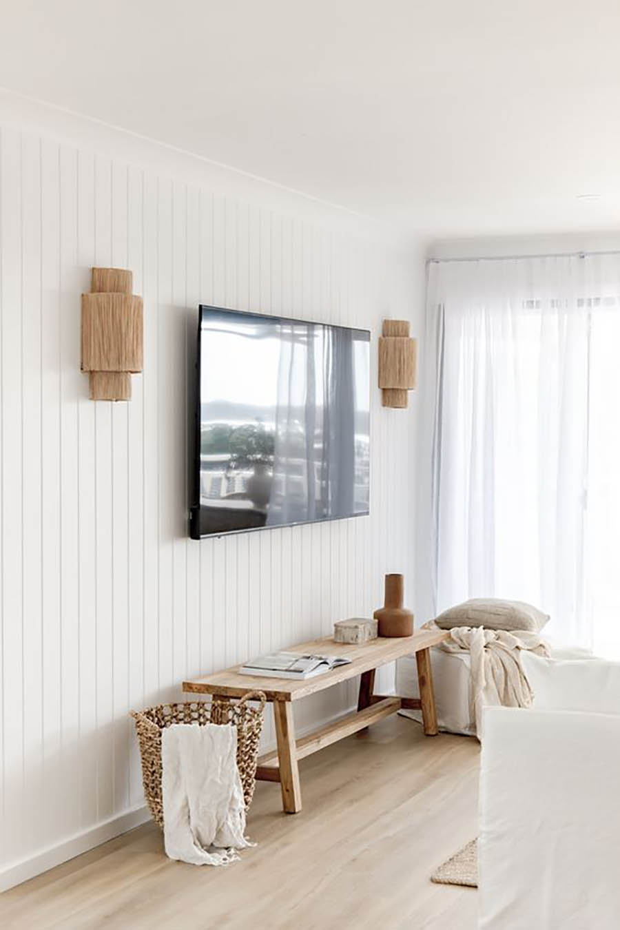
PENDANT CEILING LIGHTS. WE DON’T LOVE THEM.
 Image via Studio McGee
We know that our clients love to include pendants over kitchen islands and dining tables, but unless you have exceptional ceiling height that calls for it, we prefer to opt out.
In the average home with standard ceiling height, simple ceiling mounted downlights in a strategic lighting pattern are the most stylish and effective solution for your home.
We prefer to focus on wall lights for interest and accent in a room. Table and floor lamps also work well, but here it was would depend on available space, as they tend to take up valuable real estate space.
With that in mind, as part of March Makeover Month, we are going to try go behind the scenes as much as possible, sharing our favourite makeover and renovation ideas and inspiration, from the big projects to the small ones.
As always, thank you for following along.
Xx


