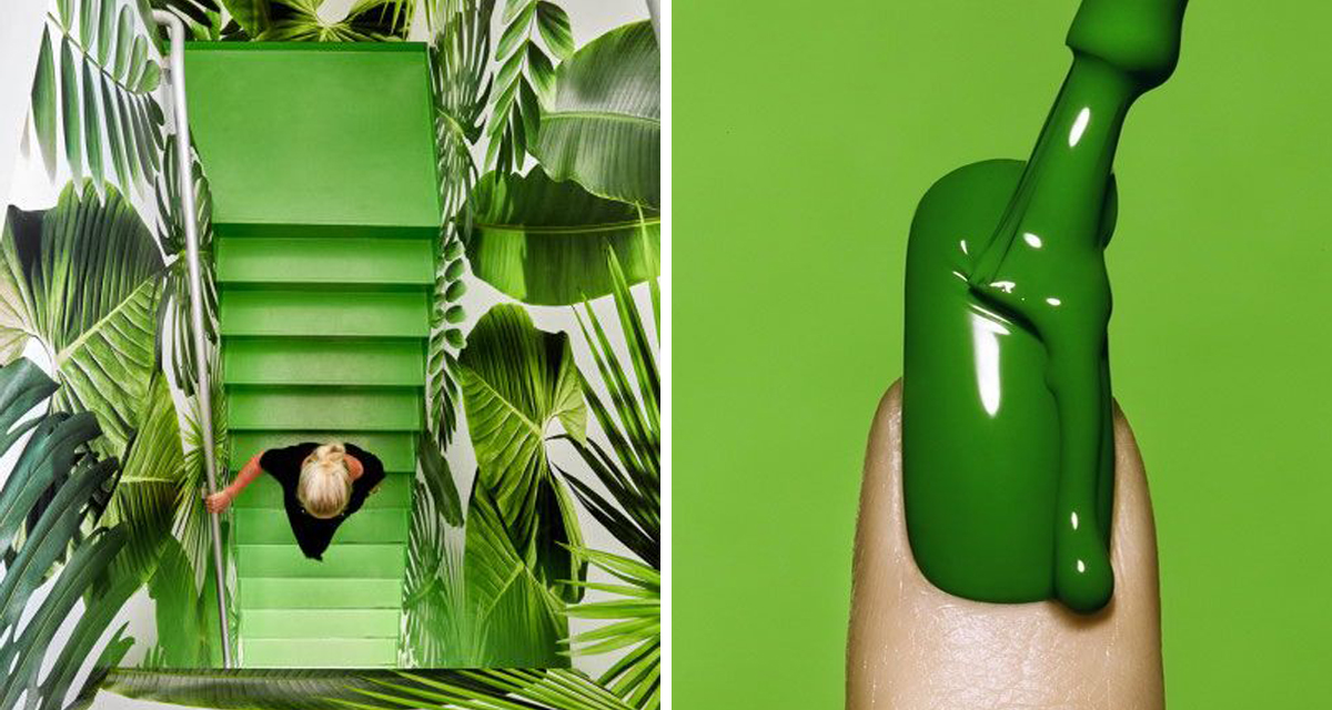
I’m working on a commercial project where the walls have been specified as a bright bright green – an even fresher and zesty yellow version of Greenery (Pantone’s current colour of the year) – so I’ve been doing my due diligence on green interior spaces.
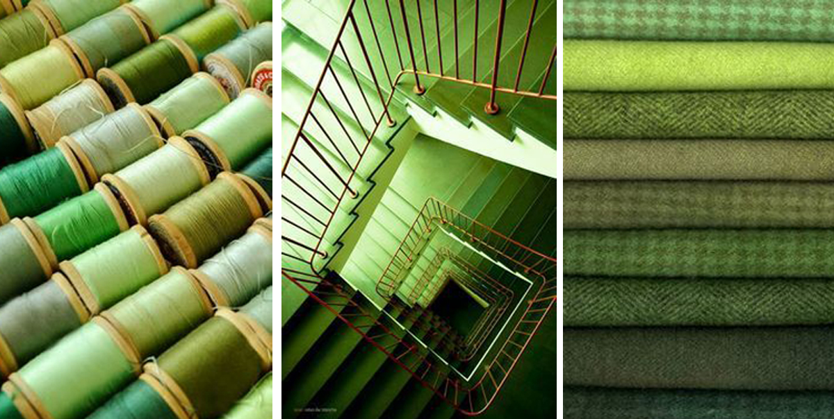
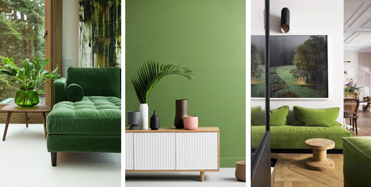
While I know Greenery is bold and statement making, I’m much more drawn to its sister colour Kale. “Evocative of the great outdoors and a healthy lifestyle, Kale is another foliage-based green that conjures up our desire to connect to nature, similar to the more vivacious Geenery.”, say Pantone.
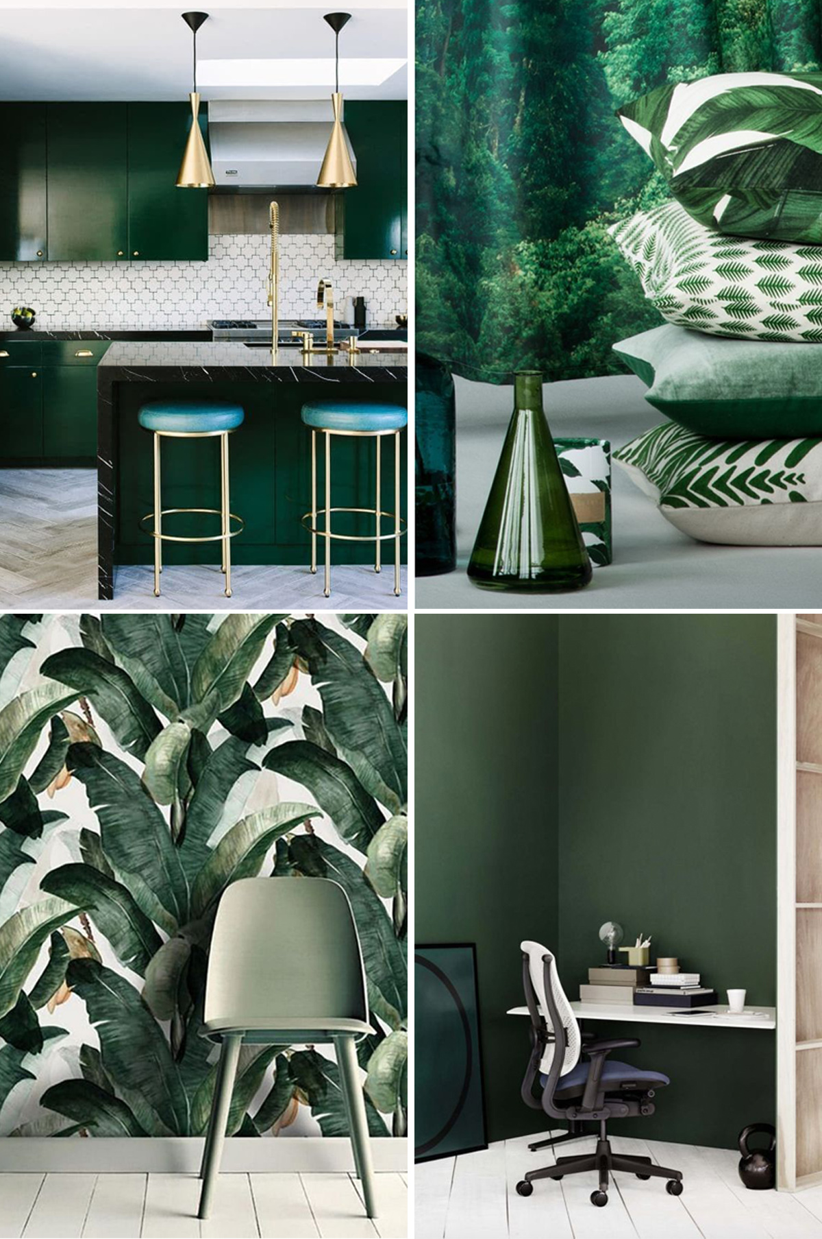
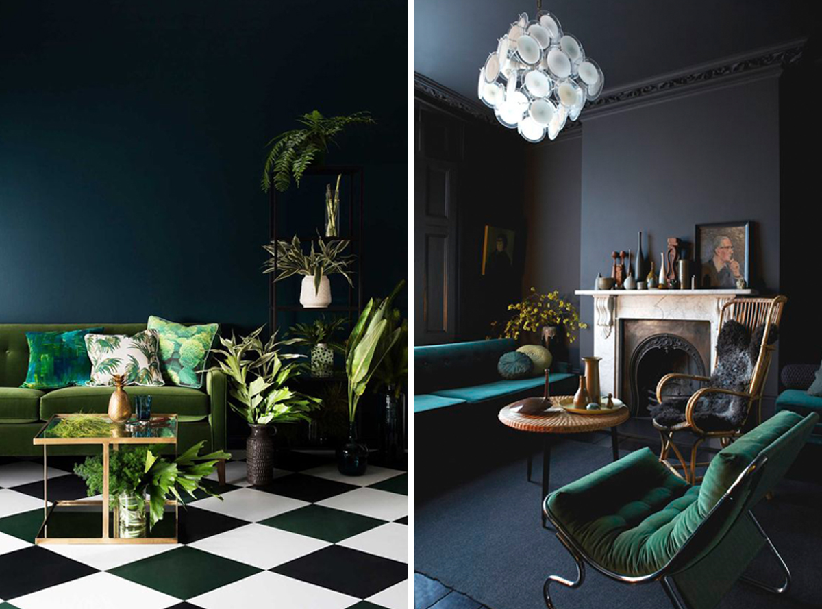
Kale has actually been showing up in paint colour trends for the last few years, with this darker shade growing to prominence thanks to the ongoing palm craze. We love how well it works with white and woods (obviously – hello nature!), but also in darker spaces with moody blues and greys.
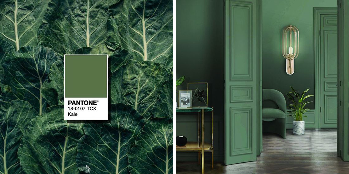
We are crushing on those upholstered green velvet chairs against the dark blue walls!
via 1 | 2 | 3 | 4 | 5 | 6 | 7 | 8 | 9 | 10 | 11 | 12 | 13 | 14


