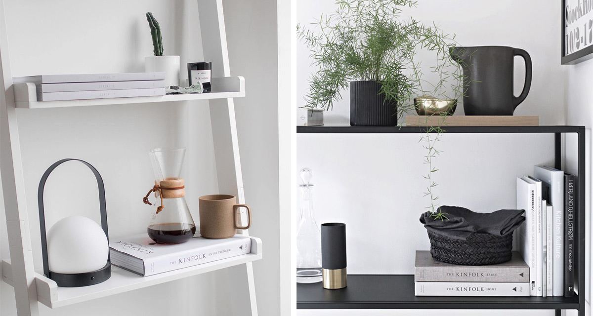
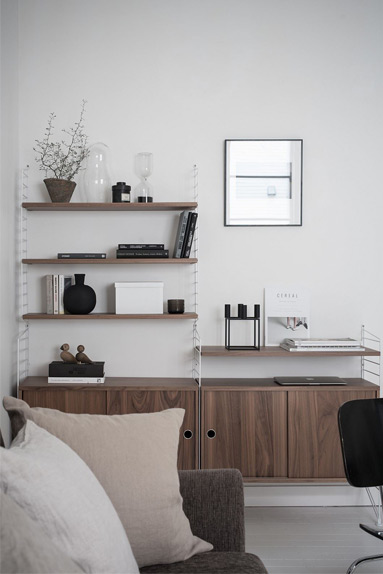
Bookshelves, open storage, countertops, working surfaces…..we’ve all got them in our homes, but some definitely look better than others. These spaces can easily turn into a mish mash of treasured pieces alongside piles of magazines, books and anything else left lying around.
In an effort to inspire a little spring cleaning and spring styling for your shelves this season, we’re talking about 3 common shelf styling mistakes and 3 easy steps to follow to get your shelves looking instagram worthy.
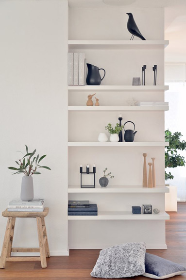
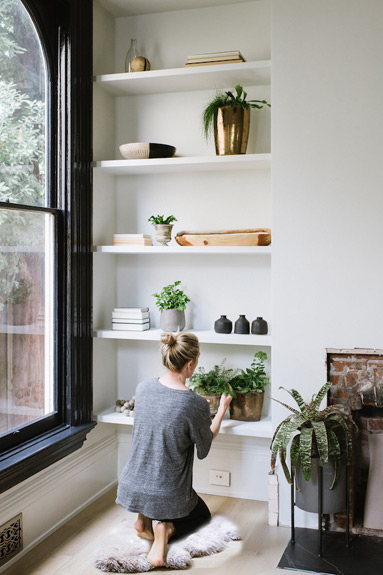
DONT’S
Here’s what you might be doing wrong….
Overcrowding and Clutter
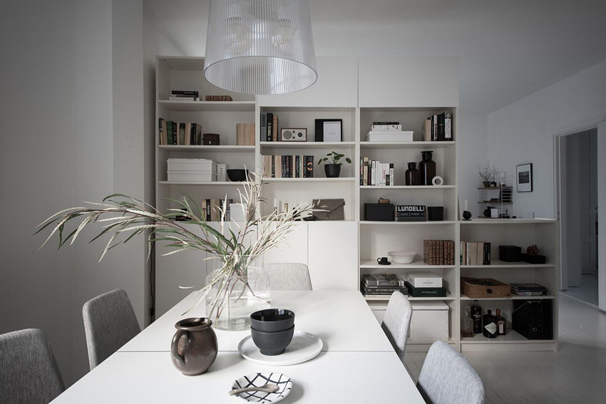
Obviously! This we all know about, and yet we still see it time and time again. While we absolutely understand and appreciate your collection of 30 treasured vases, unfortunately trying to display them all at once doesn’t always achieve the desired result.
The same applies to items just shoved onto shelves and piled onto countertops. Let’s be honest – no matter how neat your pile of newspapers and old papers is – it is not display worthy!
Sometimes if you personal items are not particular lovely to look at but necessary to keep, rather store them out of sight.
Not Having A Colour Palette
Your home decor doesn’t not have to be completely matchy-matchy but an overall colour palette will help pull the look together and make your shelves visually appealing. Style and display similar colour items together, and this also applies to your books. Group books with similar colour spines together, which helps create order and is easy on the eye.
Too Many Small Things
Lots of small pieces get lost amongst the bigger objects, and just end up gathering dust and looking bitty. You need a mix of heights amongst your pieces to balance the overall look of your shelving display.
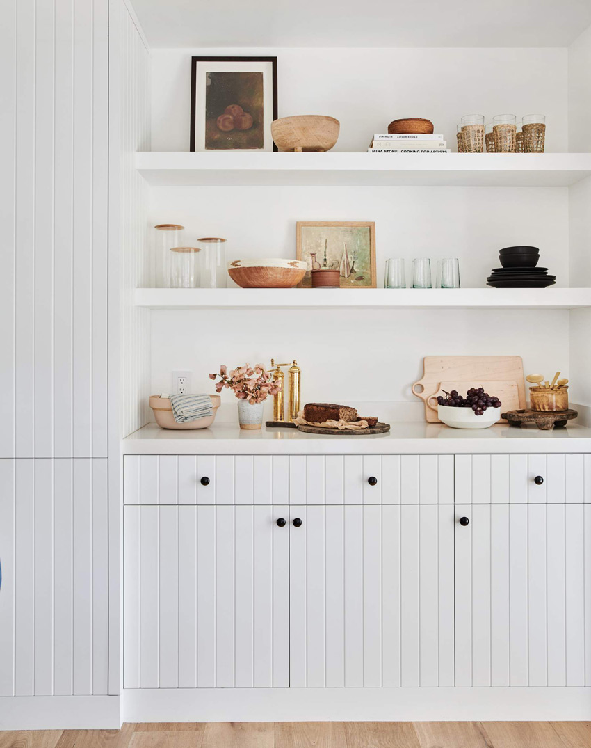
DO’S
These tried and tests ideas are easy steps you can follow to get those shelves looking ordered and beautiful…
Collect and Gather the Pieces You Want to Display
Gather what you deem to be important. These are simple item that you want to see everyday in your home, as well as what you want visitors to appreciate when they visit. Books, frames, art, baskets, boxes, sculptures, ceramics, plants and vases all look stunning on display, if chosen with thought and restraint.
Once you’ve gathered everything together in once space, start dividing what you have into smaller groups of items that work together. Group those books in similar colours. Decide which sculpture works with which vase. Once you have these smaller groups each working on their own, its time to place them back on your shelf bit by bit.
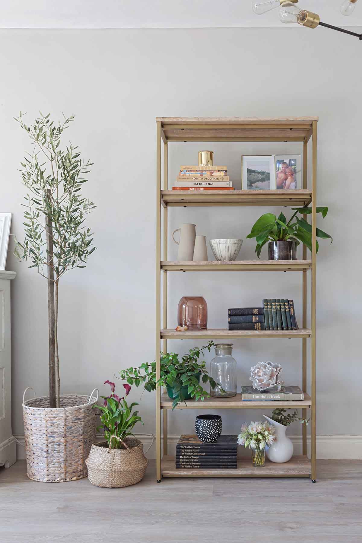 Image Source | The Home Studio Projects
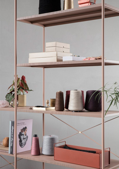
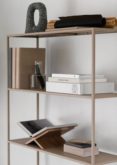
Choose an Anchor Piece for Each Shelf or Section.
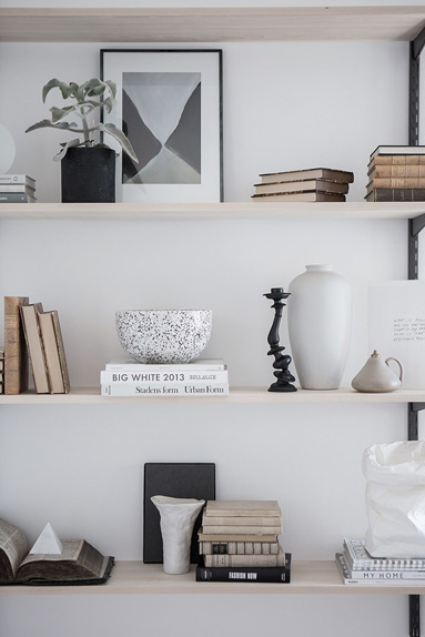
When starting the styling process think about height and texture. Larger books, artworks or tall vases work well as visual landmarks and fillers of negative space. Taller pieces add height and frames that can be lend against the back of the shelf/wall will add depth, making the space look larger. Stack books both vertically and horizontally to create height variation and face them with the page side showing if the covers do not fit your chosen colour palette.
Start Big, Go Small
As a general rule, clustering in 3’s works well but styling in a way that looks right to you is more important than following the “rules”. Once your larger and more prominent pieces are in place on the shelf, bring in the smaller accents to compliment the bigger pieces.
Remember to mix materials and heights and create balance and symmetry overall. Adding natural greenery will bring the space to life and add another pop of colour and texture.
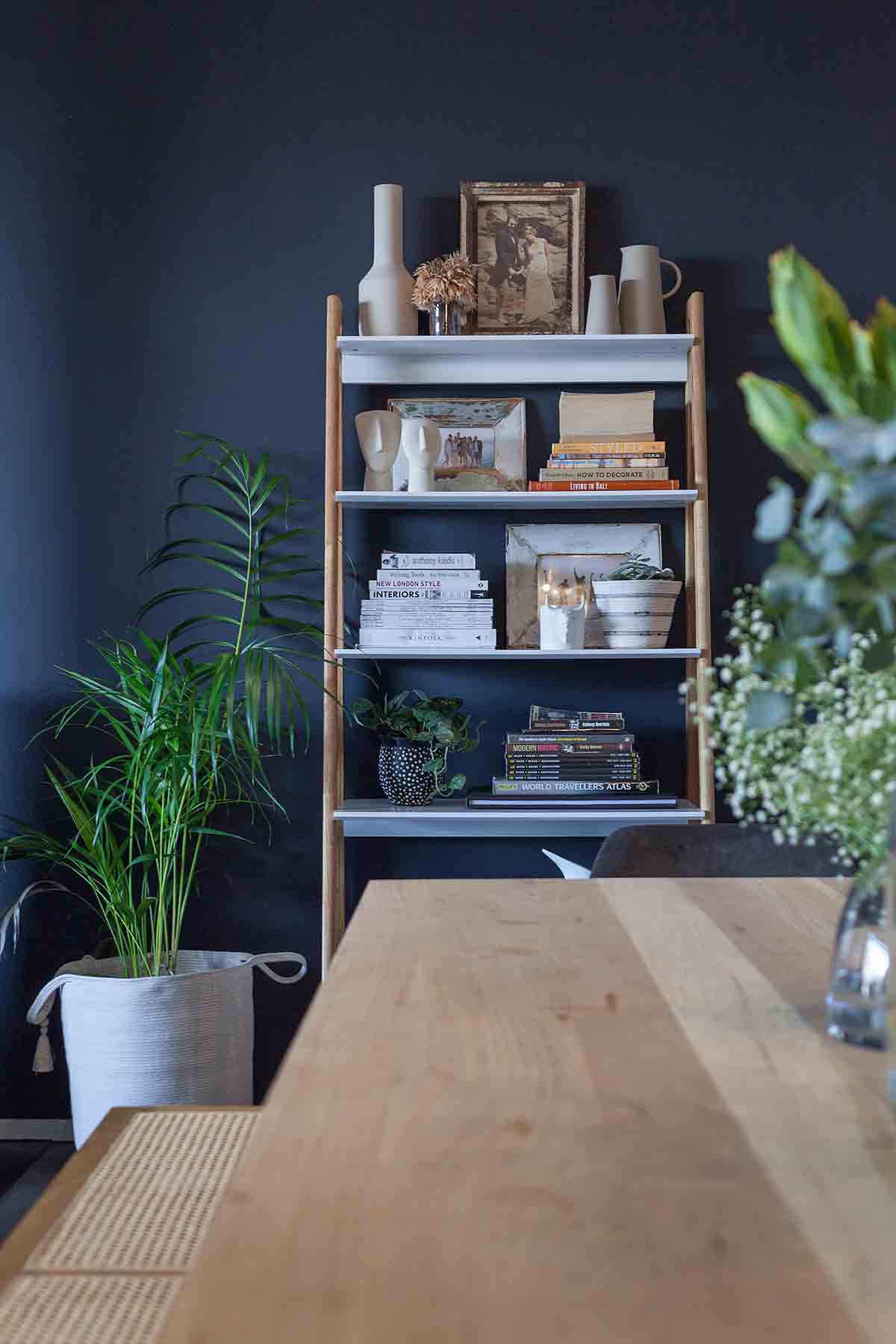
Image Source | The Home Studio Projects


