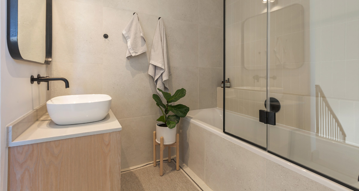
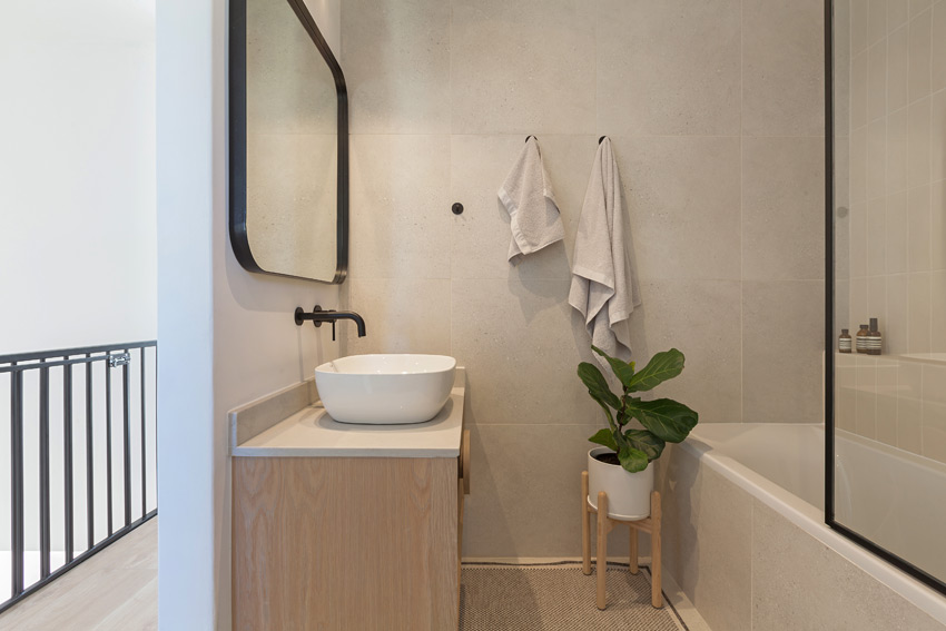
If you followed yesterday’s post, you will know that our brief for this project was to design two separate bathrooms, one with a shower and the other with a shower/bath combination. The clients wanted the colour palette from the rest of the house to follow through into the bathrooms, which led them to the decision of beige, textured subway tiles used as a feature wall and a larger format tile with similar tones on the floor and one of the other walls. The remainder of the wall space was painted white as not to overwhelm the rooms with beige.
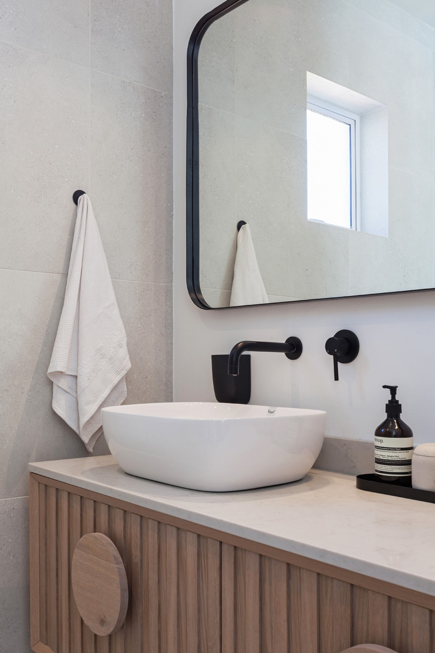
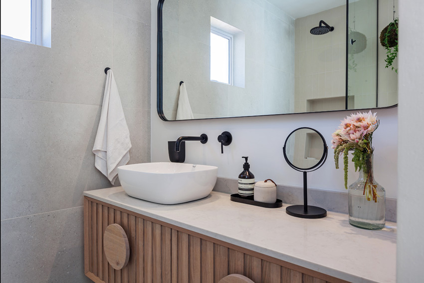
The vanities were designed to reflect the joinery in the kitchen, using the same white oak with slatted detail and London Grey Caesarstone tops. The oversized handles were a quirky element that the client loved when she spotted them on Pinterest. Surface-mount basins were installed in order to fully utilise the storage space inside the vanity and the clients chose to have only one in the master bathroom, thereby maximising the surface space of an otherwise very tiny en-suite.
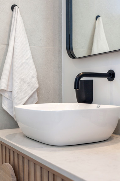
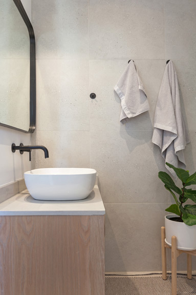
The black shower frames and mirrors were custom made to compliment that other black finishes and tapware purchased from Flush Bathrooms.
Images | SW Photography


