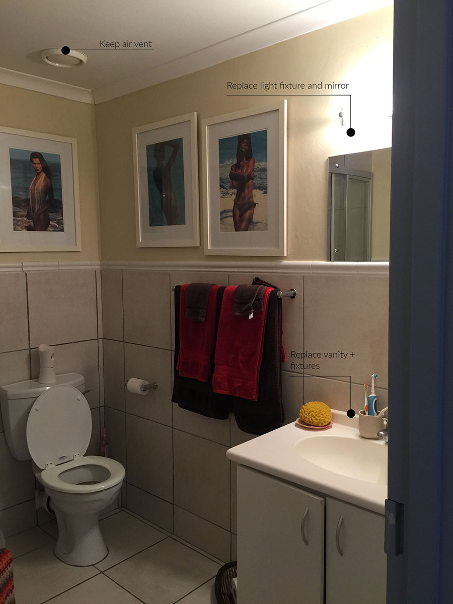
Today we’re back in our AirBnb apartment project, looking at the bathroom design process. However, before we go any further I feel it appropriate to say this about the ‘Before’ images…. Warning! The following images may contain scenes which could be distressing to all design and bathroom lovers. Viewer discretion is advised.
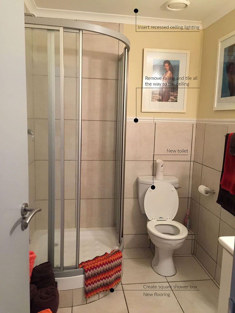
before // MASTER BATHROOM
before // KIDS BATHROOM
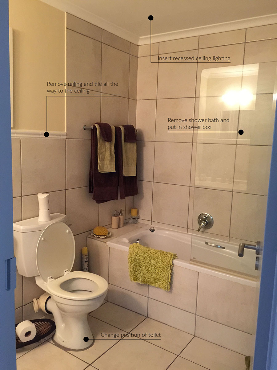
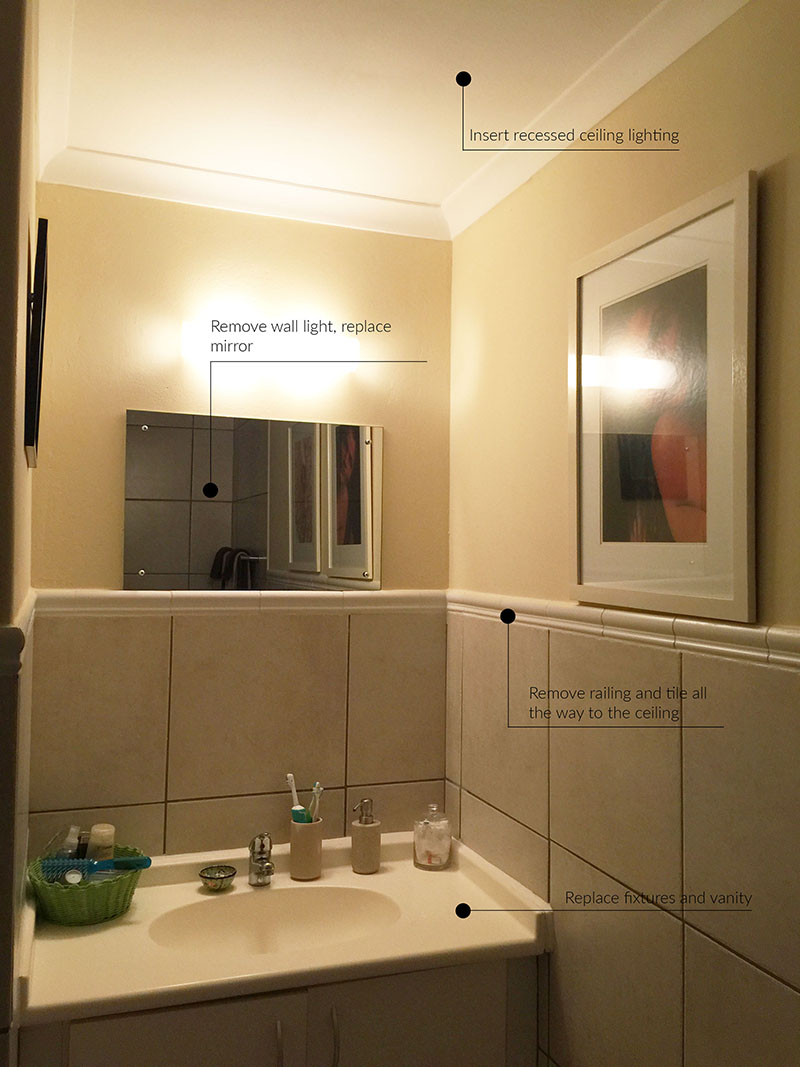
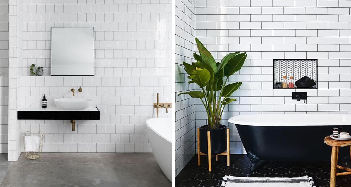
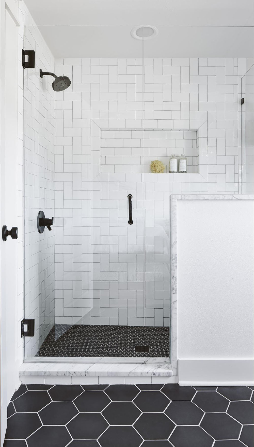
As part of the overall theme of the apartment, the client was after a monochrome bathroom that was modern and light. Originally we planned on using dark hexagonal tiles on the floors, however both bathrooms are small and dark so we felt this would be too oppressive. Instead we opted for patterned black and white floors tiles, with a different sense of style for each of the bathroom’s personalities.
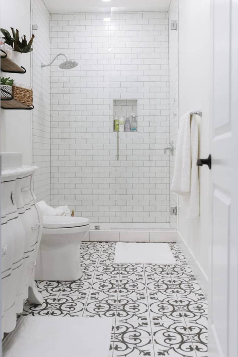
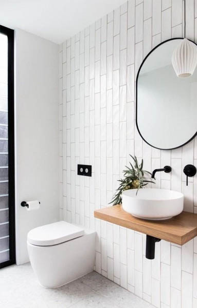
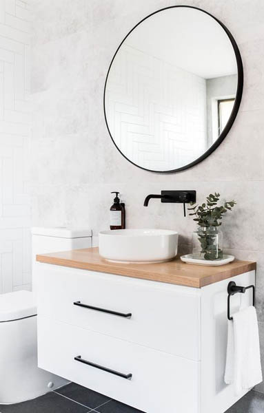
As neither of the bathrooms have any natural light, the first priority was installing recessed ceiling lighting to provide both spaces with much needed lighting. Luckily we had a dropped ceiling that allowed us to add the electrics.
We also considered using black fixtures in the bathrooms, however they are about 3 – 4 times the price of chrome fixtures, so for most people it all depends on how much room there is in the budget. If the apartment was the primary residence of the client instead of a rental property, I probably would have pushed a little harder for the black finishes However since chrome fixtures DO look modern and chic, we went with chrome and decided to save budget for other areas.
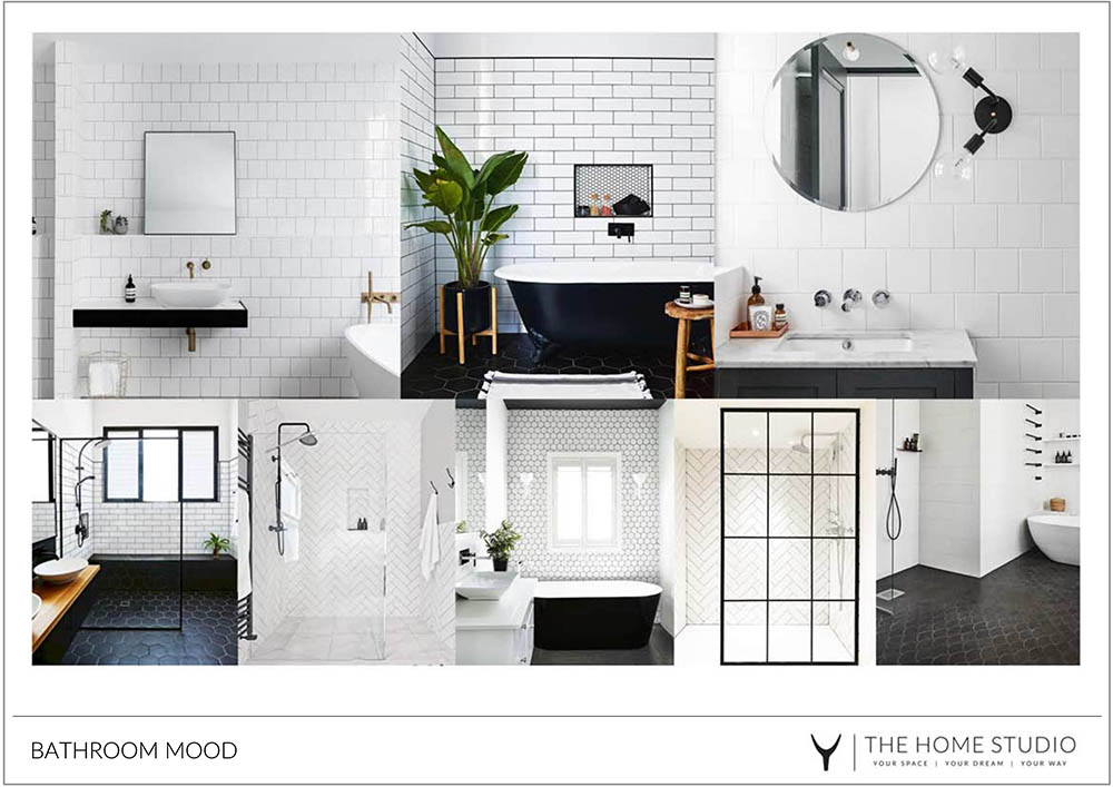
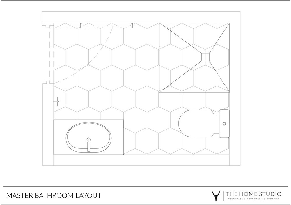
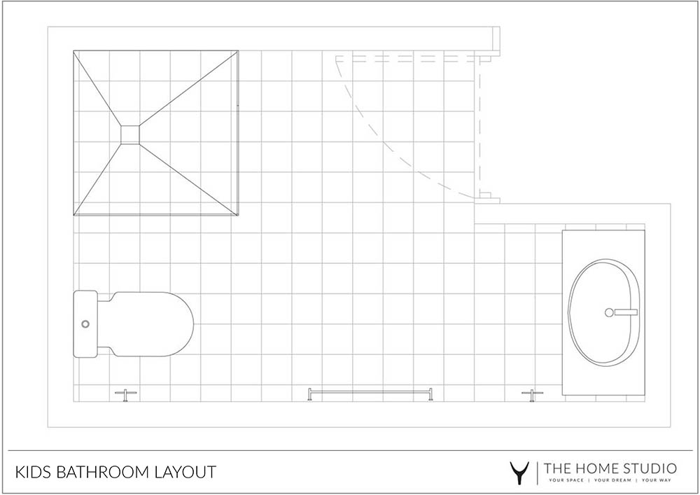
As you can see from the layouts below, the spaces are pretty tight so careful space planning was essential. Join us back here on Wednesday for the full reveal of the two bathrooms.
