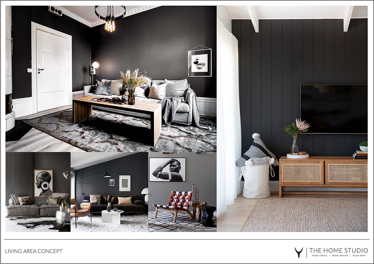
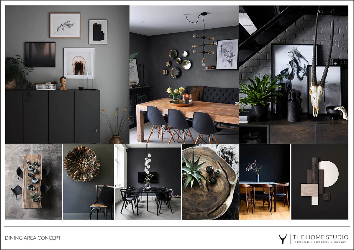
We’re back at our rental home makeover and talking about the open plan living and dining area, in a home that seems to be made up of many interconnected white boxes. With dark floors (what are actually slate coloured vinyl tiles) and tall white ceilings, the room felt much like an empty hall – with zero soul and personality.
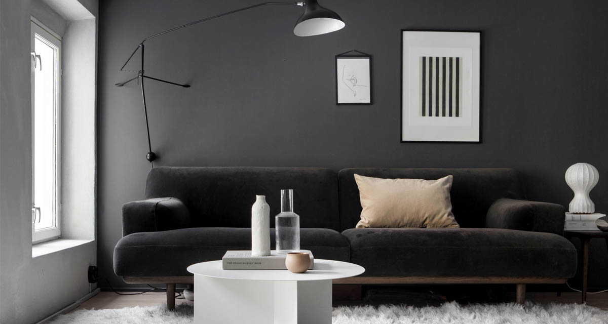
One side of the room opens onto a large deck and the other opens onto an inner courtyard, so the room gets plenty of light from both sides. With this in mind, we decided to extend the darkness from the floors right through the walls of this room. The darker palette would help ground the space, and make it feel a lot more cosy and welcoming.
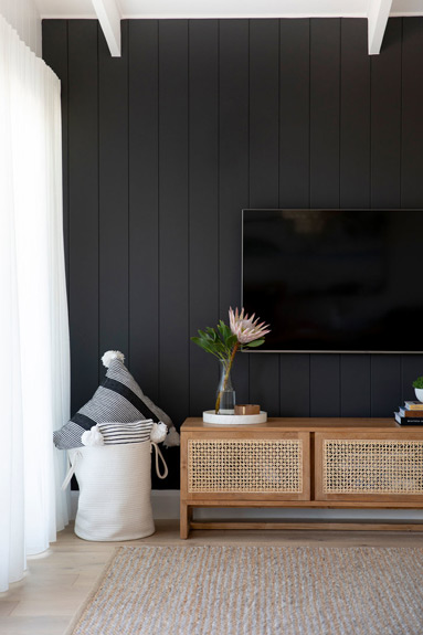
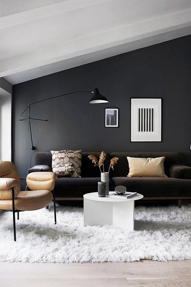
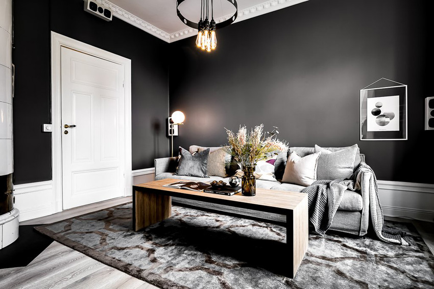
We know that not everyone likes the idea of dark rooms and interiors – they worry about a space getting too dark – so of course we flooded the client with ideas and inspiration on dark living space, and we were grateful the client trusted us enough to move forward with the concept.
The client only had a few furniture pieces that would be moving with them from their previous smaller home, so we needed to source several pieces for them. A rug for the living space and a few occasional chairs for additional seating. The dining area needed a larger dining table and chairs and the client ideally wanted a new sideboard to go alongside the dining table.
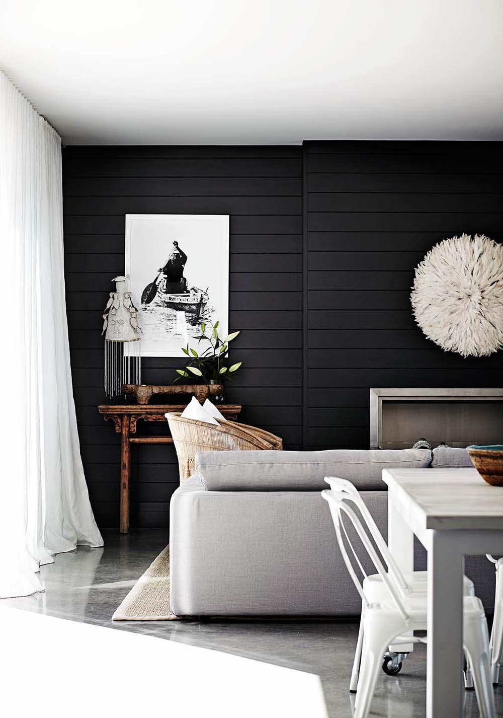
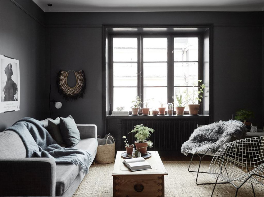
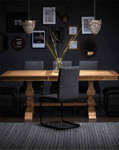
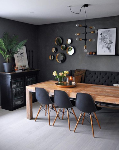
Image Source 1 | 2 | 3 | 4 | 5 | 6 | 7 | 8
Since we discussed making the space darker, style wise they were happy to go for a more masculine feeling in the space, with bigger pieces and darker finishes. They also wanted / needed the room to feel quite open, as they have two small children running around and playing everywhere. While they aren’t too precious about things getting dirty or covered in small fingerprints, they preferred pieces that could be wiped clean (until the next time).
