Hello from House G.
You may remember that just last week we talked about three important renovation pointers, which are truly relevant to House G and its renovation plan. Our goal is to retain any unspoiled architectural details, like the pressed ceilings, wooden floors and door frames. Instead of knocking down walls and changing the layout unnecessarily, we made amendments to the layout ideas, in order to preserve as much as the original layout as possible.
Initially there was talk about stripping the house back to the studs and bringing in a contemporary style to this somewhat dated space. However upon reflection, the focus is on making mostly cosmetic changes to the overall feeling and circulation spaces within the home. This will help preserve the character and period features of the space. And in theory, this should be better for the budget too.
So how do we update this entrance to make it a little more interesting?
Let’s have a look at where we are starting….


This is house upon viewing, still with the previous owners belongings in the space. Like any space, simply removing the current furniture and accessories will change the entire feeling in the space.
The original plan included changing the front door and entrance window, new floors, new dropped ceilings for recessed lighting, new door trims and new doors, new skirting….
Instead we’ve dialled this back quite dramatically. The basic plan is to sand the floors to remove the orange colour. The side windows at the front door get replaced with a single panel piece, for a modern feeling, and the front door is also updated. Everything else stays, and simply gets painted. A fresh perspective.
From a look and feel point of view, I would like to move away from a white and wood feeling to something that is more colourful, bringing in deep, saturated colours. Now this can be considered a very controversial move. Most period homes shine using an all white ceiling, to embrace the high ceilings and showcase the original wood finishes. And I agree it looking stunning, especially when combined with modern furniture and artwork.
However on very few projects do I have the opportunity to embrace lots of colour. And I seem to have a colour bug running through my body at the moment, so I am going to embrace colour as much as I can, while I have the opportunity. This might shock many people who know my favourite colour to be white.
Those of you who follow along here on the blog may have noticed we’ve had a green phase going on. It stared with a restaurant interior, then a few home spaces and most recently a ‘cloffice‘ design. We love how green combines so beautifully with beiges and warm wood tints, for a very soothing and serene setting. So a stunning green entrance is right up there on the colour list.
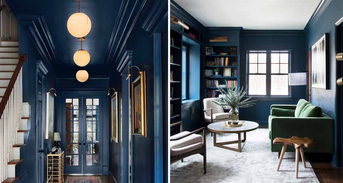
On the other hand I’e long had a thing for shades of blue, and I know The Housemate is a blue fan. I love the idea of a deep blue entrance space, taking the colour right through to the ceiling. Having this dark and cosy cocoon at the entrance will contrast beautifully with the light and white space you encounter on the other side. Again the colour works so well with the wood flooring.


 Images 1 | 2 | 3 | 4 | 5 | 6 | 7
We also believe the most powerful installation of this style and look, is when the ceiling is painted the same colour as the walls. Have a look at the space below. Beautifully installed and styled to dramatic effect with the dark walls. However notice the white skirting, door trim and ceiling. It completely changes the overall style and atmosphere in the space. It is a stunning finish, but I am still leaning towards having at least the door trims and skirting painted the same colour as the walls.

The Housemate has weighed in on these concepts, and though he is open to prosper colour choices he is not into the ceiling being painted. He prefers the white ceiling.


 Images