Today we’re back at house M going behind the scenes of the kitchen concept and design process. The Before pictures tell the whole story…. let’s have a look!

This is a small, basically square compact kitchen. The original layout had the cupboards going almost all the way around the room, with just a small entrance doorway leading into the kitchen. This made the space feel a lot more crowded and didn’t offer that much extra storage.
We also wanted to extend the upper cabinets right through to the ceiling, not only for the extra storage, but also to make the room feel taller, more spacious.


Our first round proposal included only having the cabinets on the two major walls, and then one full height pantry. However as we started digging deeper into the clients preferences, storage needs and appliance preferences, the design started evolving (as expected).
It soon became apparent the storage was priority number one for their kitchen needs, so we moved from having cabinetry on only two walls, to having its across three of the four walls. Included in this process was also changing from an integrated fridge/freezer to a larger freestanding one.
Layout One
While I’m not by any means against free-standing fridge/freezers, my preference in small spaces always lies with integrated appliances where you can. Not only are the freestanding options typically bigger in actual dimensions, but they also break up the visual line. Having a seamless look running through the kitchen cabinets just makes the space look bigger.
Layout Two

Our final design layout reverted back to an integrated fridge/freezer, which also allowed us to create a slim full height pantry cupboard, which helps tremendously with the storage requirements.
Final Layout

As the floor plan and layout concept change, so too did the ideas for the upper cabinets. As said the client requires lots of storage, however my main concern was also with overloading the kitchen and making it feel crowded.
With our first layout the main elevation looked like this.
Elevation One

Then with the addition or more cabinets around the room, we moved to the idea of open shelving in the corner, leading to the hatch. This would ease the visually heavy feeling from the upper cabinets, and also tie in nicely with the hatch opening to the dining area
Elevation Two

However in the end, when we moved the integrated fridge/freezer and included the full height pantry cupboard, we chose to keep the symmetry the same with the upper cabinets, for a more unified look and finish.
Final Elevation

As part of the design process we naturally looked at the look and feel for the kitchen. Our client went through a range of considerations and colours, which changed according to the countertop and backsplash choices. And we fully support this process. As you know, it costs lots of money to design and build a new kitchen, so unless you love your finishes, and are going to wake up loving those finishes for the foreseeable future, then you don’t rush into any decisions.
We initially explored lighter, softer colours in a classic style, with lots of white elements, to work in the small space.


However upon reflection our client decided she really preferred a bolder, richer colour for the lower cabinets. We then set upon a rich, deep shade of green, which would lend itself to a beautiful soothing kitchen space.

Throughout the process we were in agreement that the upper cabinets would be finished in white, and we also moved to include glass panel cabinets to ensure the kitchen feels light and airy.
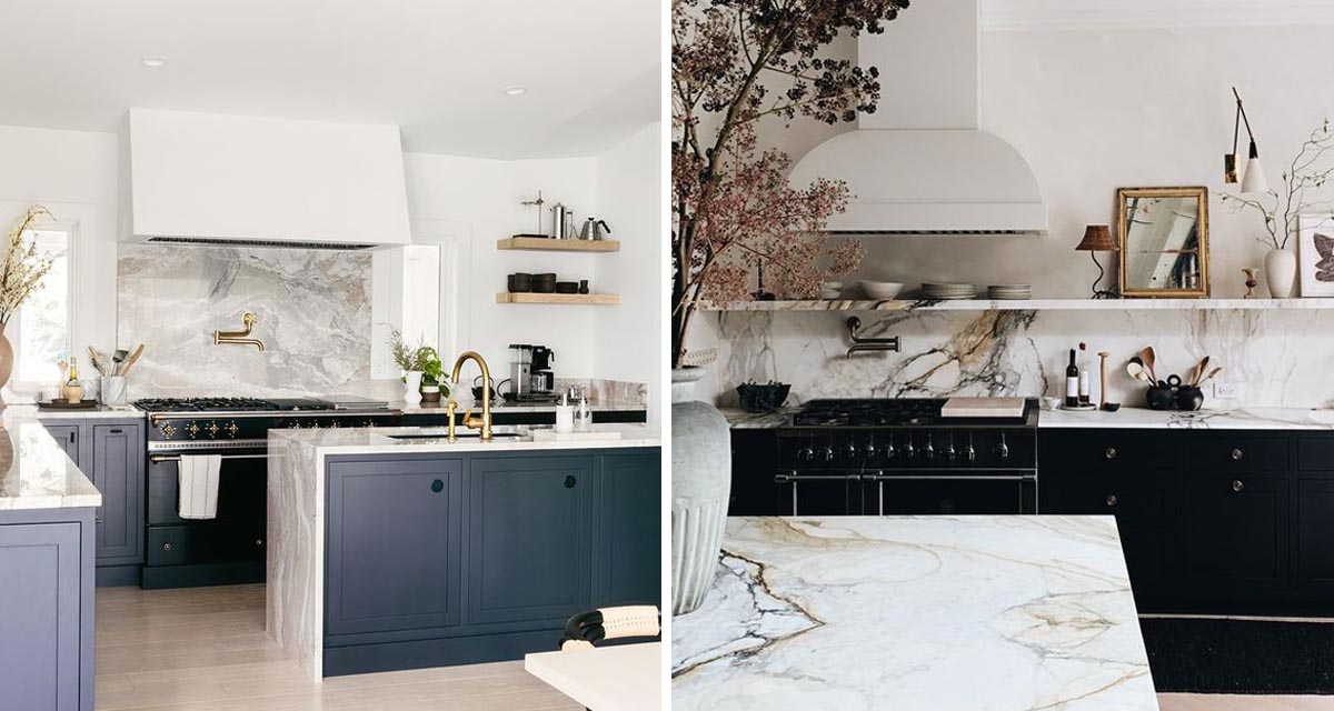
Upon finding her marble of choice, our client was inspired by these images with a darker blue/black colour on the lower cabinets, which would ensure that the veining in her marble would really pop against the dark colour. It also offers a very chic and sophisticated style in the small space. So now we had the final kitchen concept and design approved.


And then lockdown happened…
… so right now we’re sitting with a gutted shell of a kitchen and not much else. We will keep you posted on progress once we can start working again.


