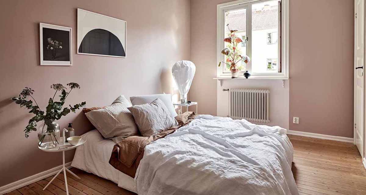
Today should absolutely be a Duvet Day, but unfortunately we’re not ostriches and can’t just stick our heads under the covers and ignore life. So we are doing the next best thing and showing you this nude bedroom makeover from our rental home project.
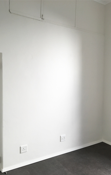
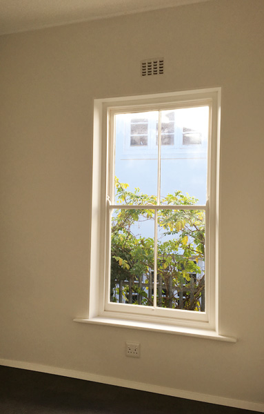
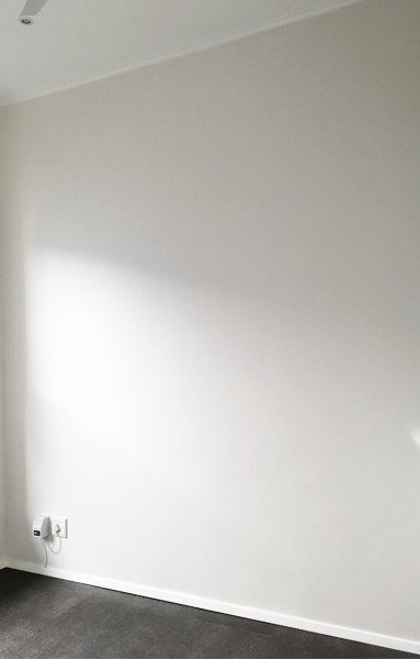
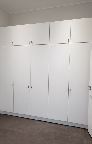
The room started out quite literally as a small square white box, with built in cupboards and very high ceilings. Added to that was the large king bed the client owned, which would pretty much take up the whole room, leaving only enough space to enter the room and access the cupboards.
There would be no space for bedside tables and bedside lights, and getting a smaller bed wasn’t an option. They don’t use bedside tables and we discussed the idea of wall lights with the client, as they don’t require any floor space. There was no wiring in place, but may light suppliers are able to put a plug on the wall if you need it.
However the client was happy with all the factors and preferred the bedroom without any distracting elements. “It is literally a room to sleep in”, they said. Our goal was to turn the white box into a cosy and welcoming space to sleep, and ensure we did not make the room feel any smaller than it already was.
BEFORE
This is the space when we first saw it.
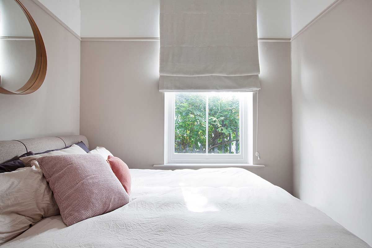
Since the bed frame itself was upholstered in a sandy colour, we made this the base colour of the new palette for the room. We decided against rugs on the floor since the bed was already upholstered and it would be practically impossible to move the bed and clean under and around the rug.
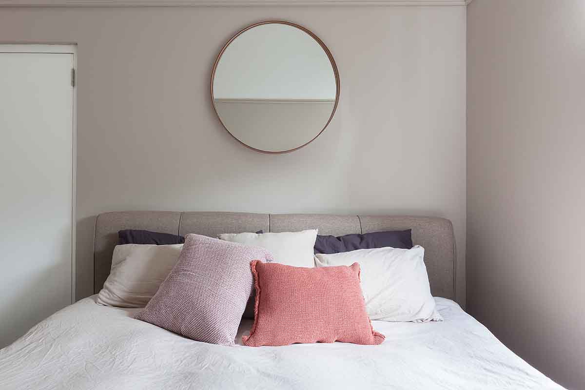
To go with the natural linen duvet cover set from H&M Home we brought in darker bed linen accents, for a modern and masculine edge, and to work with the dark flooring. We knew we also wanted to soften the feeling with lots of scatters in differing shades of nude and pink colours.
INSPIRATION
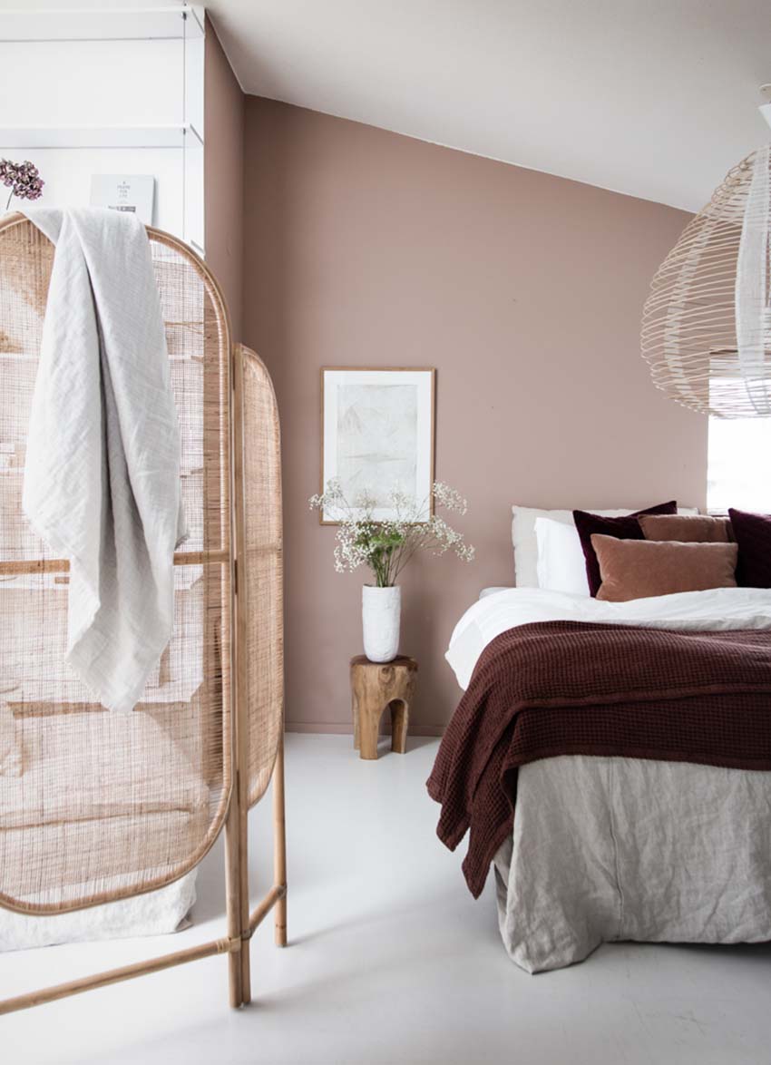
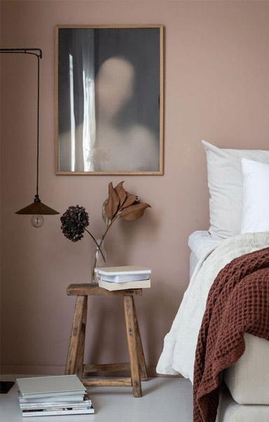
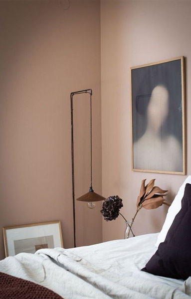
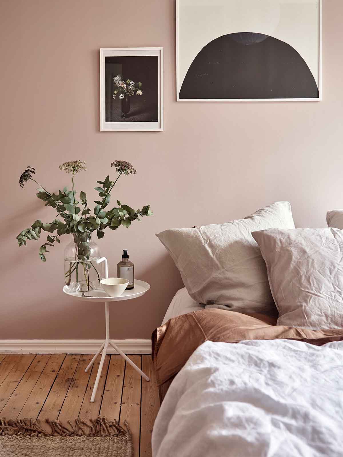
These bedroom images acted as our main source of inspiration. While these have more pinkish colour way to them, we love the fresh contrast with the white walls, and how the colour palette makes the rooms feel so cosy and luxurious at the same time. The darker scatters and throw elements prevent the room from becoming insipid.
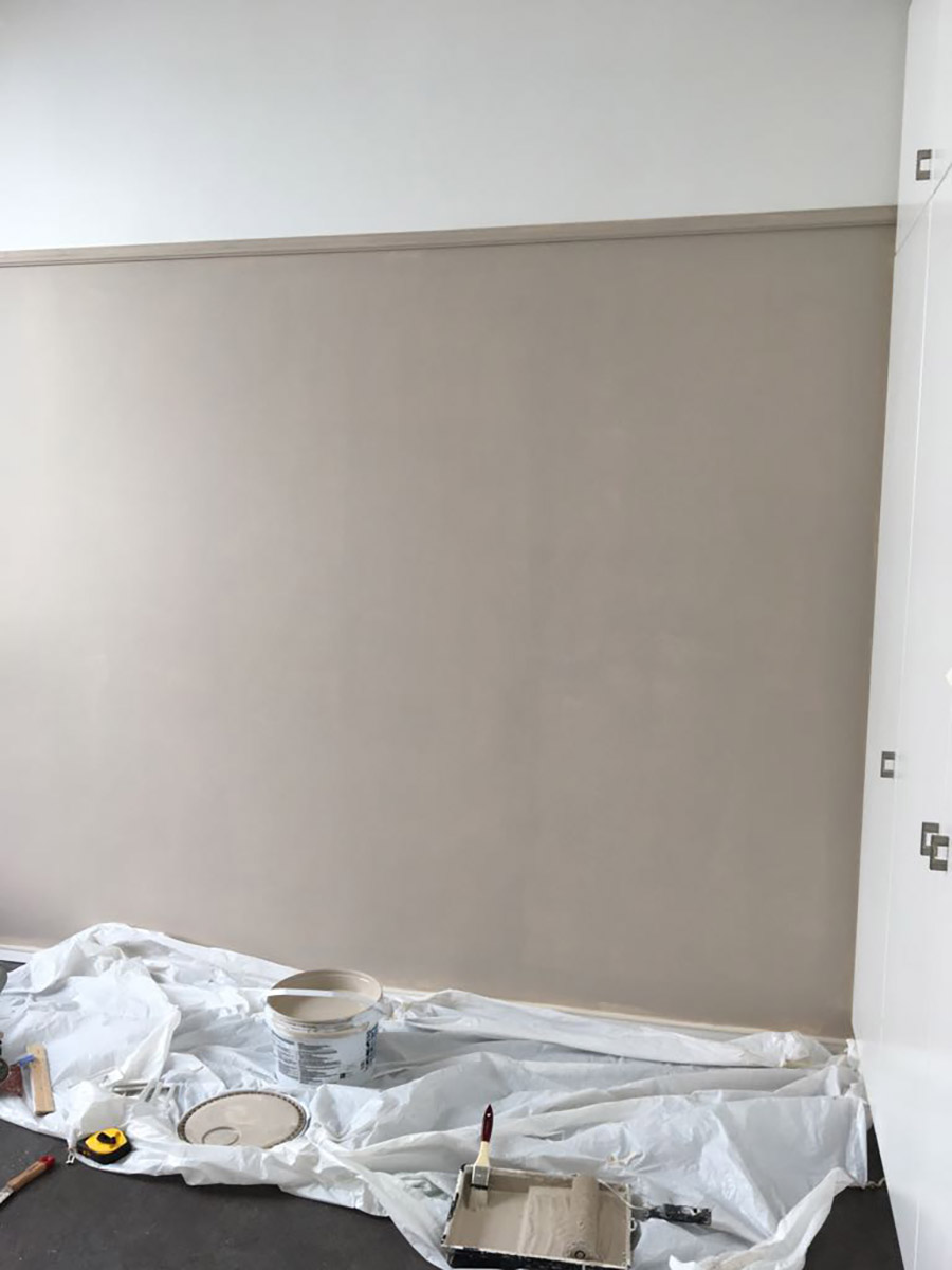
Our first step was to paint the walls a lovely rich sandy beige colour to bring warmth into the room, however we didn’t like the idea of painting the full height of the walls. Instead we decided to install a dado rail just above door height. This little DIY move not only gave the room more architectural interest, but the two tone wall colour completely changed the feeling in room from being box like to being something more considered and well thought out.
WORK IN PROGRESS
We bought this railing from Builders Warehouse, measured and cut it to fit the room and drilled it to the walls. As far as DIY projects and home fixes go, this is pretty straightforward and easy to implement. Then we simply painted the wall from the railing down.
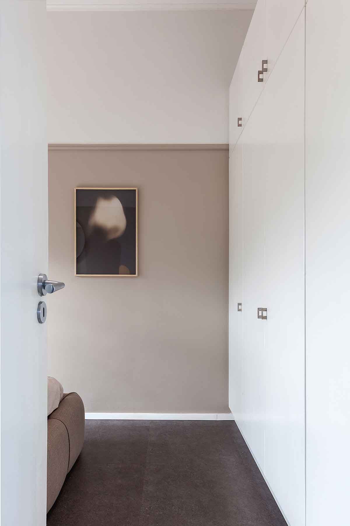
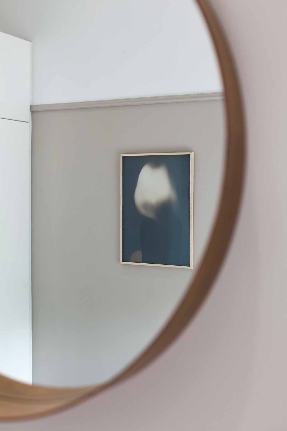
Rather than leaving the walls bare, we placed a mirror the client already owned over the bed head. The mirror over the bed added to the simplicity and lightness the client was after in the small space. One piece of artwork, that tied in with the colours of the room, was strategically placed on the wall at the foot of the bed so that it welcomes you as walk into the room.
AFTER
