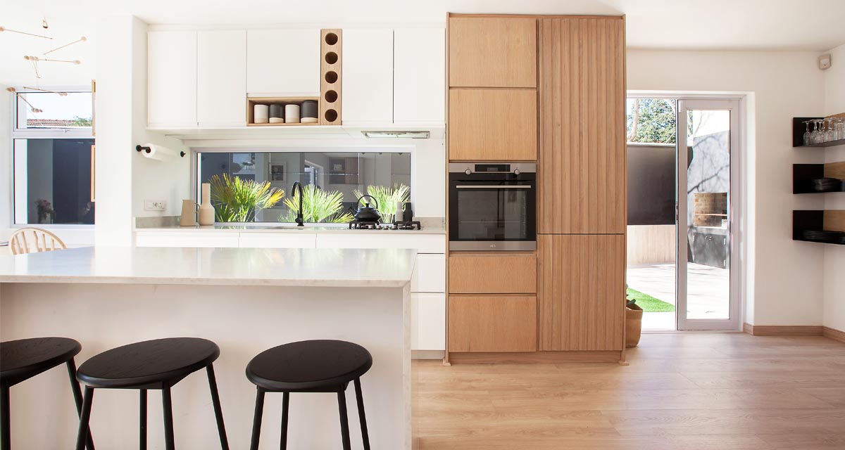
On Monday we introduced you to the kitchen and dining nook concept for a new project our designer Claire has been working on, which involved the complete overhaul of a late 1990’s duplex apartment.
Spoiler Alert – if you’ve not done one before yourself, there is nothing glamorous about a renovation process. It is messy, complicated and there is always an unforeseen glitch in the matrix!
Today we’ve got the down and dirty talking layouts and space planning, as well as looking at our the ‘Before’ and what it really looks like when you start tearing down walls….
BEFORE
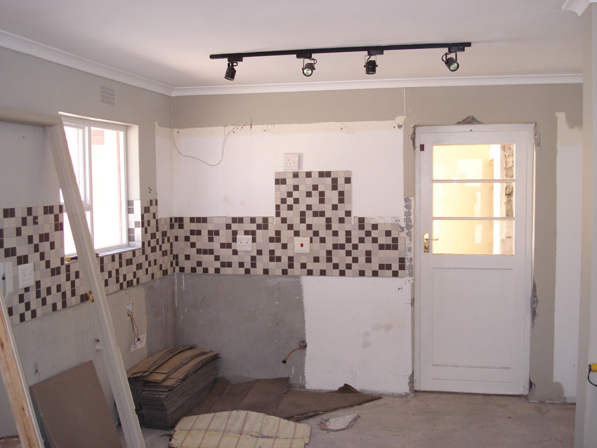
Here we are in the kitchen as it was….
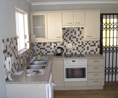
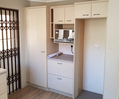
The existing kitchen was cramped and dark, with old-fashioned melamine cupboards which had been painted over, as well as a tiny island which had been cut away from an original breakfast bar.
The space also had an awkward corner (you know the ones?!) which was a dust collector and meant wasted cupboard space. The kitchen opened out onto a covered courtyard which was not utilised and lacked personality.
Since our client’s were open to a complete overhaul of the space, we could think outside the box in terms of how we were going to open the area up, let more light in and make the most of the limited floor space available
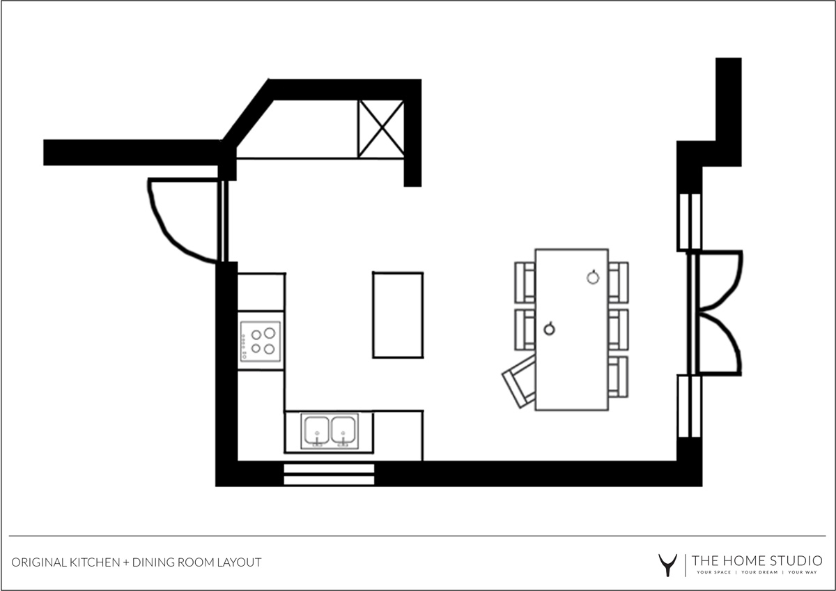
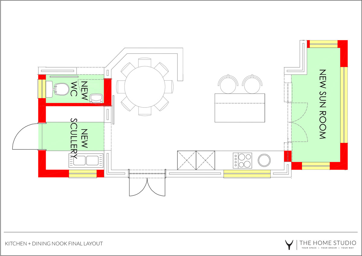
Since the dining room table – which was seldom used other than as a dumping ground – occupied the largest area, and the kitchen seemed squashed in the corner we proposed swapping them around. This would allow the kitchen to be the focal point and heart of the open plan space and would accommodate a larger kitchen island with seating which was a must for the clients.
That existing awkward kitchen corner (caused by a load bearing wall which could not be moved) would then become part of a dining room nook which could seat 6 people comfortably and have built-in seating along the wall with extra storage space. Yes please!
A scullery and sunroom extension was proposed to be added onto either side of the building. The size of these extensions was limited by a 4.5m building line that had to be adhered to but even just a small amount of extra space would make the world of difference.
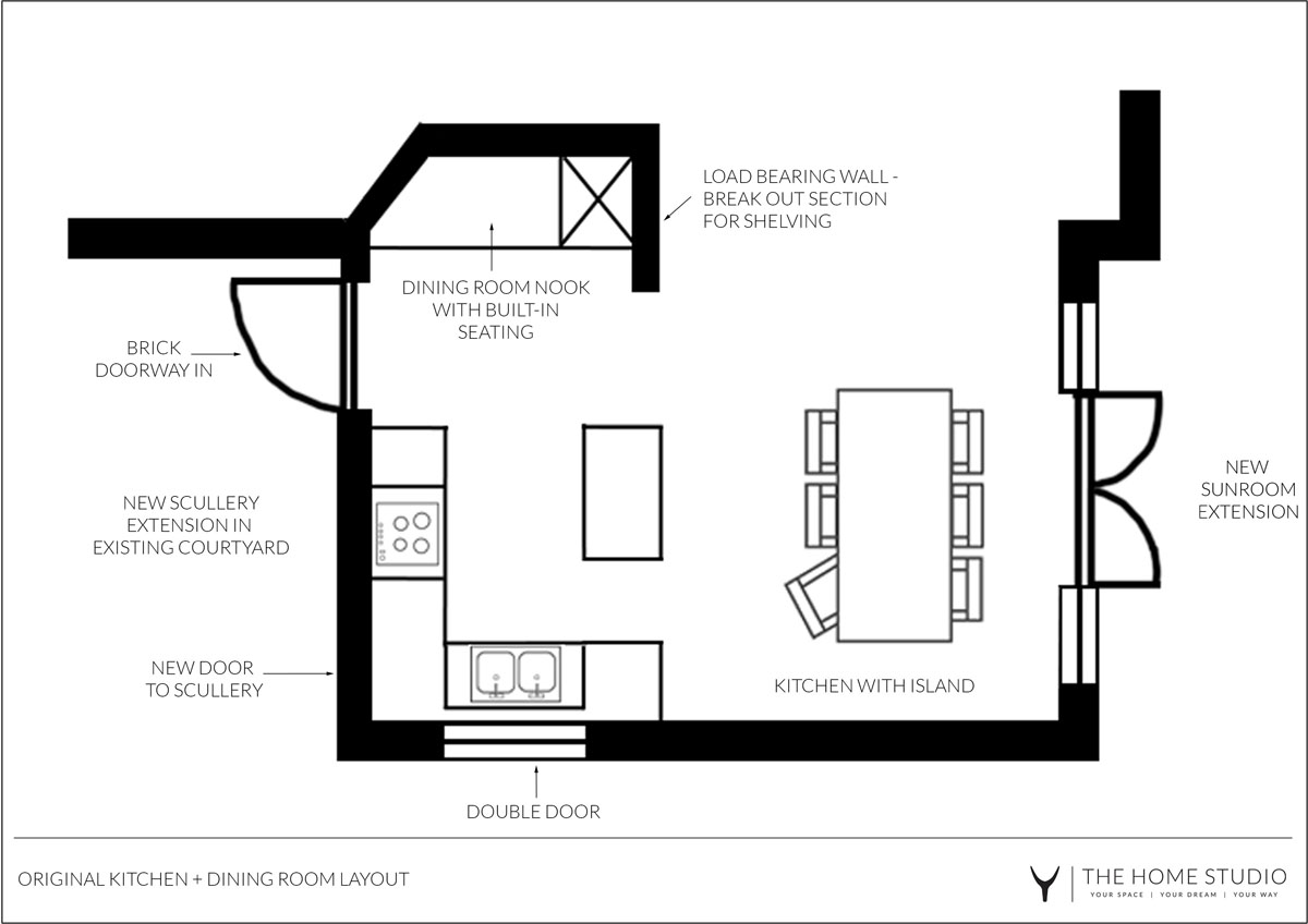
In the final plan below, you can see that we decided to break open the existing kitchen window into double doors that would lead into the garden and provide a beautiful flow of air.
The clients also decided on a window splashback in the new kitchen which is not only a popular design feature at the moment, but also a practical one as it allows light in without compromising on any valuable cupboard space.
DURING
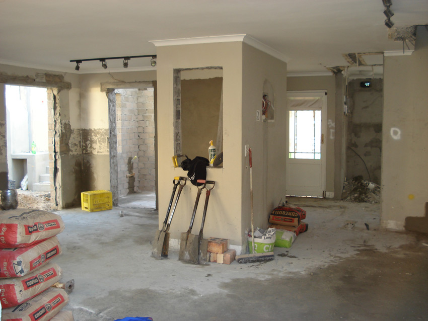
The glamour of the renovation revealed….
AFTER
Join us tomorrow when all will be revealed!!


