Welcome to Office D. An office redesign a long time in the making, not withstanding our lockdown period. Our clients at Office D have been wanting to redo their office for almost 2 years, and because of a few shuffles within their rental space and budget constraints the timing was only right at the beginning of this year.
So fresh back to work in January we met with our clients to discuss how we were going to make their office redesign happen, in a rental office space, on a set budget. To be fair, while not massive, we felt the budget was healthy enough to make impactful changes, but it was going to be a matter of prioritising the work to see where we could get the biggest return for their money.
We created the design, budgets were approved, demolition started and then lockdown arrived….
…so here we are months down the line and finally the project is nearing completion, and we have to say – it is looking good!
Let’s have a look at where we started.
BEFORE
This the main working office for the client. Pretty bland and sad. It is difficult to choose, but I think the carpet was the number one element that the client detested – and there was no negotiation on keeping the carpet. Then probably the old tile ceilings, and then the storage cabinet at the back of the room.


Looking below we see the dividing wall between the office and internal boardroom which was also sporting that 80s office glam feeling about it, and really just making the space feel rather dark and depressing.
Here again the client was looking to make the space feel warmer, lighter and more modern.


In addition to the main office and internal boardroom, the office space consists of an entrance foyer (no receptionist), separate office, second meeting room and kitchen canteen. All of which were in need of a little TLC, but listed as secondary in priority on the budget list.
As part of our final concept for the office redesign, we separated the working office from the rest of the spaces and proposed two different looks for the two different functional areas. In this way we were able to give the different spaces their own identities, and have the opportunity ‘play’ a little with the design.
Today we are talking about the concept and ideas for the main office.
Brief + Concept
Our client told us that they wanted a simple and modern space. Think Scandinavian style. They were open to all ideas, but the company colour is green (a light neon type of green) and that we need some company posters and marketing material included in the office too.
We decided to leave the green for the secondary spaces, and create a minimal and modern environment within the main office space. While the client requested a Scandinavian inspired interior, we tweaked this concept to use the very neutral palette associated with this style – consisting mostly of wood, white, grey and black – and have focussed rather on a more refined and sophisticated feeling for the office, with a slightly masculine edge, and a wood look flooring is used throughout for a fresh modern feeling.


This change in style is achieved by using darker and bolder pieces, over wood and white options. Using black as a statement accent colour provides the strong contrast and the modern edge. We use grey as the supporting colour, to bring in the texture, softness and warmth. White is used on the walls for a fresh and light setting.
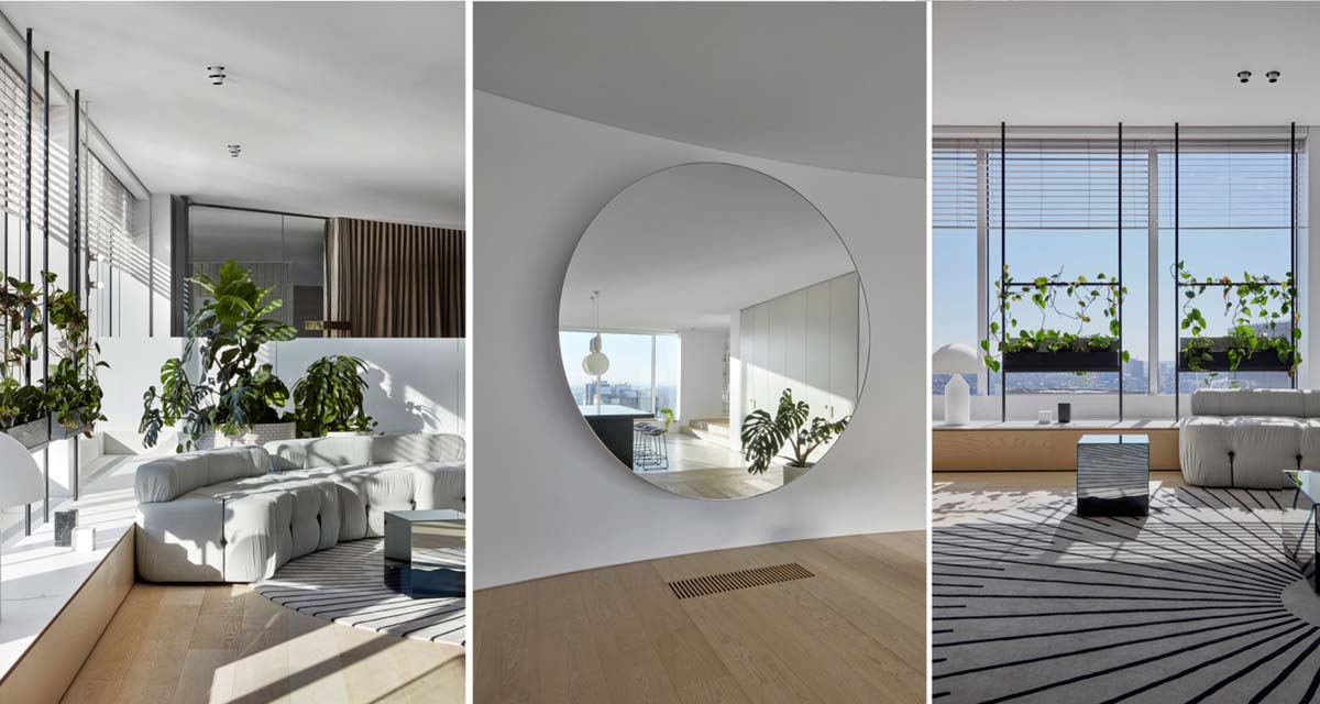
Our layout proposal for the office included placing all the ‘heavy storage’ on the back wall of the room. A feature sideboard (for mini bar functionalities) was also included in this space, and it was customised to hold the mini wine fridge. On the wall above we hang an oversized round mirror, which we love for its modern style, but also because it reflects the light and view from the large picture window in the boardroom.

We then used angled floor to ceiling dividers to create a recessed bookshelf storage, for a discreet storage solution. Initially the width of each bookshelf division is narrow enough to hold a few files, then as the need arises we widen the gap to house (and hide) the printer. Due to the depth and angle of the dividers, these functional office elements are not immediately visible within the office area and can only be seen from certain angles.
For added privacy, we place a large planter next to each desk, to help shield desks and screens from the circulation view.


This same style is continued to the internal boardroom. The frosted aluminium dividing wall is being replaced with a frameless glass wall, and at the client’s request, we would knock out the back wall of the internal board room to reveal the hidden mountain view.

We are so happy with the installation thus far. Stick with us this week and we will show you the concept for the rest of the office, and also reveal a lot of the demolition and build progress. Fingers crossed we are on track for handover this Friday!


