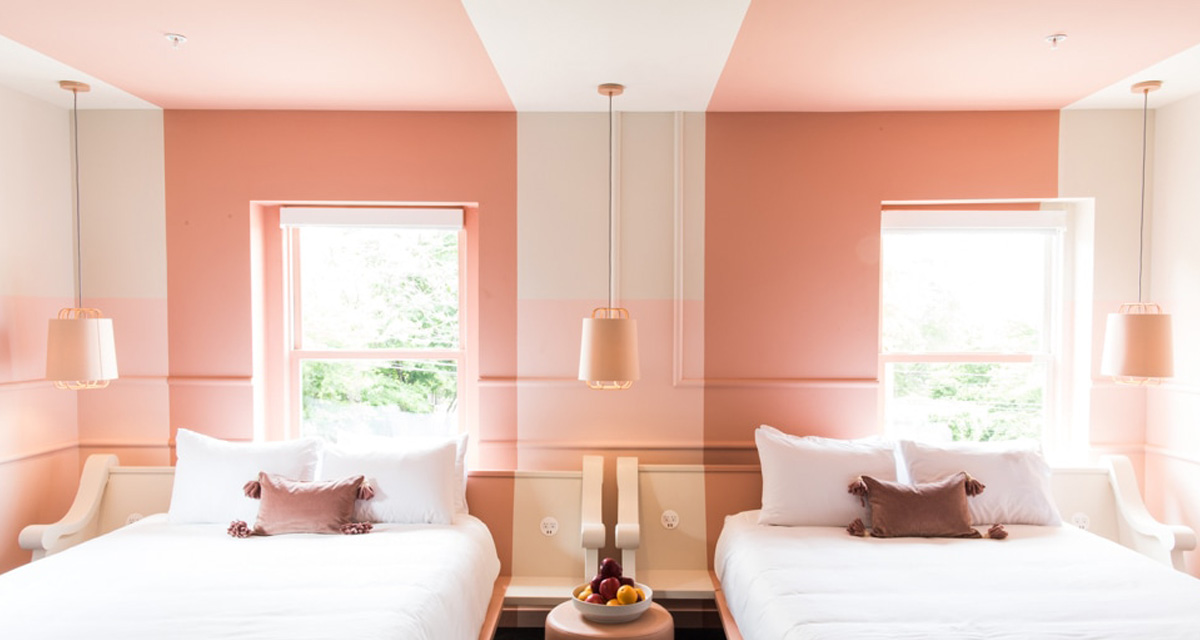
I used to LOVE a feature wall. A burgundy feature wall to be precise. Pretty much every apartment I moved into I painted myself a burgundy feature wall. They were an easy and safe way to bring some colour and interest to a room. Especially in a rental. A little fun without much of the commitment. They also made me feel like a bit of a design star. As though I had all the design answers.
And then one day they just no longer looked good. They lacked purposed and interest. They started to look really dated, really quickly. It’s like your favourite feel good outfit just lost it’s charm. Or like I’d forgotten (or been to lazy) to paint the rest of the room. Suddenly all the joy from the feature wall was gone.
But recently we’ve been enjoying the resurgence of the feature wall. There is more to it these days. No longer a coat of paint slapped on a random wall, the feature wall has evolved to be more purposeful, more considered. Here’s how we think it works best…
Moulding + Paint
This is our new favourite application. Using wall panelling or moulding to create architectural interest in a room is already a win. Whether it is straight up and down panels, or if you get more detailed with moulding and shapes, this already elevates the design of your room. The cherry on the top is painting the wall to highlight the detailing and take it to the next level.


For Those ‘Awkward’ Spaces
Awkward transition space often look a little lost. Just sitting there waiting to be noticed. Using a contrasting colour to bring attention to the area, helps make it look more purposeful. It gives the space a much needed confidence boost. It is also a super smart way to separate different functional areas of a room.


Images 4 – 5
To Define A Purpose
Similarly, creating a feature wall in a space helps to define its purpose. Incase you didn’t know, this is the entrance area…. hang your coat here.


Wallpaper
Our love of using wallpaper deserves a whole post on its own, so we’ll just touch on this subject now. We love feature wallpaper, but just like paint, we believe it needs to be used in the right setting to make sure the beauty and impact isn’t lost. Or like you ran out of wallpaper……


Images 9 | 10 + 11 via The Home Studio Projects


