Waaaay back in April we talked about a lovely two bedroom cottage project we started working on, and gave you some insight into the living room re-design. To recap – the owner was looking to move away from a more traditional french cottage feeling to something more modern, something with cleaner lines and a minimal “less is more” approach to their space.
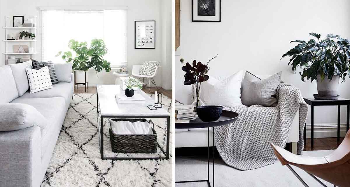
You can see in this post that initially we were bringing in lots of blush and brass accents, creating a very feminine space. As we started the sourcing process and starting pulling the pieces together, the client realised that she wanted less. Less of the blush and the golds, and more of a focus on simplicity. So we tweaked the design to incorporate our favourite neutrals of grey, white and black for a simple, soothing living space.
INSPIRATION + IDEAS
The more we discussed options the more inspired the client became by the simplicity and beauty of Scandinavian inspired living spaces – especially with their focus on fewer, better pieces. Removing the need to fill a room ‘just because you think you should’ really resonated with our client.

Below are the Before pictures of the living area. In the end we made several changes – the carpets were removed and new flooring was put down, most the furniture was bought new (sofa, coffee table, armchair, pictures, light…), however a few pieces were painted for a new lease on life and re-used in the space, while others were repurposed in other rooms. As part of maximising her budget our client was amazing at selling her unwanted items – a true lesson in upcycling and working the budget to the end.
BEFORE


Watch this space – tomorrow we reveal the AFTER!


