It seems like a lifetime ago that we first spoke about the kitchen and dining concept for Apartment D, a one-bedroom apartment located in Cape Town which underwent a complete gut renovation.
For this project, our client tasked us with the planning, project managing, furnishing and styling of their apartment, with the final aim of being able to rent it out on AirBnB.
With the beautiful views of the Mother City being the hero, a modern, minimal and visitor-friendly space was to be created – all the while maintaining a fairly strict budget.
Based on our client’s love of the colour green, we (Claire and Karen) worked in a soft palette of sage green, grey and white – which is such a stunning colour combination and always creates a lovely timeless interior setting. The wood (or rather wood look) flooring finished off the space, and playing on the mountain views and scenery, we brought in earthy accents to give the apartment plenty of warmth and texture.

Let’s have a look at where we started! Yes, it was truly time for the yellow melamine cupboards and red feature wall to go.
MAIN BEDROOM BEFORE
MAIN BEDROOM CONCEPT
With the concept for the open plan kitchen and dining firmly in place, we set our sights on the master bedroom. Because the overall floor space of the apartment was fairly limited, we wanted to ensure the bedroom felt cohesive with and an extension of the rest of the apartment. There it made sense to keep to to the same colour palette and work with similar materials throughout the entire space.
We did, however, feel there was an opportunity to paint the large blank wall behind the bed an accent colour, and initially looked at a darker shade of the sage green used in the kitchen. Something like this crossed our minds, but we felt the result would fall too flat in the main bedroom.

To bring in added interest and texture, we turned to our love of wall panelling. The option of a full or half height panelled wall was discussed and our client loved the idea (obviously). Unfortunately, due to the curved nature of the walls of the apartment there was going to be a risk of the wood warping over time. So while we sadly parked this idea on this project, if you’re thinking of doing something similar in your home and the conditions are right – we say definitely do it!


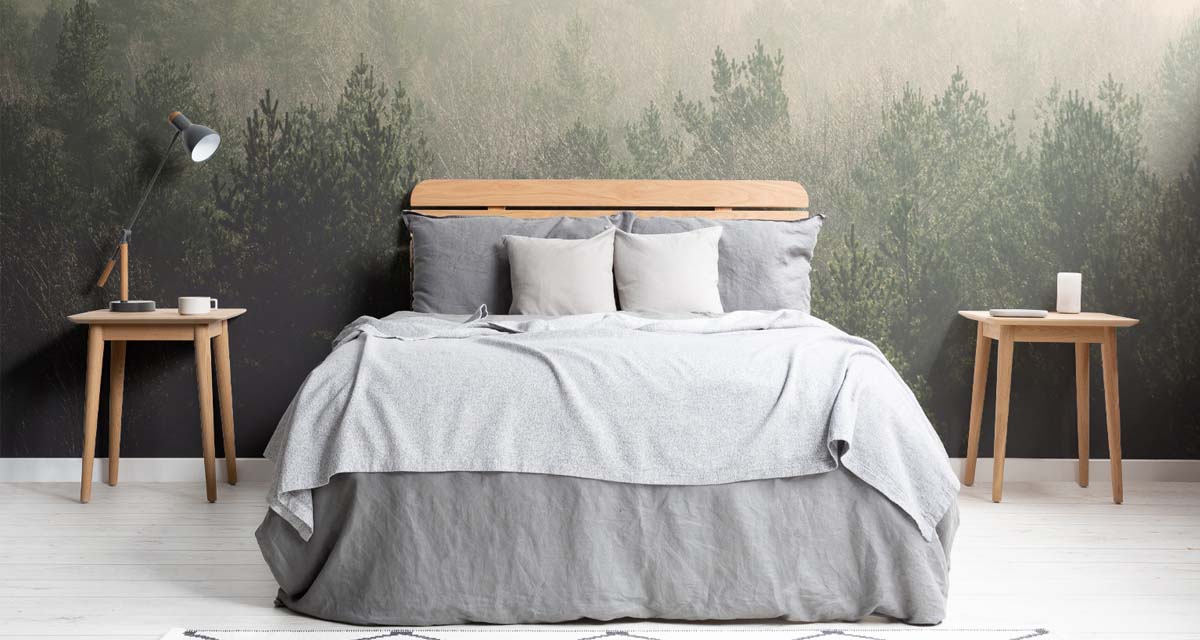
In the end we got the client’s onboard (initially they were not pro wallpaper) and convinced them to embrace a botanical wallpaper behind the bed. We wanted an option that would tie the palette of the entire home together, and create a bold feature without overpowering the entire space.


The final selection came down to this stunning design from Lemon, that we felt when paired together with the oak furnishings, crisp white linen bedding and floaty sheer curtains, we would achieve the perfect look for this main bedroom space.

The results are simply beautiful, and we can’t wait to share the complete transformation of Apartment D with you in the New Year!


