The Staircase Dilemma
We refer this aspect of the design process and a dilemma because this staircase was subject to many a disagreement between the builders, engineers and designers. Everyone had a different opinion about how this problem should be solved. What was the problem? Well, as you can see from the before pictures shown below, the concrete staircase was big, bulky and took up a large portion of the downstairs living space. The owners had also previously boxed in the unusable space under the stairs with a cupboard, providing a small amount of awkward storage space, but also adding to the dark and unwieldy look and feel of the staircase.
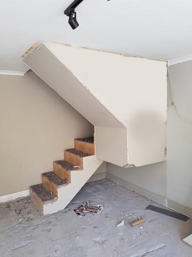
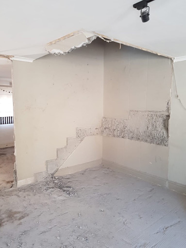 What we wanted to do was create a staircase that was light and airy, but that also felt as though it was meant to be there, forming part of the living area as a whole. We presented the idea of an “integrated staircase” to the clients. One, that would form part of a single unit for storage, a fireplace and an entertainment centre along the entire wall of the living area. We gathered a couple of inspiration images from Pinterest to present to the builder and engineer in order to explain our concept more clearly. The clients loved the idea of partially floating stairs to add to the airiness but a balustrade was a must as they have young children.
Integrated Concept
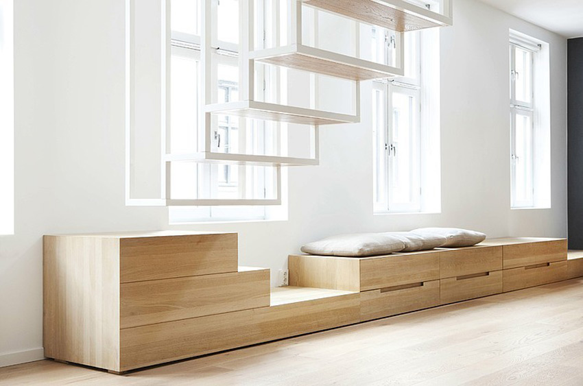
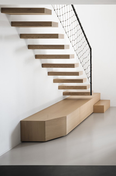
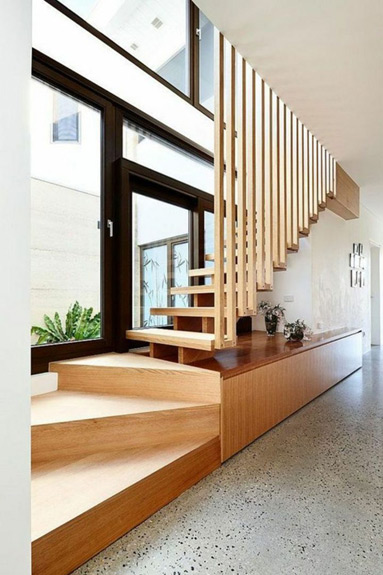
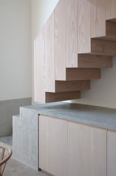
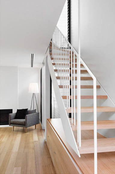
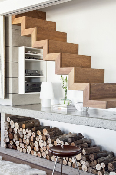
What made our plight even more challenging was that the staircase would have to have a 90 degree turn. There was just no other way with the limited opening we had in the concrete ceiling and the head space available. After a lot of brainstorming, a concept evolved incorporating a concrete unit cladded with terrazzo look tiles, white oak storage underneath and on top, floating oak treads and a simple steel balustrade. 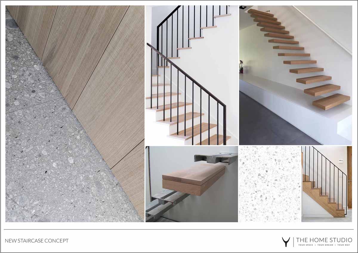
The Other Side
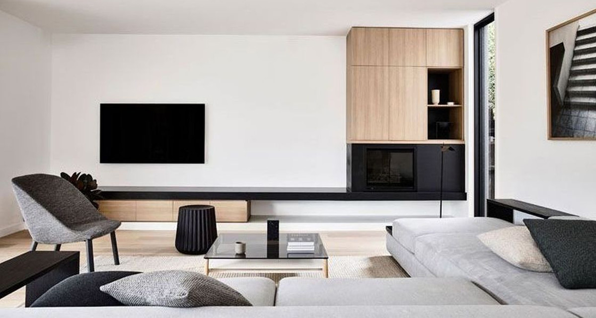
On the other side of the integrated unit, which would extend all the way along the one wall of the living area and end in the staircase, the clients wanted to include a built-in fireplace, storage and a wall mounted TV above, as well as, storage space and shelving for other devices below. Again, we turned to Pinterest to provide them with some visual inspiration. 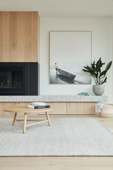
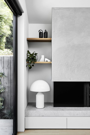
The remainder of the living area would be decorated in beige, white and grey hues with black accents, much the same as the other areas of the open plan space. The clients wanted the space to remain fairly uncluttered and open as it was a small area that would serve as a multifunctional space for their growing family. 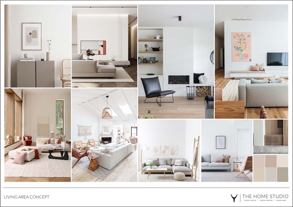 We will be revealing the end result of this space soon…


