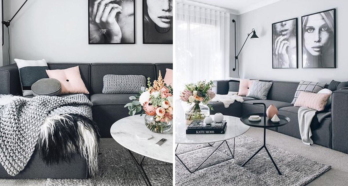
Today we’re introducing you to a lovely two bedroom cottage project we’re working on, starting with the design for the combined living and dining area. From our initial consultation and discussions with the client we learn that they are looking to move away from a more traditional french cottage feeling to something more modern, something with cleaner lines and a minimal, “less is more” approach to their space.
She also favours light colour furniture, whites and greys, velvet fabrics, with touches of blush for a whimsy and feminine touch, adding in either brass or black accents.
Sound ideal right? Without further ado we start our research into the concept and mood for the space. There is plenty of inspiration to feed our creativity.


From the images we notice how the colour of the rug changes up the feeling in the space, with a darker or grey rug grounding the space a thank lighter options. It also takes away the insipid feeling of too much pink or young, girlyness from the space. It’s still femine, but a man would feel comfortable in the room too.

 1 | 2 | 3 | 4 | 5 | 6 | 7 | 8 | 9 | 10
For us the key to this look is to bring in darker hues of pinks, burgundy and warm terracotta to add a sophisticated element to the design, as well as providing great contrast. Look at this stunning restaurant setting with its blush pink and ruby red velvet furniture. Such a beautiful contrast.
Our concept brings in these contrasting colours to add a level of chic, modern sophistication to the space. We also brought in different textures and layers for a cosy feeling. 
Next week we’ll show you how to get the look at home, across a few a budget options.


