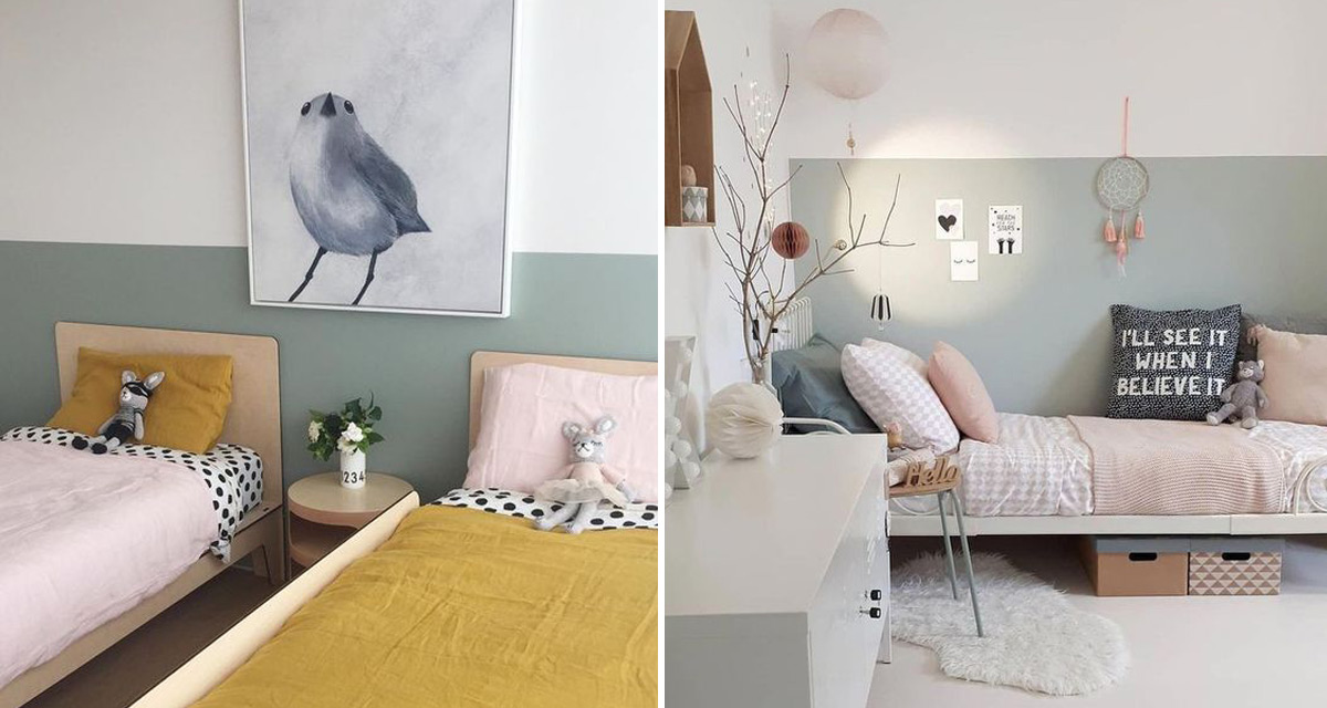
We love designing kids rooms. Typically there is more opportunity to bring in colour, and there are so many gorgeous and fun details that can be added to a kids room – especially for the little little ones. For the most part it is difficult to choose and hold yourself back!
When it came to planning this a little girl’s toddler bedroom we knew a few certainties from the start. The first was that the room would need to incorporate a new toddler bed and a corner reading nook. The clients decided to do away with their compactum as they had enough storage space within the existing built-in cupboards and, with any luck, their diaper changing days would soon be behind them.
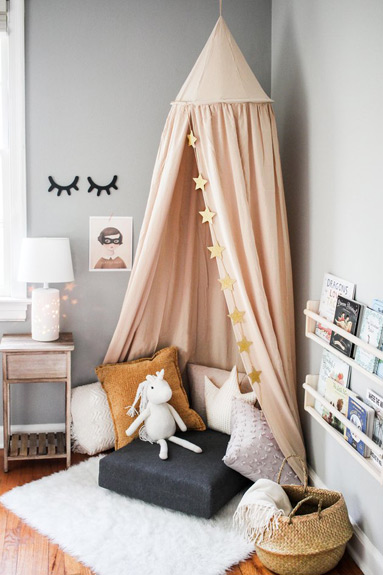
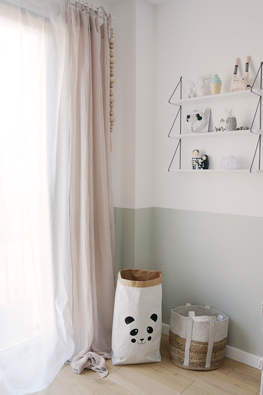
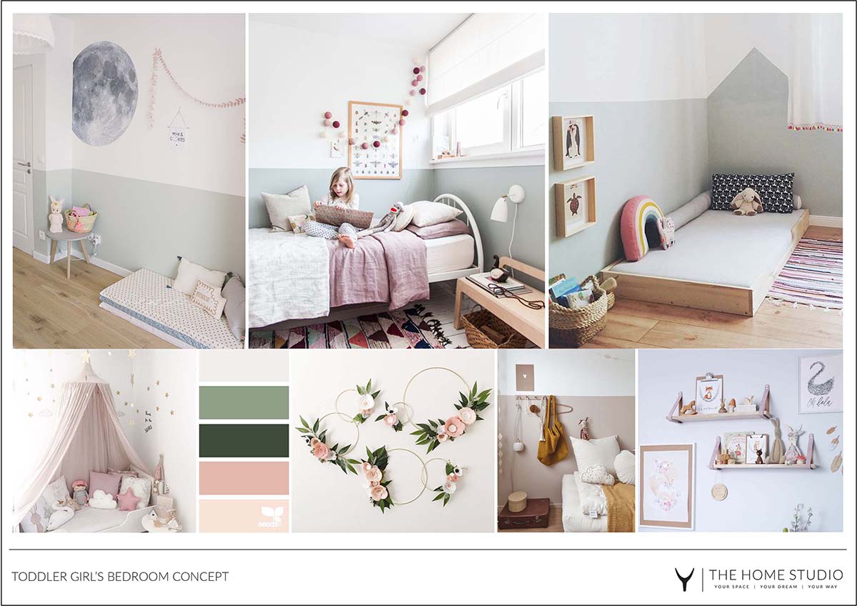
The second certainty was that even though the rest of the house was mainly white with neutral accents, in their daughters room they wanted to incorporate some colour. The chosen colours would however need to work alongside the home’s overall minimalist look, so our designer Claire suggested a selection of soft neutrals, sage green and blush pink.
The clients loved the fact that these colours also go really well with ochre or burgundy, which they might want to include over time as their little girl gets older.
Given the smaller footprint of the room, Claire decided to paint half the wall – which is both a great cost-saving and design savvy option, as previously discussed in this post.
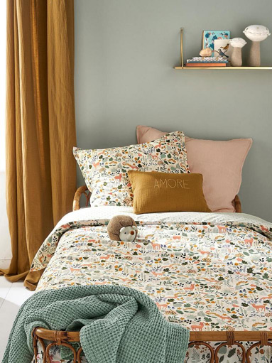
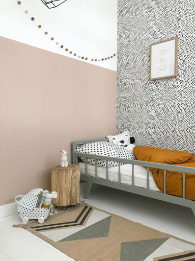
Image Source 1 | 2 | 3 | 4 | 5 | 6
As part of the design concept Claire presented the client this mood board, which showed off the soft tones, feminine florals and versatility of adding or taking away colour that the client was after.
Tomorrow we will reveal this beautiful space, as well as discuss a few more behind the scene thoughts and decisions.


